visualization_tutorial_01
데이터 시각화
데이터 시각화의 기본 조건
목적에 맞는 선정
- 선형 그래프, 막대 그래프, 산점도, 박스플롯 etc
환경에 맞는 도구 선택
- 코드 기반(R, Python)
- 프로그램 기반 (시각화 툴)
- Powr BI, Tableau, Excel
문맥(도메인)에 맞는 색과 도형 사용
- 회사 로고 색깔
- 색상의 일반적인 통념
- 빨간색(경고), 초록색(안전)
코드 기반의 장점
- 재현성 (함수화)
- 여러 그래프 동시 작성 가능
- 기존 코드 Ctrl + C/V
- 데이터 크기 제한 없음 (RAM 조건 충족 시)
- 재현성 (함수화)
Matplotlib 사용시 주의점
- 객체 지향 API 문법을 사용하라
- 숙달 시 다른 곳에도 사용 가능하다.
- pyplot API 문법 사용은 자제하라.
- 숙달해도 다른 문법과 차이가 있어서 쓸 데가 없다.
- 객체 지향 API 문법을 사용하라
참고
데이터 분석 강의안_220307.pdf 63페이지. ‘시각화’
Matplotlib : https://matplotlib.org/stable/api/ticker_api.html
seaborn : https://seaborn.pydata.org/
국새 파이썬 시각화 TOP 블로그 Pega Devlog (jehyunlee.github.io)
- 이 분 블로그는 정독할 필요가 있으니, 즐겨찾기 해두자.
라이브러리 불러오기
1 | import matplotlib |
3.2.2
0.11.2
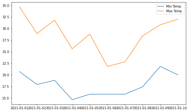
시각화 그려보기
1 | import matplotlib.pyplot as plt |
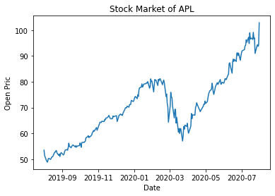
주섹 데이터 다운로드 받기
1 | !pip install yfinance --upgrade --no-cache-dir |
Collecting yfinance
Downloading yfinance-0.1.70-py2.py3-none-any.whl (26 kB)
Requirement already satisfied: pandas>=0.24.0 in /usr/local/lib/python3.7/dist-packages (from yfinance) (1.3.5)
Requirement already satisfied: numpy>=1.15 in /usr/local/lib/python3.7/dist-packages (from yfinance) (1.21.5)
Requirement already satisfied: multitasking>=0.0.7 in /usr/local/lib/python3.7/dist-packages (from yfinance) (0.0.10)
Collecting lxml>=4.5.1
Downloading lxml-4.8.0-cp37-cp37m-manylinux_2_17_x86_64.manylinux2014_x86_64.manylinux_2_24_x86_64.whl (6.4 MB)
[K |████████████████████████████████| 6.4 MB 9.7 MB/s
[?25hCollecting requests>=2.26
Downloading requests-2.27.1-py2.py3-none-any.whl (63 kB)
[K |████████████████████████████████| 63 kB 41.2 MB/s
[?25hRequirement already satisfied: python-dateutil>=2.7.3 in /usr/local/lib/python3.7/dist-packages (from pandas>=0.24.0->yfinance) (2.8.2)
Requirement already satisfied: pytz>=2017.3 in /usr/local/lib/python3.7/dist-packages (from pandas>=0.24.0->yfinance) (2018.9)
Requirement already satisfied: six>=1.5 in /usr/local/lib/python3.7/dist-packages (from python-dateutil>=2.7.3->pandas>=0.24.0->yfinance) (1.15.0)
Requirement already satisfied: idna<4,>=2.5 in /usr/local/lib/python3.7/dist-packages (from requests>=2.26->yfinance) (2.10)
Requirement already satisfied: certifi>=2017.4.17 in /usr/local/lib/python3.7/dist-packages (from requests>=2.26->yfinance) (2021.10.8)
Requirement already satisfied: urllib3<1.27,>=1.21.1 in /usr/local/lib/python3.7/dist-packages (from requests>=2.26->yfinance) (1.24.3)
Requirement already satisfied: charset-normalizer~=2.0.0 in /usr/local/lib/python3.7/dist-packages (from requests>=2.26->yfinance) (2.0.12)
Installing collected packages: requests, lxml, yfinance
Attempting uninstall: requests
Found existing installation: requests 2.23.0
Uninstalling requests-2.23.0:
Successfully uninstalled requests-2.23.0
Attempting uninstall: lxml
Found existing installation: lxml 4.2.6
Uninstalling lxml-4.2.6:
Successfully uninstalled lxml-4.2.6
[31mERROR: pip's dependency resolver does not currently take into account all the packages that are installed. This behaviour is the source of the following dependency conflicts.
google-colab 1.0.0 requires requests~=2.23.0, but you have requests 2.27.1 which is incompatible.
datascience 0.10.6 requires folium==0.2.1, but you have folium 0.8.3 which is incompatible.[0m
Successfully installed lxml-4.8.0 requests-2.27.1 yfinance-0.1.70
1 | import yfinance as yf |
[*********************100%***********************]  1 of 1 completed
Date
2019-08-01    53.474998
2019-08-02    51.382500
2019-08-05    49.497501
2019-08-06    49.077499
2019-08-07    48.852501
Name: Open, dtype: float64
<class 'pandas.core.series.Series'>
pyplot 형태
1 | import matplotlib.pyplot as plt |
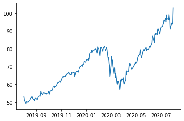
객체지향으로 그리기
- fix 는 테두리
- 나머지는 ax가 표현
1 | import matplotlib.pyplot as plt |
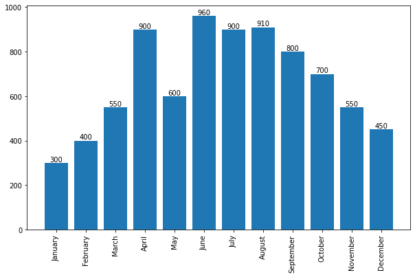
막대 그래프
1 | import matplotlib.pyplot as plt |
barplots :  <BarContainer object of 12 artists>
Rectangle(xy=(0.6, 0), width=0.8, height=300, angle=0)
Rectangle(xy=(1.6, 0), width=0.8, height=400, angle=0)
Rectangle(xy=(2.6, 0), width=0.8, height=550, angle=0)
Rectangle(xy=(3.6, 0), width=0.8, height=900, angle=0)
Rectangle(xy=(4.6, 0), width=0.8, height=600, angle=0)
Rectangle(xy=(5.6, 0), width=0.8, height=960, angle=0)
Rectangle(xy=(6.6, 0), width=0.8, height=900, angle=0)
Rectangle(xy=(7.6, 0), width=0.8, height=910, angle=0)
Rectangle(xy=(8.6, 0), width=0.8, height=800, angle=0)
Rectangle(xy=(9.6, 0), width=0.8, height=700, angle=0)
Rectangle(xy=(10.6, 0), width=0.8, height=550, angle=0)
Rectangle(xy=(11.6, 0), width=0.8, height=450, angle=0)
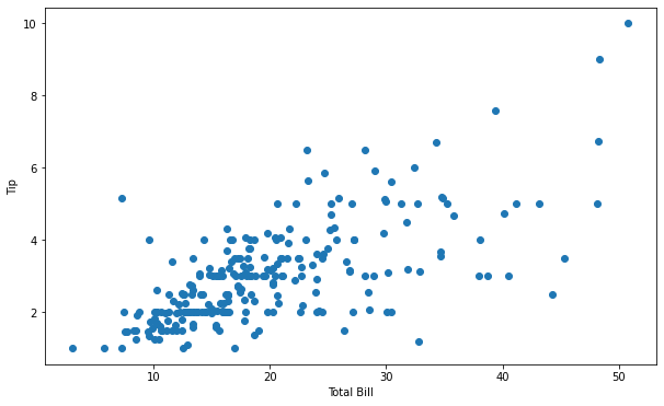
1 | ### 산점도 |
1 | import seaborn as sns |
<function matplotlib.pyplot.show>
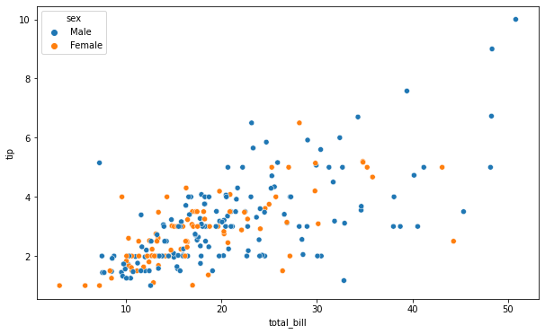
1 | label, data = tips.groupby('sex') |
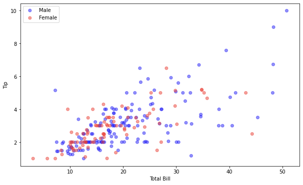
Seaborn
- 다음 코드는 위와 같은 결과가 나온다. 하지만 더 간단하다.
1 | import matplotlib.pyplot as plt |
1 | # 두 개의 그래프를 동시에 표현 |
막대 그래프 그리기 seaborn 방식
1 | sns.countplot(x="day", data=tips) |
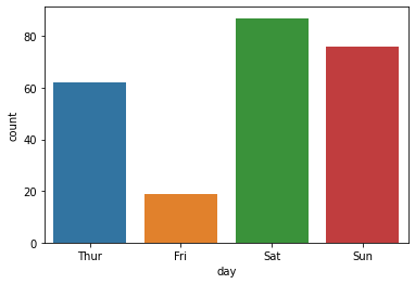
1 | print(tips['day'].value_counts().index) |
CategoricalIndex(['Sat', 'Sun', 'Thur', 'Fri'], categories=['Thur', 'Fri', 'Sat', 'Sun'], ordered=False, dtype='category')
[87 76 62 19]
Fri     19
Thur    62
Sun     76
Sat     87
Name: day, dtype: int64
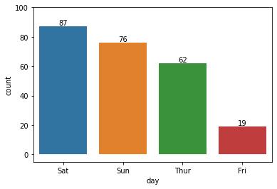
1 | flg, ax = plt.subplots() |
Rectangle(xy=(-0.4, 0), width=0.8, height=87, angle=0)
Rectangle(xy=(0.6, 0), width=0.8, height=76, angle=0)
Rectangle(xy=(1.6, 0), width=0.8, height=62, angle=0)
Rectangle(xy=(2.6, 0), width=0.8, height=19, angle=0)
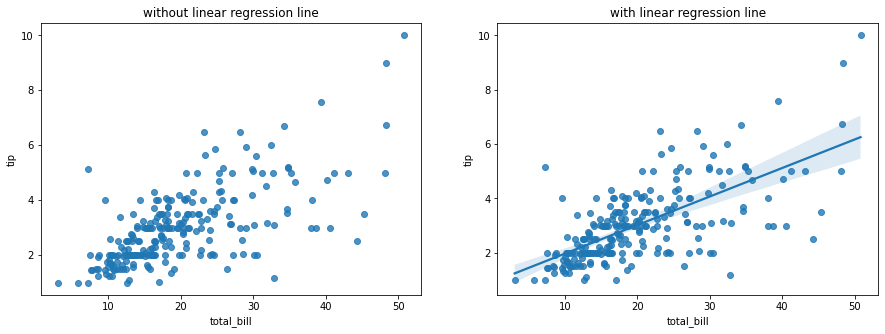
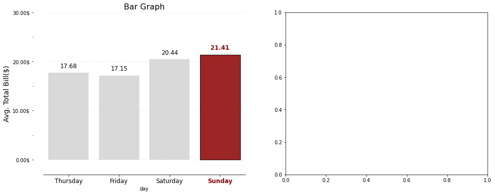
어려운 시각화 그래프
1 | import matplotlib.pyplot as plt |
21.41
Text(0, 0, 'Thur')
Text(0, 0, 'Fri')
Text(0, 0, 'Sat')
Text(0, 0, 'Sun')
visualization_tutorial_01
https://kmk3593.github.io/2022/03/26/visualization_tutorial_01/
You need to set
install_url to use ShareThis. Please set it in _config.yml.