chapter4_1
로지스틱 회귀
- 대상이 어떤 타깃에 속할 확률을 구한다.
데이터 불러오기
- 컬럼 설명 177p 그림
1 | import pandas as pd |
| Species | Weight | Length | Diagonal | Height | Width | |
|---|---|---|---|---|---|---|
| 0 | Bream | 242.0 | 25.4 | 30.0 | 11.5200 | 4.0200 |
| 1 | Bream | 290.0 | 26.3 | 31.2 | 12.4800 | 4.3056 |
| 2 | Bream | 340.0 | 26.5 | 31.1 | 12.3778 | 4.6961 |
| 3 | Bream | 363.0 | 29.0 | 33.5 | 12.7300 | 4.4555 |
| 4 | Bream | 430.0 | 29.0 | 34.0 | 12.4440 | 5.1340 |
  <script>
    const buttonEl =
      document.querySelector('#df-3c5195bb-ad65-485c-8b95-563887f303f2 button.colab-df-convert');
    buttonEl.style.display =
      google.colab.kernel.accessAllowed ? 'block' : 'none';

    async function convertToInteractive(key) {
      const element = document.querySelector('#df-3c5195bb-ad65-485c-8b95-563887f303f2');
      const dataTable =
        await google.colab.kernel.invokeFunction('convertToInteractive',
                                                 [key], {});
      if (!dataTable) return;

      const docLinkHtml = 'Like what you see? Visit the ' +
        '<a target="_blank" href=https://colab.research.google.com/notebooks/data_table.ipynb>data table notebook</a>'
        + ' to learn more about interactive tables.';
      element.innerHTML = '';
      dataTable['output_type'] = 'display_data';
      await google.colab.output.renderOutput(dataTable, element);
      const docLink = document.createElement('div');
      docLink.innerHTML = docLinkHtml;
      element.appendChild(docLink);
    }
  </script>
</div>
- unique()
- 어떤 종류의 생선이 있는지 species 열에서 고유한 값을 추출한다.
1 | print(pd.unique(fish['Species'])) |
['Bream' 'Roach' 'Whitefish' 'Parkki' 'Perch' 'Pike' 'Smelt']
데이터 변환
- 배열로 변환
1 | fish_input = fish[['Weight', 'Length', 'Diagonal', 'Height', 'Width']] # Diagonal = 대각선 |
(159, 5)
- target 배열로 변환
- 종속변수
1 | fish_target = fish['Species'].to_numpy() |
훈련 데이터와 테스트 데이터
- 이제 데이터를 훈련 세트와 테스트 세트로 나눈다.
- 외워야 할 정도로 중요. 자주 쓰다보면 외워진다.
1 | from sklearn.model_selection import train_test_split |
- 표준화 전처리
- 이유가 중요하다
- 사이킷런의 StandardScaler 클래스를 사용해 훈련 세트와 테스트 세트를 표준화 전처리한다.
- 반드시 훈련 세트의 통계값으로 테스트 세트를 변환해야 한다.
1 | from sklearn.preprocessing import StandardScaler |
1 | print(train_input[:5]) |
     Weight  Length  Diagonal   Height   Width
26    720.0    35.0      40.6  16.3618  6.0900
137   500.0    45.0      48.0   6.9600  4.8960
146     7.5    10.5      11.6   1.9720  1.1600
90    110.0    22.0      23.5   5.5225  3.9950
66    140.0    20.7      23.2   8.5376  3.2944
[[ 0.91965782  0.60943175  0.81041221  1.85194896  1.00075672]
 [ 0.30041219  1.54653445  1.45316551 -0.46981663  0.27291745]
 [-1.0858536  -1.68646987 -1.70848587 -1.70159849 -2.0044758 ]
 [-0.79734143 -0.60880176 -0.67486907 -0.82480589 -0.27631471]
 [-0.71289885 -0.73062511 -0.70092664 -0.0802298  -0.7033869 ]]
k-최근접 이웃 분류기의 확률 예측
- 필요한 데이터를 모두 준비했다.
- 이제 k-최근접 이웃 분류기로 테스트 세트에 들어 있느 확률을 예측한다.
1 | from sklearn.neighbors import KNeighborsClassifier |
0.8907563025210085
0.85
182p
다중 분류( multi-class classification)
- 앞서 fish 데이터프레임에서 7종류의 생선이 있었다.
- fish[‘Species’]를 사용해 타깃 데이터를 만들었기에 두 세트의 타깃 데이터에도 7개의 생선 종류가 들어가 있다.
- 이렇게 타깃 데이터에 2개 이상의 클래스가 포함된 문제를 ‘다중 분류’라 부른다.
1 | import numpy as np |
[[0.     0.     1.     0.     0.     0.     0.    ]
 [0.     0.     0.     0.     0.     1.     0.    ]
 [0.     0.     0.     1.     0.     0.     0.    ]
 [0.     0.     0.6667 0.     0.3333 0.     0.    ]
 [0.     0.     0.6667 0.     0.3333 0.     0.    ]]
['Bream' 'Parkki' 'Perch' 'Pike' 'Roach' 'Smelt' 'Whitefish']
- 위 코드의 결과는 어떤 물고기일지에 대한 확률이다.
- 예를 들어, 1번째 샘플은 100% 확률로 perch이다.
- 에를 들어, 4번째 샘플은 66% 확률로 perch이고, 33% 확률로 Roach이다.
로지스틱 회귀
중요도 : 최상
오늘 유튜브 영상 반드시 시청
- 개념 재복습 반드시 필요
Why?
- 로지스틱 회귀
- 기초 통계로도 활용 (의학통계)
- 머신러닝 부류모형의 기초 모형인데, 성능이 생각보다 나쁘지 않음
- 데이터셋, 수치 테이터 기반
- 딥러닝 : 초기모형에 해당됨.
- 로지스틱 회귀
이름은 회귀이지만 분류 모델이다.
선형 회귀와 동일하게 선형 방정식을 학습한다.
- 예를 들어 다음과 같다.
- z = a x (weight) + b x (length) + c x (Diagonal) + d x (Height) + e x (width) + f
- 여기에서 a, b, c, d, e는 가중치 혹은 계수이다.
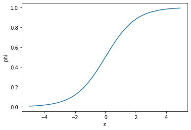
- z 가 확률이 되려면 0~1 사이의 값이어야 한다.
- 이를 위해 사용하는 것이 시그모이드 함수( 또는 로지스틱 함수)이다.
- 예를 들어 다음과 같다.
1 / ( 1 + e^(-z) )
- 이 식이 로지스틱 함수( 시그모이드 함수) 이다.
넘파이를 사용하여 z의 그래프를 그려보자.
- -5와 5 사이에서 0.1 간격으로 배열 z를 만든 다음 z 위치마다 로지스틱 함수를 계산한다.
- 함수 계산은 np.exp() 함수를 사용한다.
1 | import numpy as np |
개발자 취업을 원한다면
- 공부 별도로 하지 않는다!
- 다만 알고리즘의 컨셉은 이해해야 한다.
- 얘기가 서로 통해야 하기 때문에
데이터 분석 관련 지망이라면
- 공부해야 한다.
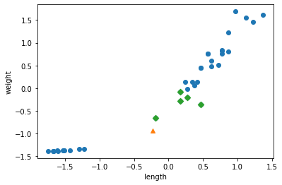
로지스틱 회귀로 이진 분류 수행하기
사이킷런에는 로지스틱 회귀모델인 LogisticRegression 클래스가 준비되어 있다.
이진 분류이 경우
- 로지스틱 함수의 출력이 0.5보다 크면 양성 클래스
- 로지스틱 함수의 출력이 0.5보다 작으면 음성 클래스
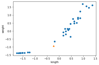
불리언 인덱싱 (boolean indexing)
- 넘파일 배열은 True, False 값을 전달하여 행을 선택할 수 있다.
- 이를 불리언 인덱싱이라고 부른다.
1 | char_arr = np.array(['A', 'B', 'C', 'D', 'E']) |
['A' 'C']
- A 와 C만 True이므로 위 결과가 나온다.
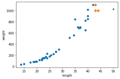
- 이와 같은 방식으로 훈련 세트에서 도미(bream)와 빙어(smelt)의 행만 골라낸다.
- 비교 연산자를 사용하면 도미와 빙어의 행을 True로 만들 수 있다.
1 | # OR 연산자(|) 를 사용하여 비교 결과를 합친다. |
위에서 bream_smelt_indexes 배열은 도미와 빙어일 경우만 True값이 들어간다.
이 배열을 사용해 train_scaled와 train_targt 배열에 불리언 인덱싱을 적용하여 도미와 빙어 데이터만 골라낼 수 있다.
186p
모형 만들고 예측하기!
이제 이 데이터로 로지스틱 회귀 모델을 훈련한다.
1 | from sklearn.linear_model import LogisticRegression |
LogisticRegression()
- 훈련한 모델을 사용해 train_bream_smelt에 있는 처음 5개 샘플을 예측한다.
1 | # 예측하기 |
['Bream' 'Smelt' 'Bream' 'Bream' 'Bream']
- 2 번째 샘플을 제외하고 모두 도미로 예측했다.
- 예측 확률은 predict_proba() 메서드에서 제공한다.
- 처음 5개 샘플의 예측 확률을 출력해 본다.
1 | print(lr.predict_proba(train_bream_smelt[:5])) # predict_proba에서 예측 확률 제공 |
[[0.99759855 0.00240145]
 [0.02735183 0.97264817]
 [0.99486072 0.00513928]
 [0.98584202 0.01415798]
 [0.99767269 0.00232731]]
['Bream' 'Smelt']
위에서 첫번째 열이 음성 클래스(0)에 대한 확률이다.
위에서 두번째 열이 양성 클래스(1)에 대한 확률이다.
bream이 음성이고, smelt가 양성 클래스이다.
이진 분류를 수행 완료했다.
이제 선형 회귀에서터럼 로지스틱 회귀가 학습한 계수를 확인한다.
방정식의 각 기울기와 상수를 구하는 코드
1 | print(lr.coef_, lr.intercept_) |
[[-0.4037798 -0.57620209 -0.66280298 -1.01290277 -0.73168947]] [-2.16155132]
이 로지스틱 회귀 모델이 학습한 방정식은 다음과 같다.
- z = -0.404 x (weight) -0.576 x (length) -0.663 x (Diagonal) -1.103 x (Height) -0.732 x (width) -2.161
- 확실히 로지스틱 회귀는 선형 회귀와 비슷하다.
LogistricRegression 모델로 z값을 계산해 보자.
z식
z값을 출력하자.
1 | decisions = lr.decision_function(train_bream_smelt[:5]) |
[-6.02927744 3.57123907 -5.26568906 -4.24321775 -6.0607117 ]
- 이 z값을 로지스틱 함수에 통과시키면 확률을 얻을 수 있다.
- expit() 함수를 이용해 편하게 계산 가능하다.
- 이 함수를 이용해 decisions 배열의 값을 확률로 변환한다.
1 | from scipy.special import expit |
[0.00240145 0.97264817 0.00513928 0.01415798 0.00232731]
양성 클래스에 대한 z값을 반환했다.
지금까지 이진 분류를 통해 2종류의 생선 샘플을 골라냈고 이를 이용해 로지스틱 회귀 모델을 훈련했다.
188p
Reference : 혼자 공부하는 머신러닝 + 딥러닝
chapter3_3
특성 공학과 규제
- 선형 회귀는 특성이 많을수록 효과가 좋아진다.
- 무게와 길이뿐만 아니라 높이와 두께도 활용해보자.
- 사이킷런의 PolynomialFeatures 클래스를 사용한다.
포인트
- 모델에 규제를 추가함
- 모형의 과대적합을 방지하기 위해!
- 훈련 데이터는 예측 성능이 좋고! 테스트 데이터는 예측성능이 떨어지는 현상
- 릿지, 라쏘 회귀 (중요도 하)
- 모형의 과대적합을 방지하기 위해!
- 하이퍼 파라미터 (개념 이해 중요!)
- 머신러닝 모델이 학습할수 없고 사람이 알려줘야 하는 파라미터 (161p 참고)
- 실무에서는 그렇게 큰 의미가 없음
- 이유 : 가성비가 떨어짐 (작업시간 대비 성능 보장이 안 됨)
하이퍼 파라미터
- 기본 모델에서 과대적합이 발생함
- 모델의 성능을 높여주기 위해 여러 옵션을 선택 및 값 조정
- 문제 : 항상 선응이 보장이 안됨
- 모델마다 하이퍼 파라미터 새팅하는 방법이 다 다름 (종류가 제 각각)
- scikit-learn 라이브러리 내 모델의 갯수가 103개
- 어떤 모델은 하이퍼 파라미터 새팅 위해 필요한 매개 변수가 1개인 경우도 있음
- 어떤 모델은 하이퍼 파라미터의 매개변수가 80개가 넘어가는 것도 있음
- 하이퍼 파라미터 기존에 세팅되어 있는대로 사용 권유 (조건: 그 모델에 잘 모르면!!)
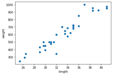
다중 회귀 (multiple regression)
- 여러 개의 특성을 사용한 선형 회귀를 다중 회귀라고 부른다.
특성 공학(feagure engineering)
- 기존의 각 특성을 서로 곱해서 또 다른 특성을 만들 수 있다.
- 예를 들어, ‘농어 길이 x 농어 높이’를 새로운 특성으로 삼을 수 있다.
- 이렇게 기존의 특성을 사용해 새로운 특성을 뽑아내는 작업을 특성 공학이라고 부른다.
데이터 준비
이전과 달리 농어의 특성 3개를 사용한다.
판다스를 이용하여 간편하게 데이터를 입력한다.
판다스(pandas)는 데이터 분석 라이브러리이다.
데이터프레임(dataframe)은 판다스의 핵심 데이터 구조이다.
판다스 데이터 프레임을 만들기 위해 많이 사용하는 파일은 CSV 파일이다.
다음 주소와 read_csv()함수로 파일을 읽어낸다. :https://bit.ly/perch_csv_data
read_csv() 함수로 데이터프레임을 만든 다음 to_numpy() 메서드를 사용해 넘파이 배열로 바꾼다.
1 | import pandas as pd # pd는 관례적으로 사용하는 판다스의 별칭이다. |
[[ 8.4   2.11  1.41]
 [13.7   3.53  2.  ]
 [15.    3.82  2.43]
 [16.2   4.59  2.63]
 [17.4   4.59  2.94]
 [18.    5.22  3.32]
 [18.7   5.2   3.12]
 [19.    5.64  3.05]
 [19.6   5.14  3.04]
 [20.    5.08  2.77]
 [21.    5.69  3.56]
 [21.    5.92  3.31]
 [21.    5.69  3.67]
 [21.3   6.38  3.53]
 [22.    6.11  3.41]
 [22.    5.64  3.52]
 [22.    6.11  3.52]
 [22.    5.88  3.52]
 [22.    5.52  4.  ]
 [22.5   5.86  3.62]
 [22.5   6.79  3.62]
 [22.7   5.95  3.63]
 [23.    5.22  3.63]
 [23.5   6.28  3.72]
 [24.    7.29  3.72]
 [24.    6.38  3.82]
 [24.6   6.73  4.17]
 [25.    6.44  3.68]
 [25.6   6.56  4.24]
 [26.5   7.17  4.14]
 [27.3   8.32  5.14]
 [27.5   7.17  4.34]
 [27.5   7.05  4.34]
 [27.5   7.28  4.57]
 [28.    7.82  4.2 ]
 [28.7   7.59  4.64]
 [30.    7.62  4.77]
 [32.8  10.03  6.02]
 [34.5  10.26  6.39]
 [35.   11.49  7.8 ]
 [36.5  10.88  6.86]
 [36.   10.61  6.74]
 [37.   10.84  6.26]
 [37.   10.57  6.37]
 [39.   11.14  7.49]
 [39.   11.14  6.  ]
 [39.   12.43  7.35]
 [40.   11.93  7.11]
 [40.   11.73  7.22]
 [40.   12.38  7.46]
 [40.   11.14  6.63]
 [42.   12.8   6.87]
 [43.   11.93  7.28]
 [43.   12.51  7.42]
 [43.5  12.6   8.14]
 [44.   12.49  7.6 ]]
- 타깃 데이터는 이전과 동일한 방식으로 준비한다.
1 | import numpy as np |
- 그 다음 perch_full과 perch_weight를 훈련 세트와 테스트 세트로 나눈다.
1 | from sklearn.model_selection import train_test_split |
- 이 데이터를 사용해 새로운 특성을 만든다.
사이킷런의 변환기
사이킷런은 특성을 만들거나 전처리하기 위한 다양한 클래스를 제공한다.
이런 클래스를 변환기(transformer)라고 부른다.
사이킷런의 모델 클래스에 일관된 fit(), score(), predict() 메서드가 있는 것처럼 변환기 클래스는 모두 fit(), transform()메서드를 제공한다
사용할 변환기는 PolynomialFeatures 클래스이다.
이 클래스는 sklearn.preprocessing패키지에 포함되어 있다.
1 | from sklearn.preprocessing import PolynomialFeatures |
- 2개의 특성 2와 3으로 이루어진 샘플 하나를 적용해본다.
- 이 클래스의 객체를 만르고 fit(), transform() 메서드를 차례대로 호출한다.
1 | poly = PolynomialFeatures() |
[[1. 2. 3. 4. 6. 9.]]
fit()
- 새롭게 만들 특성 조합을 찾는다.
transform()
- 실제로 데이터를 변환한다.
위 코드에서 fit()메서드에 입력데이터만 전달했다.
즉 여기에서는 2개의 특성을 가진 샘플 [2,3]이 6개의 특성을 가진 샘플 [1. 2. 3. 4. 6. 9.]로 바뀌었다.
PolynomialFeatures 클래스는 기본적으로 각 특성을 제곱한 항을 추가하고 특성끼리 서로 곱한 항을 추가한다.
2와 3을 각각 제곱한 4와 9가 추가되었고, 2와 3을 곱한 6이 추가된다. 1은 다음 식에 의해 추가된다.
무게 = a x 길이 + b x 높이 + c x 두께 + d x 1
이렇게 놓고 보면 특성은 (길이, 높이, 두께, 1)이 된다.
하지만 사이킷런의 선형 모델은 자동으로 절편(계수)을 추가하므로 굳이 이렇게 특성을 만들 필요가 없다.
include_bias = False로 지정하여 다시 특성을 변환한다.
1 | poly = PolynomialFeatures(include_bias=False) |
[[2. 3. 4. 6. 9.]]
- 절편을 위한 항이 제거되고 특성의 제곱과 특성끼리 곱한 항만 추가되었다.
- 이제 이 방식으로 train_input에 적용한다.
- train_input을 변환한 데이터를 train_poly에 저장하고 이 배열의 크기를 확인해 보자.
1 | poly = PolynomialFeatures(include_bias=False) |
(42, 9)
- PolynomialFeaures 클래스는 9개의 특성이 어떻게 만들어졌는지 확인하는 아주 좋은 방법을 제공한다.
- get_feature-names_out() 메서드를 호출하면 9개의 특성이 각각 어떤 입력의 조합으로 만들어졌는지 알려준다.
1 | poly.get_feature_names_out() |
array(['x0', 'x1', 'x2', 'x0^2', 'x0 x1', 'x0 x2', 'x1^2', 'x1 x2',
       'x2^2'], dtype=object)
- x0은 첫 번째 특성을 의미하고 x0^2는 첫 번째 특성의 제곱, x0 x1은 첫 번째와 두 번째 특성의 곱을 타나내는 식이다.
- 이제 테스트 세트를 변환한다.
1 | test_poly = poly.transform(test_input) |
- 이어서 변환된 특성을 사용하여 다중 회귀 모델을 훈련한다.
다중 회귀 모델 훈련하기
- 사이킷런의 LinearRegression 클래스를 임포트하고 앞에서 만든 train_poly를 사용해 모델을 훈련시킨다.
1 | from sklearn.linear_model import LinearRegression |
0.9903183436982124
- 높은 점수가 나왔다.
- 농어의 길이뿐만 아니라 높이와 두께를 모두 사용했고 각 특성을 제곱하거나 서로 곱해서 다항 특성을 더 추가했다.
- 특성이 늘어나면 선형 회귀의 능력이 강해짐을 알 수 있다.
1 | print(lr.score(test_poly, test_target)) |
0.9714559911594134
- 테스트 셑트에 대한 점수는 높아지지 않았지만 농어의 길이만 사용했을 때 있던 과소적합 문제가 더 이상 나타나지 않게 되었다.
- 특성을 더 많이 추가하면 어떻게될까? 3제곱, 4제곱 항까지 넣는 것이다.
- PolynomialFeaures 클래스의 degree 매개변수를 사용하여 필요한 고차항의 최대 차수를 지정할 수 있다.
- 5제곱까지 특성을 만들어 출력해본다.
1 | poly = PolynomialFeatures(degree=5, include_bias=False) |
(42, 55)
- 만들어진 특성의 개수가 무려 55개나 된다.
- train_poly 배열의 열의 개수가 특성의 개수이다.
- 이 데이터를 사용해 선형 회귀 모델을 다시 훈련한다.
1 | lr.fit(train_poly, train_target) |
0.9999999999991097
- 거의 완벽한 점수다.
- 테스트 세트에 대한 점수는 어떨까?
1 | print(lr.score(test_poly, test_target)) |
-144.40579242684848
음수가 나왔다.
특성의 개수를 늘리면 선형 모델은 더 강력해진다.
하지만 이런 모델은 훈련 세트에 너무 과대적합되므로 테스트 세트에서는 형편없는 점수를 만든다.
이 문제를 해결하기 위해 2가지 방법이 있다.
- 방법 1. 다시 특성을 줄인다.
- 방법 2. 규제를 사용한다.
규제 (regularization)
- 규제는 머신러닝 모델이 훈련 세트를 너무 과도하게 학습하지 못하도록 훼방하는 것을 말한다.
- 즉 모델이 훈련 세트에 과대적합되지 않도록 만드는 것이다.
- 회귀 모델의 경우 특성에 곱해지는 계수(또는 기울기)의 크기를 작게 만드는 일이다.
1 | # 규제하기 전에 먼저 정규화를 진행한다. |
- StandardScaler 클래스의 객체 ss를 초기화한 후 PolynomialFeatures 클래스로 만든 train_poly를 사용해 이 객체를 훈련한다.
- 반드시 훈련 세트로 학습한 변환기를 사용해 테스트 세트까지 변환해야 한다.
- 이제 표준점수로 변환한 train_scaled와 test_scaled가 준비되었다.
릿지(ridge)와 라쏘(lasso)
- 선형 회귀 모델에 규제를 추가한 모델이다.
- 두 모델은 규제를 가하는 방법이 다르다.
- 릿지
- 계수를 제곱한 값을 기준으로 규제를 적용한다.
- 라쏘
- 계수의 절댓값을 기준으로 규제를 적용한다.
릿지 회귀
- 릿지와 라쏘 모두 sklearn.linear_model 패키지 안에 있다.
- 모델 객체를 만들고 fit() 메서드에서 훈련한 다음 score()메서드로 평가한다.
- 앞서 준비한 train_scaled 데이터로 릿지 모델을 훈련한다.
1 | from sklearn.linear_model import Ridge |
0.9896101671037343
- 선형 회귀에 비해 낮아졌다.
- 이번에는 테스트 세트에 대한 점수를 확인한다.
1 | print(ridge.score(test_scaled, test_target)) |
0.9790693977615397
확실히 과대적합도지 않아 테스트 세트에서도 좋은 성능을 내고 있다.
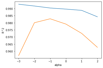
릿지와 라쏘 모델을 사용할 때 규제의 양을 임의로 조절할 수 있다.
모델 객체를 만들 때 alpha매개변수로 규제의 강도를 조절한다.
alpha 값이 크면 규제 강도가 세지므로 계수 값을 줄이고 더 과소적합되도록 유도한다.
aplha 값이 작으면 계수를 줄이는 역할이 줄어들고 선형 회귀 모델과 유사해지므로 과대적합될 가능성이 크다.
적절한 alpha값을 찾는 한 가지 방법은 alpha값에 R^2값의 그래프를 그려 보는 것이다.
훈련 세트와 테스트 세트의 점수가 가장 가까운 지점이 최적의 alpha 값이 된다.
alpha값을 바꿀 때마다 score() 메서드의 결과를 저장할 리스트를 만든다.
1 | import matplotlib.pyplot as plt |
다음은 alpha를 0.001에서 100까지 10배씩 늘려가며 릿지 회귀 모델을 훈련한 다음 훈련 세트와 테스트 세트의 점수를 리스트에 저장한다.
사람이 직버 지정해야 하는 매개변수 (하이퍼 파라미터)
다 돌려봐서 성능이 놓은 alpha 값 찾기
경우의 수 (15가지)
- A 조건 : 5가지
- B 조건 : 3가지
1 | alpha_list = [0.001, 0.01, 0.1, 1, 10, 100] |
- 이제 그래프를 그려본다.
- alpha 값을 10배씩 늘렸기 때문에 그래프 일부가 너무 촘촘해진다.
- alpha_list에 있는 6개의 값을 동일한 간격으로 나타내기 위해 로그 함수로 바꾸어 지수로 표현한다.
- 0.001은 -3, 0.01은 -2가 되는 식이다.
1 | plt.plot(np.log10(alpha_list), train_score) |

위는 훈련 세트 그래프, 아래는 테스트 세트 그래프이다.
이 그래프 왼쪽에서 두 세트의 점수 차이가 크다.
훈련 세트에만 잘 맞는 과대적합의 전형적인 모습니다.
반대로 오른쪽에서는 두 세트의 점수가 모두 낮아지는 과소적합이 나타난다.
적절한 alpha값은 두 그래프가 가장 가깝고 테스트 세트의 점수가 가장 높은 -1, 즉 10^-1 = 0.1 이다.
alpha 값을 0.1로 하여 최종 모델을 훈련한다.
1 | ridge = Ridge(alpha=0.1) |
0.9903815817570366
0.9827976465386926
- 이 모델은 훈련 세트와 테스트 세트의 점수가 비슷하게 모두 높고 과대적합과 과소적합 사이에서 균형을 맞추고 있다.
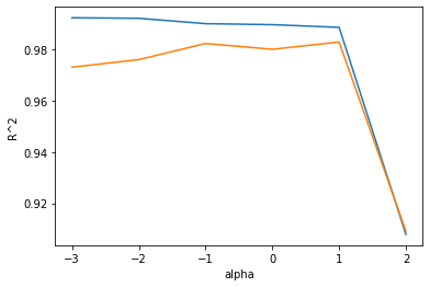
- 이번에는 라쏘 모델을 훈련해보자.
라쏘 회귀
- 라쏘 모델을 훈련하는 것은 릿지와 매우 비슷하다.
- Ridge 클래스를 Lasso 클래스로 바꾸는 것이 전부이다.
1 | from sklearn.linear_model import Lasso |
0.989789897208096
- 라소도 과대적합을 잘 억제한 결과를 보여준다.
- 테스트 세트의 점수도 확인한다.
1 | print(lasso.score(test_scaled, test_target)) |
0.9800593698421883
- 릿지만큼 좋은 점수가 나왔다.
- 앞에서와 같이 alpha값을 바꾸어 가며 훈련 세트와 테스트 세트에 대한 점수를 계산한다.
1 | train_score = [] |
/usr/local/lib/python3.7/dist-packages/sklearn/linear_model/_coordinate_descent.py:648: ConvergenceWarning: Objective did not converge. You might want to increase the number of iterations, check the scale of the features or consider increasing regularisation. Duality gap: 1.878e+04, tolerance: 5.183e+02
  coef_, l1_reg, l2_reg, X, y, max_iter, tol, rng, random, positive
/usr/local/lib/python3.7/dist-packages/sklearn/linear_model/_coordinate_descent.py:648: ConvergenceWarning: Objective did not converge. You might want to increase the number of iterations, check the scale of the features or consider increasing regularisation. Duality gap: 1.297e+04, tolerance: 5.183e+02
  coef_, l1_reg, l2_reg, X, y, max_iter, tol, rng, random, positive
- train_score와 test_score 리스트를 사용해 그래프를 그린다.
- 이 그래프도 x축은 로그 스케일로 바꿔 그린다.
1 | plt.plot(np.log10(alpha_list), train_score) |

- 이 그래프도 왼쪽은 과대적합을 부여주고 있고, 오른쪽으로 갈수록 두 세트의 점수가 좁혀지고 있다.
- 라쏘 모델에서 최적의 alpha값은 1, 즉 10^1 = 10이다.
- 이 값으로 다시 모델을 훈련한다.
1 | lasso = Lasso(alpha=0.1) |
0.990137631128448
0.9819405116249363


/usr/local/lib/python3.7/dist-packages/sklearn/linear_model/_coordinate_descent.py:648: ConvergenceWarning: Objective did not converge. You might want to increase the number of iterations, check the scale of the features or consider increasing regularisation. Duality gap: 8.062e+02, tolerance: 5.183e+02
  coef_, l1_reg, l2_reg, X, y, max_iter, tol, rng, random, positive
- 모델이 잘 훈련되었다.
- 라쏘 모델은 계수 값을 아예 0으로 만들 수 있다.
- 라쏘 모델의 계수는 coef_ 속성에 저장되어 있다. 이 중에 0인 것을 헤아려본다.
1 | print(np.sum(lasso.coef_ == 0)) |
35
- 많은 계수가 0이 되었다.
- 55개의 특성을 모델에 주입했지만 라소 모델이사용한 특성은 15개 밖에 되지 않는다.
- 이런 특징 때문에 라쏘 모델을 유용한 특성을 골라내는 용도로도 사용할 수 있다.
전체 소스 코드
- 다음 주소를 참고하라 : https://bit.ly/hg-03-3
1 | # 특성 공학과 규제 |
[[ 8.4   2.11  1.41]
 [13.7   3.53  2.  ]
 [15.    3.82  2.43]
 [16.2   4.59  2.63]
 [17.4   4.59  2.94]
 [18.    5.22  3.32]
 [18.7   5.2   3.12]
 [19.    5.64  3.05]
 [19.6   5.14  3.04]
 [20.    5.08  2.77]
 [21.    5.69  3.56]
 [21.    5.92  3.31]
 [21.    5.69  3.67]
 [21.3   6.38  3.53]
 [22.    6.11  3.41]
 [22.    5.64  3.52]
 [22.    6.11  3.52]
 [22.    5.88  3.52]
 [22.    5.52  4.  ]
 [22.5   5.86  3.62]
 [22.5   6.79  3.62]
 [22.7   5.95  3.63]
 [23.    5.22  3.63]
 [23.5   6.28  3.72]
 [24.    7.29  3.72]
 [24.    6.38  3.82]
 [24.6   6.73  4.17]
 [25.    6.44  3.68]
 [25.6   6.56  4.24]
 [26.5   7.17  4.14]
 [27.3   8.32  5.14]
 [27.5   7.17  4.34]
 [27.5   7.05  4.34]
 [27.5   7.28  4.57]
 [28.    7.82  4.2 ]
 [28.7   7.59  4.64]
 [30.    7.62  4.77]
 [32.8  10.03  6.02]
 [34.5  10.26  6.39]
 [35.   11.49  7.8 ]
 [36.5  10.88  6.86]
 [36.   10.61  6.74]
 [37.   10.84  6.26]
 [37.   10.57  6.37]
 [39.   11.14  7.49]
 [39.   11.14  6.  ]
 [39.   12.43  7.35]
 [40.   11.93  7.11]
 [40.   11.73  7.22]
 [40.   12.38  7.46]
 [40.   11.14  6.63]
 [42.   12.8   6.87]
 [43.   11.93  7.28]
 [43.   12.51  7.42]
 [43.5  12.6   8.14]
 [44.   12.49  7.6 ]]
[[1. 2. 3. 4. 6. 9.]]
[[2. 3. 4. 6. 9.]]
(42, 9)
0.9903183436982124
0.9714559911594134
(42, 55)
0.9999999999991097
-144.40579242684848
0.9896101671037343
0.9790693977615397
0.9903815817570366
0.9827976465386926
0.989789897208096
0.9800593698421883


/usr/local/lib/python3.7/dist-packages/sklearn/linear_model/_coordinate_descent.py:648: ConvergenceWarning: Objective did not converge. You might want to increase the number of iterations, check the scale of the features or consider increasing regularisation. Duality gap: 1.878e+04, tolerance: 5.183e+02
  coef_, l1_reg, l2_reg, X, y, max_iter, tol, rng, random, positive
/usr/local/lib/python3.7/dist-packages/sklearn/linear_model/_coordinate_descent.py:648: ConvergenceWarning: Objective did not converge. You might want to increase the number of iterations, check the scale of the features or consider increasing regularisation. Duality gap: 1.297e+04, tolerance: 5.183e+02
  coef_, l1_reg, l2_reg, X, y, max_iter, tol, rng, random, positive
0.9888067471131867
0.9824470598706695
40
- Reference : 혼자 공부하는 머신러닝 + 딥러닝
chapter3_2
데이터 준비하기
1 | import numpy as np |
- 훈련 세트와 테스트 세트로 나눈다.
1 | from sklearn.model_selection import train_test_split |
((42,), (14,), (42,), (14,))
- 훈련 세트와 테스트 세트를 2차원 배열로 변경
1 | train_input = train_input.reshape(-1, 1) |
(42, 1) (14, 1)
모델 만들기
1 | from sklearn.neighbors import KNeighborsRegressor |
KNeighborsRegressor(n_neighbors=3)
예측
- 혼자 공부하는 머신러닝 + 딥러닝
- p132
1 | # 어떤 숫자로 바꿔도 결과는 동일하다 |
[1033.33333333]
시각화
1 | import matplotlib.pyplot as plt |

- [과제] 위 시각화를 객체 지향으로 변경한다!
1 | import matplotlib.pyplot as plt |
'\nimport matplotlib.pyplot as plt\n\n# 객체 지향으로 변경\nfig, ax = plt.subplots()\nax.scatter(perch_length, perch_weight)\nax.set_xlabel("length")\nax.set_xlabel("weight")\n\nplt.show()\n'
- 머신러닝 모델은 주기적으로 훈련해야 한다. (135p)
- MLOps (Machine Learning & Operations)
- 최근에 각광받는 데이터 관련 직업 필수 스킬!
- 입사와 함께 공부시작 (데이터 분석가, 머신러닝 엔지니어, 데이터 싸이언티스트 희망자)
선형회귀 (머신러닝)
- 평가지표 확신이 더 중요! R2 점수, MAE, MSE,…
- 5가지 가정들…
- 잔차의 정규성
- 등분산성, 다중공선성, etc…
- 종속변수 ~ 독립변수간의 “인간관계”를 찾는 과정…
1 | from sklearn.linear_model import LinearRegression |
[7094.41034777]
1 | plt.scatter(train_input, train_target) |
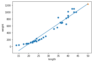
회귀식을 찾기
- coef_ : 기울기
- intercept_ : 상수
1 | # 기울기, 상수 |
[39.01714496] -709.0186449535477
- 기울기 : 계수 = 가중치(딥러닝)
1 | plt.scatter(train_input, train_target) |
- 모형 평가 (138p)
- 과소 적합이 됨
다항회귀의 필요성
- 치어를 생각해보자
- 치어가 1cm
1 | print(lr.predict([[1]])) |
[-670.00149999]
- (140p) 1차 방정식을 2차방정식으로 만드는 과정이 나옴
- 넘파이 브로드캐스팅
- 배열의 크기가 동일하면 상관 없음
- 배열의 크기가 다른데, 연산을 할 때, 브로드캐스팅 원리가 적용
- 브로드캐스팅 튜토리얼, 뭘 찾아서, 추가적 공부를 해야 함(분석가 지망, ai분야 지망)
1 | train_poly = np.column_stack((train_input ** 2, train_input)) |
(42, 2) (14, 2)
1 | lr = LinearRegression() |
[1573.98423528]
1 | # 기울기, 상수 |
[ 1.01433211 -21.55792498] 116.0502107827827
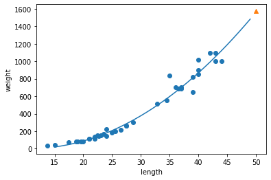
이 모델은 다음과 같은 그래프를 학습했다.
- 무게 = 1.01 x 길이^2 - 21.6 x 길이 + 116.05
KNN의 문제점
- 농어의 길이가 커져도 무게는 동일함 (현실성 제로)
단순 선형회귀(1차 방정식)의 문제점
- 치어(1cm)의 무게가 음수로 나옴 (현실성 제로)
다항 회귀(2차 방정식)으로 변경
- 현실성 있음
이런 방정식을 다항싱(polynomial)이라 부르며 다항식을 사용한 선형 외귀를 다항 회귀(polynomial regression)이라 부른다.
이를 이용하여 이전과 동일하게 훈련 세트의 산점도에 그래프로 그려보자.
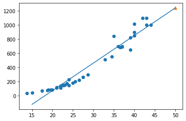
1 | # 구간별 직선을 그리기 위해 15 에서 49까지 정수 배열을 만든다. |

- 앞선 단순 선형 회귀 모델보다 훨씬 나은 그래프가 그려졌다.
- 이제 훈련 세트와 테스트 세트의 R^2 점수를 평가한다.
1 | print(lr.score(train_poly, train_target)) |
0.9706807451768623
0.9775935108325122
- 두 세트의 점수가 높아졌다. 좋은 결과다.
- 하지만 여전히 테스트 세트의 점수가 조금 더 높다.
- 과소적합이 아직 남아 있는 듯 하다. 3-3 에서 이를 해결해보자
전체 소스 코드
- 다음을 참고하라 : bit.ly/hg-03-2
1 | import numpy as np |
[1033.33333333]
1033.3333333333333
[1033.33333333]
[1241.83860323]
[39.01714496] -709.0186449535477
0.939846333997604
0.8247503123313558
(42, 2) (14, 2)
[1573.98423528]
[  1.01433211 -21.55792498] 116.0502107827827
0.9706807451768623
0.9775935108325122
- Reference : 혼자 공부하는 머신러닝 + 딥러닝
chapter3_1
데이터 준비
1 | import numpy as np |
k-최근점 이웃 회귀(Regression)
- 중요도 : 하 (그냥 넘어가세요!)
- 실무에서 잘 안쓰이고, 시간은 한정되어 있기 때문
시각화
- 다음과 같이 fig, ax를 이용해 객체 지향으로 작성하라
1 | import matplotlib.pyplot as plt |
훈련데이터 테스트데이터셋 분리
- 외워야 할 정도로 중요하다.
1 | from sklearn.model_selection import train_test_split |
((42,), (14,), (42,), (14,))
- reshape() 사용하여 2차원 배열로 바꿈
1 | train_input = train_input.reshape(-1, 1) |
(42, 1) (14, 1)
결정계수
- 모델이 얼마만큼 정확하냐?
1 | from sklearn.neighbors import KNeighborsRegressor |
0.992809406101064
MAE
- 타깃과 예측의 절댓값 오차를 평균하여 반환
1 | from sklearn.metrics import mean_absolute_error |
array([  60. ,   79.6,  248. ,  122. ,  136. ,  847. ,  311.4,  183.4,
        847. ,  113. , 1010. ,   60. ,  248. ,  248. ])
- mae를 구한다.
- mae = mean_absolute_error
- 평균적 오차를 구하는 것이다.
1 | mae = mean_absolute_error(test_target, test_prediction) |
- 평균적으로 19g정도 다르다.
과대적합 vs 과소적합
- 공통점은 머신러닝 모형이 실제 테스트 시 잘 예측을 못함!
- 과대적합 : 훈련데이터에는 예측 잘함 / 테스트 데이터에서는 예측을 잘 못함
- 처리하기 곤란
- 과소적합 : 훈련데이터에서는 예측을 못하고, 테스트데이터에서는 예측을 잘 함 or 둘다 예측을 잘 못함.
- 데이터의 양이 적거나, 모델을 너무 간단하게 만듬!
1 | # 훈련 데이터 점수 확인하자. |
0.9698823289099254
- 0.97 정도 나옴
1 | # Defult 5를 3으로 변경 |
0.9804899950518966
- 훈련데이터로 검증 0.98
1 | print(knr.score(test_input, test_target)) |
0.9746459963987609
- mae 구하기
- 평균적 오차 구하기
1 | test_prediction = knr.predict(test_input) |
35.42380952380951
- 평균적으로 35.4g 다름
결론
k 그룹을 5로 했을 때, R2 점수는 0.98, MAE는 19 였음
k 그룹을 3로 했을 때, R2 점수는 0.97, MAE는 35 였음
k 그룹을 7로 했을 때, R2 점수는 0.97, MAE는 32 였음
Reference : 혼자 공부하는 머신러닝 + 딥러닝
chapter2
지도학습과 비지도 학습
지도학습 : 경진대외 유형
입력과 타깃 : 독립변수(입력), 종속변수(타깃)
정답이 있는 문제
- 1 유형 : 타이타닉 생존자 분류 : survived (타깃)
- 2 유형 : 카페 예상매출액 : 숫자를 예측
특성(Feature) : 독립변수(엑셀의 컬럼)
비지도 학습 : 뉴스기사 종류를 분류
- 기사 1 : 사회, 의학, …
- 기사 2 : 사회, 경제, …
훈련 세트와 테스트 세트
1 | fish_length = [25.4, 26.3, 26.5, 29.0, 29.0, 29.7, 29.7, 30.0, 30.0, 30.7, 31.0, 31.0, |
1 | fish_data = [[l,w] for l, w in zip(fish_length, fish_weight)] |
- 머신러닝 모델
1 | from sklearn.neighbors import KNeighborsClassifier |
훈련세트와 테스트 세트로 분리
1 | # 0부터 ~ 34인덱스까지 사용 |
1 | kn = kn.fit(train_input, train_target) |
0.0
1 | fish_data[:34] |
[[25.4, 242.0],
 [26.3, 290.0],
 [26.5, 340.0],
 [29.0, 363.0],
 [29.0, 430.0],
 [29.7, 450.0],
 [29.7, 500.0],
 [30.0, 390.0],
 [30.0, 450.0],
 [30.7, 500.0],
 [31.0, 475.0],
 [31.0, 500.0],
 [31.5, 500.0],
 [32.0, 340.0],
 [32.0, 600.0],
 [32.0, 600.0],
 [33.0, 700.0],
 [33.0, 700.0],
 [33.5, 610.0],
 [33.5, 650.0],
 [34.0, 575.0],
 [34.0, 685.0],
 [34.5, 620.0],
 [35.0, 680.0],
 [35.0, 700.0],
 [35.0, 725.0],
 [35.0, 720.0],
 [36.0, 714.0],
 [36.0, 850.0],
 [37.0, 1000.0],
 [38.5, 920.0],
 [38.5, 955.0],
 [39.5, 925.0],
 [41.0, 975.0]]
1 | fish_target[34:] |
[1, 0, 0, 0, 0, 0, 0, 0, 0, 0, 0, 0, 0, 0, 0]
샘플링 편향
넘파이
- 리스트로 연산은 지원이 잘 안 됨.
- 리스트를 넘파이 배열로 변환
1 | import numpy as np |
(49, 2) (49,)
- suffle : 데이터를 섞어준다
- 실험 재현성
- np.random.seed(42) 란?
- 뒤에 42는 무의미한 수치이다.
- 랜덤 시드이다.
- 어떤 특정한 시작 숫자를 정해 주면 컴퓨터가 정해진 알고리즘에 의해 마치 난수처럼 보이는 수열을 생성한다.
- 이런 시작 숫자를 시드(seed)라고 한다.
1 | # 76p |
array([ 0,  1,  2,  3,  4,  5,  6,  7,  8,  9, 10, 11, 12, 13, 14, 15, 16,
       17, 18, 19, 20, 21, 22, 23, 24, 25, 26, 27, 28, 29, 30, 31, 32, 33,
       34, 35, 36, 37, 38, 39, 40, 41, 42, 43, 44, 45, 46, 47, 48])
- 셔플
1 | # 셔플 = 섞는다 |
[13 45 47 44 17 27 26 25 31 19 12  4 34  8  3  6 40 41 46 15  9 16 24 33
 30  0 43 32  5 29 11 36  1 21  2 37 35 23 39 10 22 18 48 20  7 42 14 28
 38]
- 훈련 데이터 및 테스트데이터 재 코딩
1 | train_input = input_arr[index[:35]] |
[ 32. 340.] [ 32. 340.]
1 | test_input = input_arr[index[35:]] |
1 | train_input.shape, train_target.shape, test_input.shape, test_target.shape |
((35, 2), (35,), (14, 2), (14,))
시각화 생략
두 번째 머신러닝 프로그램
1 | kn = kn.fit(train_input, train_target) |
1.0
- 다음 두 코드의 결과가 같다. 예측 성공.
1 | kn.predict(test_input) |
array([0, 0, 1, 0, 1, 1, 1, 0, 1, 1, 0, 1, 1, 0])
1 | test_target |
array([0, 0, 1, 0, 1, 1, 1, 0, 1, 1, 0, 1, 1, 0])
02-2 데이터 전처리
넘파이로 데이터 준비하기
- 다음 주소를 참고하라 : bit.ly/bream_smelt
1 | fish_length = [25.4, 26.3, 26.5, 29.0, 29.0, 29.7, 29.7, 30.0, 30.0, 30.7, 31.0, 31.0, |
- 2차원 리스트를 작성해보자.
- 넘파이의 column_stack() 함수는 전달받은 리스트를 일렬로 세운 다음 차례대로 나란히 연결한다.
1 | import numpy as np |
array([[1, 4],
       [2, 5],
       [3, 6]])
- 이제 fish_length와 fish_weight를 합친다.
1 | fish_data = np.column_stack((fish_length, fish_weight)) |
[[ 25.4 242. ]
 [ 26.3 290. ]
 [ 26.5 340. ]
 [ 29.  363. ]
 [ 29.  430. ]]
- 동일한 방법으로 타깃 데이터도 만들어 보자.
- np.ones()와 np.zeros() 함수를 이용한다.
1 | print(np.ones(5)) |
[1. 1. 1. 1. 1.]
- np.concatenate() 함수를 사용하여 첫 번째 차원을 따라 배열을 연결해보자.
1 | fish_target = np.concatenate((np.ones(35), np.zeros(14))) |
[1. 1. 1. 1. 1. 1. 1. 1. 1. 1. 1. 1. 1. 1. 1. 1. 1. 1. 1. 1. 1. 1. 1. 1.
 1. 1. 1. 1. 1. 1. 1. 1. 1. 1. 1. 0. 0. 0. 0. 0. 0. 0. 0. 0. 0. 0. 0. 0.
 0.]
사이킷런으로 훈련 세트와 테스트 세트 나누기
- train_test_split()
- 이 함수는 전달되는 리스트나 배열을 비율에 맞게 훈련 세트와 테스트 세트로 나누어 준다.
- 사용법 : 나누고 싶은 리스트나 배열을 원하는 만큼 전달하면 된다.
1 | from sklearn.model_selection import train_test_split |
- fish_data와 fish_target 2개의 배열을 전달했으므로 2개씩 나뉘어 총 4개의 배열이 반환된다.
- 차례대로 처음 2개는 입력 데이터(train_input, test_input), 나머지 2개는 타깃 데이터(train_target, test_target)이다.
- 랜덤 시드(random_state)는 42로 지정했다.
1 | print(train_input.shape, test_input.shape) |
(36, 2) (13, 2)
1 | print(train_target.shape, test_target.shape) |
(36,) (13,)
- 훈련 데이터와 테스트 데이터를 각각 36개와 13개로 나누었다.
- 입력 데이터는 2개의 열이 있는 2차원 배열이고 타깃 데이터는 1차원 배열이다.
- 도미와 빙어가 잘 섞였는지 확인해보자.
1 | print(test_target) |
[1. 0. 0. 0. 1. 1. 1. 1. 1. 1. 1. 1. 1.]
- 13개의 테스트 세트 중에 10개가 도미(1)이고, 3개가 빙어(0)이다.
- 빙어의 비율이 좀 모자란데, 이는 샘플링 편항때문이다.
- 이러한 문제를 train_test_split() 함수로 해결할 수 있다.
- stratify 매개변수에 타깃 데이터를 전달하면 클래스 비율에 맞게 데이터를 나누다.
- 훈련 데이터가 작거나 특정 클래스의 샘플 개수가 적을 때 특히 유용하다.
1 | train_input, test_input, train_target, test_target = train_test_split(fish_data, fish_target, stratify=fish_target, random_state=42) |
[0. 0. 1. 0. 1. 0. 1. 1. 1. 1. 1. 1. 1.]
- 빙어가 하나 늘었다.
- 이전과 달리 비율이 좀 더 비슷해졌다.
- 데이터 준비가 완료되었다.
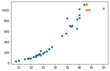
수상한 도미 한 마리
- 앞서 준비한 데이터로 k-최근접 이웃을 훈련해 보자.
1 | from sklearn.neighbors import KNeighborsClassifier |
1.0
- 완벽한 결과이다. 테스트 세트의 도미와 빙어를 모두 올바르게 분류했다.
- 이 모델에 문제가 되었던 도미 데이터를 넣고 결과를 확인해본다.
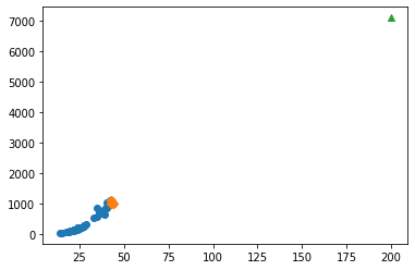
1 | print(kn.predict([[25, 150]])) |
[0.]
- 도미 데이터인데 빙어로 나왔다.
- 산점도로 다시 확인해보자.
1 | import matplotlib.pyplot as plt |
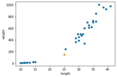
- 새로운 샘플은 marker 매개변수를 이용하여 삼각형으로 표시했다.
- 샘플은 오른쪽의 도미와 가까운 위치에 있는데 어째서 빙어로 판단했을까?
- k-최근접 이웃은 주변의 샘플 중에서 다수인 클래스를 예측으로 사용한다.
- KNeighborsClassifier클래스는 주어진 샘플에서 가장 가까운 이웃을 찾아 주는 kneighbors() 메서드를 제공한다.
- 이 클래스의 이웃 개수인 n-neighbors의 기본값은 5이므로 5개의 이웃이 반환된다.
1 | distances, indexes = kn.kneighbors([[25, 150]]) |
- indexes 배열을 사용해 훈련 데이터 중에서 이웃 샘플을 따로 구분해 그려본다.
1 | plt.scatter(train_input[:,0], train_input[:,1]) |
Text(0, 0.5, 'weight')

- marker=’D’로 지정하면 산점도를 마름모로 그린다.
- 삼각형 샘플에 가장 가까운 5개의 샘플이 초록 다이아몬드로 표시되었다.
- 가장 가까운 이웃에 도미가 하나밖에 포함되지 않았다.
1 | print(train_input[indexes]) |
[[[ 25.4 242. ]
  [ 15.   19.9]
  [ 14.3  19.7]
  [ 13.   12.2]
  [ 12.2  12.2]]]
- 가장 가까운 생선 4개는 빙어(0)인 것 같다.
- 타깃 데이터로 확인하면 더 명확하다.
1 | print(train_target[indexes]) |
[[1. 0. 0. 0. 0.]]
- 해당 문제 해결의 실마리를 위해 distance배열을 출력해본다.
- 이 배열에는 이웃 샘플까지의 거리가 담겨 있다.
1 | print(distances) |
[[ 92.00086956 130.48375378 130.73859415 138.32150953 138.39320793]]
기준을 맞춰라
- 산점도를 다시 살펴본다.
- 삼각형 샘플과 근처 5개 샘플 사이의 거리가 이상하다.
- 가장 가까운 것과의 거리가 92이고, 그 나머지는 두 배 이상 멀어보이는데 수치는 그렇지 않다.
- 이는 x의 범위가 좁고 y축의 범위가 넓기에 그렇게 보이는 것이다.
- 명확하게 보기 위해 x축의 범위를 동일하게 맞춘다.
- xlim()함수를 사용하여 x축 범위를 지정한다.
1 | plt.scatter(train_input[:,0], train_input[:,1]) |

- 두 특성(길이와 무게)의 값이 놓인 범위가 매우 다르다.
- 이를 투 특성의 스케일(scale)이 다르다고 한다.
데이터 전처리
데이터를 표현하는 기준이 다르면 알고리즘이 올바르게 예측할 수 없다.
알고리즘이 거리 기반일 때 특히 그렇다. 여기에는 k-최근접 이웃도 포함된다.
이런 알고리즘들은 샘플 간의 거리에 영향을 많이 받으므로 제대로 사요하려면 특성값을 일정한 기준으로 맞춰 주어야 한다.
이런 작업을 데이터 전처리(data preprocessing)이라고 부른다.
표준 점수
- 가장 널리 사용하는 전처리 방법 중 하나는 표준점수(standatd score)이다.
- 표준점수는 각 특성값이 평균에서 표준편차의 몇 배만큼 떨어져 있는지를 나타낸다.
- 이를 통해 실제 특성값의 크기와 상광없이 동일한 조건으로 비교할 수 있다
1 | mean = np.mean(train_input, axis=0) |
- np.mean() 함수는 평균을 계산하고, np.std() 함수는 표준편차를 계산한다.
- axis=0으로 지정했으며, 이렇게 하면 행을 따라 각 열의 통계 값을 계산한다.
1 | print(mean, std) |
[ 27.29722222 454.09722222] [ 9.98244253 323.29893931]
- 각 특성마다 평균과 표준편차가 구해졌다.
- 이제 원본 데이터에서 평균을 빼고 표준편차로 나누어 표준점수로 변환한다.
1 | train_scaled = (train_input - mean) / std |
- 브로드 캐스팅 (breadcastion)
- 이 식은 어떻게 계산될까?
- 넘파이는 train_input의 모든 행에서 mean에 있는 두 평균값을 뺀다.
- 그 다은 std에 있는 두 표준편차를 모든 행에 적용한다.
- 이런 넘파이 기능을 브로드캐스팅이라고 부른다.
전처리 데이터로 모델 훈련하기
- 앞에서 표준점수로 변환한 train_scaled를 만들었다.
- 다시 샘플을 산점도로 그려보자.
1 | plt.scatter(train_scaled[:,0], train_scaled[:,1]) |

- 우측 상단에 샘플 하나가 덩그러니 떨어져 있다.
- 훈련 세트를 mean(평균)으로 빼고 std(표준편차)로 나누어 주었기 때문에 값의 범위가 달라졌다.
- 동일한 기준으로 샘플을 변환하고 다시 산점도를 그려보자.
1 | new = ([25, 150] - mean) / std |

- 훈련 데이터의 두 특성이 비슷한 범위를 차지하고 있다.
- 이제 이 데이터셋으로 k-최근접 이웃 모델을 다시 훈련해 보자.
1 | kn.fit(train_scaled, train_target) |
KNeighborsClassifier()
- 테스트 세트의 스케일을 변환해 보자.
1 | test_scaled = (test_input - mean) / std |
- 이제 모델을 평가한다.
1 | kn.score(test_scaled, test_target) |
1.0
- 완벽하다. 모든 테스트 세트의 샘플을 완벽하게 분류했다.
- 앞서 훈련 세트의 평균고 표준편차로 변환한 김 팀장의 샘플 사용해 모델의 예측을 출력해보자.
1 | print(kn.predict([new])) |
[1.]
- 드디어 도미(1)로 예측했다. 확일시 길이가 25cm이고 무게가 150g인 생선은 도미일 것이다.
- 마지막으로 keighbors()함수로 이 샘플의 k-최근점 이웃을 구한 다음 산점도로 그려보자.
- 특성을 표준점수로 바꾸었기 때문에 알고리즘이 올바르게 거리를 측정했을 것이다.
1 | distances, indexes = kn.kneighbors([new]) |
- 삼각형 샘플에서 가장 가까운 샘플은 모두 도미이다.
- 따라서 이 수상한 샘플을 도미로 예측하는 것이 당연하다.
- 성공이다. 특성값의 스케일에 민감하지 않고 안정적인 예측을 할 수 있는 모델을 만들었다.
전체 소스 코드
- 다음 주소를 참고하라 : bit.ly/hg-02-2
1 | fish_length = [25.4, 26.3, 26.5, 29.0, 29.0, 29.7, 29.7, 30.0, 30.0, 30.7, 31.0, 31.0, |
[[ 25.4 242. ]
[ 26.3 290. ]
[ 26.5 340. ]
[ 29. 363. ]
[ 29. 430. ]]
[1. 1. 1. 1. 1.]
[1. 1. 1. 1. 1. 1. 1. 1. 1. 1. 1. 1. 1. 1. 1. 1. 1. 1. 1. 1. 1. 1. 1. 1.
1. 1. 1. 1. 1. 1. 1. 1. 1. 1. 1. 0. 0. 0. 0. 0. 0. 0. 0. 0. 0. 0. 0. 0.
0.]
(36, 2) (13, 2)
(36,) (13,)
[1. 0. 0. 0. 1. 1. 1. 1. 1. 1. 1. 1. 1.]
[0. 0. 1. 0. 1. 0. 1. 1. 1. 1. 1. 1. 1.]
[0.]

[[[ 25.4 242. ]
[ 15. 19.9]
[ 14.3 19.7]
[ 13. 12.2]
[ 12.2 12.2]]]
[[1. 0. 0. 0. 0.]]
[[ 92.00086956 130.48375378 130.73859415 138.32150953 138.39320793]]
[ 27.29722222 454.09722222] [ 9.98244253 323.29893931]
[1.]

- Reference : 혼자 공부하는 머신러닝 + 딥러닝
chapter1_3
혼자 공부하는 머신 러닝 + 딥러닝
생선 분류 문제
- 한빛 마켓에서 팔기 시작한 생선은 ‘도미’, 곤들매기’, ‘농어’, ‘강꼬치고기’, ‘로치’, ‘빙어’, ‘송어’이다.
- 이 생선들을 프로그램으로 분류한다고 가정해 보자. 어떻게 프로그램을 만들어야 할까.
도미 데이터 준비하기
- 우선 생선의 특징을 알기 쉽게 구분해보자.
- 예를들어 30cm이상인 생선은 도미라고 한다.
1 | #if fish_length >= 30: |
- 하지만 이는 절대적인 기준이 될 수 없다.
- 기준을 제대로 파악하기 위한 과정을 수행해보자.
- 데이터는 다음 링크를 참고하라.: https://gist.github.com/rickiepark/b37d04a95a42ef6757e4a99214d61697
- 다음 코드는 35마리의 도미의 길이와 생선의 무게에 대한 데이터이다.
1 | bream_length = [25.4, 26.3, 26.5, 29.0, 29.0, 29.7, 29.7, 30.0, 30.0, 30.7, 31.0, 31.0, |
위 리스트에서 첫 번째 도미의 길이는 25.4cm, 무게는 242.0g이다.
각 도미의 특징을 길이와 무게로 표현했음을 알 수 있다.
책에서는 이런 특징을 특성(feature)이라 부른다.
길이인 bream_length를 x축으로 삼는다.
무게인 bream_weight를 y축으로 한다.
이를 토대로 각 도미를 그래프에 점으로 표시해 보자.
- 이런 그래프를 산점도(scatter plot)라 부른다.
1 | import matplotlib.pyplot as plt # matplotlib의 pyplot 함수를 plt로 줄여서 사용 |
- 도미 35마리를 2차원 그래프에 점으로 나타냈다.
- 생선의 길이가 길수록 무게가 많이 나간다고 생각하면 이 그래프는 매우 자연스럽다.
- 이렇게 산점도 그래프가 일직선에 가까운 형태로 나타나는 경우를 선형적(linear)이라고 한다.
빙어 데이터 준비하기
- 이번엔 빙어의 데이터를 준비해 보자.
- 데이터는 다음 링크를 참고하라 : https://gist.github.com/rickiepark/1e89fe2a9d4ad92bc9f073163c9a37a7
- 다음 코드는 14 마리의 빙어에 대한 데이터이다.
1 | smelt_length = [9.8, 10.5, 10.6, 11.0, 11.2, 11.3, 11.8, 11.8, 12.0, 12.2, 12.4, 13.0, 14.3, 15.0] |
- 빙어는 도미에 비해 크기도 작고 무게도 가볍다.
- 빙어의 데이터도 산점도로 그려보자.
- 하는 김에 도미와 빙어의 산점도를 비교한다.
1 | plt.scatter(bream_length, bream_weight) |
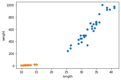
- Matplotlib에 의해 두 산점도 색깔이 다르게 출력된다.
- 주황색 점이 빙어의 산점도이며 도미에 비해 길이도 무게도 작다.
- 또한 빙어는 도미와 달리 길이가 늘어나도 무게가 크게 늘지 않는다는 것을 알 수 있다.
첫 번째 머신러닝 프로그램
- 가장 간단하고 이해하기 쉬운 k-최근접 이웃(k-Nearest Neighbors) 알고리즘을 사용해 도미와 비엉 데이터를 구분해본다.
- 알고리즘 사용 이전에 앞서 준비했던 두 생선의 데이터를 합친다.
1 | length = bream_length + smelt_length |
- 책에서 사용하는 머신러닝 패키지는 사이컷런(scikit-learn)이다.
- 이 패키지를 이용하여 각 특성의 리스트를 세로 방향으로 늘어뜨린 2차원 리스트를 만들어야 한다.
- 이렇게 만들기 위해서 파이썬의 zip() 함수와 리스트 내포(list comprehension)구문을 사용한다.
- zip() 함수는 나열된 리스트 각각에서 하나씩 원소를 꺼내 반환한다.
- zip() 함수와 리스트 내포 구문을 사용해 length와 weight 리스트를 2차원 리스트로 만들어보자.
1 | fish_data = [[l, w] for l, w in zip(length, weight)] |
- for문은 zip() 함수로 length와 weight 리스트에서 원소를 하나씩 꺼내어 l과 w에 할당한다.
- 그러면 [l, w] 가 하나의 원소로 구성된 리스트가 만들어진다.
1 | print(fish_data) |
[[25.4, 242.0], [26.3, 290.0], [26.5, 340.0], [29.0, 363.0], [29.0, 430.0], [29.7, 450.0], [29.7, 500.0], [30.0, 390.0], [30.0, 450.0], [30.7, 500.0], [31.0, 475.0], [31.0, 500.0], [31.5, 500.0], [32.0, 340.0], [32.0, 600.0], [32.0, 600.0], [33.0, 700.0], [33.0, 700.0], [33.5, 610.0], [33.5, 650.0], [34.0, 575.0], [34.0, 685.0], [34.5, 620.0], [35.0, 680.0], [35.0, 700.0], [35.0, 725.0], [35.0, 720.0], [36.0, 714.0], [36.0, 850.0], [37.0, 1000.0], [38.5, 920.0], [38.5, 955.0], [39.5, 925.0], [41.0, 975.0], [41.0, 950.0], [9.8, 6.7], [10.5, 7.5], [10.6, 7.0], [11.0, 9.7], [11.2, 9.8], [11.3, 8.7], [11.8, 10.0], [11.8, 9.9], [12.0, 9.8], [12.2, 12.2], [12.4, 13.4], [13.0, 12.2], [14.3, 19.7], [15.0, 19.9]]
2차원 리스트
- 첫 번째 생선의 길이 25.4cm와 무게 242.0g이 하나의 리스트를 구성하고 이런 리스트가 모여 전체 리스트를 만들었다.
- 이런 리스트를 2차원 리스트 혹은 리스트의 리스트라고 부른다.
생선 49개의 데이터가 준비되었다.
이제 마지막으로 준비할 데이터는 정답 데이터이다.
각 데이터가 실제로는 어떤 생선인지 정답지를 만드는 작업니다.
정답 리스트
- 머신러닝은 물론이고 컴퓨터 프로그램은 문자를 직접 이해하지 못한다.
- 대신 도미와 빙어를 숫자 1과 0으로 표현해보자
- 앞서 도미와 방어를 순서대로 나열했기에 정답 리스트는 1이 35번 등장하고 0이 14번 등장한다.
1 | fish_target = [1] * 35 + [0] * 14 |
[1, 1, 1, 1, 1, 1, 1, 1, 1, 1, 1, 1, 1, 1, 1, 1, 1, 1, 1, 1, 1, 1, 1, 1, 1, 1, 1, 1, 1, 1, 1, 1, 1, 1, 1, 0, 0, 0, 0, 0, 0, 0, 0, 0, 0, 0, 0, 0, 0]
- 이제 사이킷런 패키지에서 k-최근접 이웃 알고리즘을 구현한 클래스인 KNeighborsClassifier를 임포트한다.
1 | from sklearn.neighbors import KNeighborsClassifier |
- 임포트한 KNeighborsClassfier 클래스의 객체를 먼저 만든다.
1 | kn = KNeighborsClassifier() |
- 훈련
- 이 객체에 fish_data와 fish_target을 전달하여 도미를 찾기 위한 기준을 학습시킨다.
- 이런 과정을 머신러닝에서는 훈련(training)이라 부른다.
- 사이킷런에서는 fit() 메서드가 이런 역할을 한다.
- 이 메서드에 fish_data 와 fish_target 을 순서대로 전달해보자.
1 | kn.fit(fish_data, fish_target) |
KNeighborsClassifier()
- 평가
- fit() 메서드는 주어진 데이터로 알고리즘을 훈련한다.
- 이제 객체(또는 모델) kn이 얼마나 잘 훈련되었는지 평가해봐야 한다.
- 사이킷런에서 모델을 평가하는 메서드는 score()메서드이다.
- 이 메서드는 0에서 1 사이의 값을 반환한다.
- 1은 모든 데이터를 정확히 맞혔다는 것을 나타낸다.
- 예를 들어 0.5라면 절반만 맞혔다는 의미이다.
1 | kn.score(fish_data, fish_target) |
1.0
- 정확도
- 1.0 이 출력되었다.
- 모든 fish_data의 답을 정확히 맞혔다는 뜻이 된다.
- 이러한 값을 정확도(accuracy)라고 부른다.
k-최근접 이웃 알고리즘
앞에서 첫 번째 머신러닝 프로그램을 성공적으로 만들었다.
여기에서 사용한 알고리즘은 k-최근접 이웃이다.
이 알고리즘은 어떤 데이터에 대한 답을 구할 때 주위의 다른 데이터를 보고 다수를 차지하는 것을 정답으로 사용하다.
- 마치 근묵자흑과 같이 주위의 데이터로 현재 데이터를 판단하는 것이다.
예를 들어, 이전에 출력한 산점도에서 삼각형으로 표시된 새로운 데이터가 있다고 가정해 보자.
이 삼각형은 도미와 빙어 중 어디에 속할까?
이 삼각형이 도미의 데이터 부근에 위치해 있다면 도미라고 판단할 것이다.
k-최급접 이웃 알고리즘도 마찬가지이다.
실제 코드로도 그런지 한 번 확인해 보자.
1 | kn.predict([[30, 600]]) # 2차원 리스트 |
array([1])
predict() 메서드
- predict() 메서드는 새로운 데이터의 정답을 예측한다.
- 이 메서드도 앞서 fit() 메소드와 마찬가지로 2차원 리스트를 전달해야 한다.
- 그래서 삼각형 포인트를 리스트로 2번 감싼것이다.
- 반환되는 값은 1.
- 우리는 앞서 도미는 1, 빙어는 0으로 가정했다.
- 즉, 삼각형은 도미이다.
k-최근접 이웃 알고리즘을 위해 준비해야 하는 것은 데이터를 모두 가지고 있는 것 뿐이다.
새로운 데이터에 대해 예측할 때는 가장 가까운 직선거리에 어떤 데이터가 있는지를 살피기만 하면 된다.
단점으로는 이런 특징 때문에 데이터가 아주 많은 경우 사용하기 어렵다는 점이 있다.
사이킷런의 KNeighborsClassifier 클래스도 마찬가지이다.
이 클래스는 _fit_X 속성에 우리가 전달한 fish_data를 모두 가지고 있다.
또 _y 속성에 fish_target을 가지고 있다.
1 | print(kn._fit_X) |
[[ 25.4 242. ]
[ 26.3 290. ]
[ 26.5 340. ]
[ 29. 363. ]
[ 29. 430. ]
[ 29.7 450. ]
[ 29.7 500. ]
[ 30. 390. ]
[ 30. 450. ]
[ 30.7 500. ]
[ 31. 475. ]
[ 31. 500. ]
[ 31.5 500. ]
[ 32. 340. ]
[ 32. 600. ]
[ 32. 600. ]
[ 33. 700. ]
[ 33. 700. ]
[ 33.5 610. ]
[ 33.5 650. ]
[ 34. 575. ]
[ 34. 685. ]
[ 34.5 620. ]
[ 35. 680. ]
[ 35. 700. ]
[ 35. 725. ]
[ 35. 720. ]
[ 36. 714. ]
[ 36. 850. ]
[ 37. 1000. ]
[ 38.5 920. ]
[ 38.5 955. ]
[ 39.5 925. ]
[ 41. 975. ]
[ 41. 950. ]
[ 9.8 6.7]
[ 10.5 7.5]
[ 10.6 7. ]
[ 11. 9.7]
[ 11.2 9.8]
[ 11.3 8.7]
[ 11.8 10. ]
[ 11.8 9.9]
[ 12. 9.8]
[ 12.2 12.2]
[ 12.4 13.4]
[ 13. 12.2]
[ 14.3 19.7]
[ 15. 19.9]]
1 | print(kn._y) |
[1 1 1 1 1 1 1 1 1 1 1 1 1 1 1 1 1 1 1 1 1 1 1 1 1 1 1 1 1 1 1 1 1 1 1 0 0
0 0 0 0 0 0 0 0 0 0 0 0]
- 실제로 k-최근접 이웃 알고리즘은 무언가 훈련되는 게 없는 셈이다.
- fit()메서드에 전달한 데이터를 모두 저장하고 있다가 새로운 데이터가 등장하면 가장 가까운 데이터를 참고하여 어떤 생선인지 구분한다.
- 그럼 가까운 몇 개의 데이터를 참고할까?
- 이는 정하기 나름이다.
- KNeighborsClassifier 클래스의 기본값은 5이다.
- 이 기준은 n_neighbors 매개변수로 바꿀 수 있다.
- 예를 들어, 다음 코드 실행 시 어떤 결과가 나올까?
1 | kn49 = KNeighborsClassifier(n_neighbors=49) # 참고 데이터를 49개로 한 kn49 모델 |
- 가장 가까운 데이터 49개를 사용하는 k-최근접 이웃 모델에 fish_data를 적용하면 fish_data에 있는 모든 생선을 사용하여 예측하게 된다.
- 다시 말하면 fish_data의 데이터 49개 중에 도미가 35개로 다수를 차지하므로 어떤 데이터를 넣어도 무조건 도미로 예측할 것이다.
1 | kn49.fit(fish_data, fish_target) |
0.7142857142857143
- fish_data에 있는 생선 중에 도미가 35개이고 빙어가 14개이다.
- kn49모델은 도미만 올바르게 맞히기 때운에 다음과 같이 정확도를 계산하면 score() 메서드와 같은 값을 얻을 수 있다.
1 | print(35/49) |
0.7142857142857143
- 확실히 n_neighbors 매개변수를 49로 두는 것은 좋지 않다.
- 기본 값을 5로 하여 도미를 완벽하게 분류한 모델을 사용하기로 한다.
도미와 빙어 분류 (중간 정리)
- 지금까지 도미와 빙어를 구분하기 위해 첫 머신러닝 프로그램을 만들었다.
- 먼저 도미 35마리와 빙어 14마리의 길이와 무게를 측정해서 파이썬 리스트로 만든다.
- 그 다음 도미와 빙어 데이터를 합친 2차원 리스트를 준비했다.
- 사용한 머신러닝 알고리즘은 k-최근접 이웃 알고리즘이다.
- 사이킷런의 k-최근접 이웃 알고리즘은 주변에서 가장 가까운 5개의 데이터를 보고 다수결의 원칙에 따라 데이터를 예측한다.
- 이 모델은 준비된 데이터를 모두 맞혔다.
- 도미와 빙어를 분류하는 문제를 풀면서 KNeighborsClassifier 클래스의 fit(), score(), predict() 메서드를 사용해 보았다.
- 끝으로 k-최근접 이웃 알고리즘의 특징을 알아보았다.
전체 소스 코드
1 | # 마켓과 머신러닝 |


[[25.4, 242.0], [26.3, 290.0], [26.5, 340.0], [29.0, 363.0], [29.0, 430.0], [29.7, 450.0], [29.7, 500.0], [30.0, 390.0], [30.0, 450.0], [30.7, 500.0], [31.0, 475.0], [31.0, 500.0], [31.5, 500.0], [32.0, 340.0], [32.0, 600.0], [32.0, 600.0], [33.0, 700.0], [33.0, 700.0], [33.5, 610.0], [33.5, 650.0], [34.0, 575.0], [34.0, 685.0], [34.5, 620.0], [35.0, 680.0], [35.0, 700.0], [35.0, 725.0], [35.0, 720.0], [36.0, 714.0], [36.0, 850.0], [37.0, 1000.0], [38.5, 920.0], [38.5, 955.0], [39.5, 925.0], [41.0, 975.0], [41.0, 950.0], [9.8, 6.7], [10.5, 7.5], [10.6, 7.0], [11.0, 9.7], [11.2, 9.8], [11.3, 8.7], [11.8, 10.0], [11.8, 9.9], [12.0, 9.8], [12.2, 12.2], [12.4, 13.4], [13.0, 12.2], [14.3, 19.7], [15.0, 19.9]]
[1, 1, 1, 1, 1, 1, 1, 1, 1, 1, 1, 1, 1, 1, 1, 1, 1, 1, 1, 1, 1, 1, 1, 1, 1, 1, 1, 1, 1, 1, 1, 1, 1, 1, 1, 0, 0, 0, 0, 0, 0, 0, 0, 0, 0, 0, 0, 0, 0]

[[ 25.4 242. ]
[ 26.3 290. ]
[ 26.5 340. ]
[ 29. 363. ]
[ 29. 430. ]
[ 29.7 450. ]
[ 29.7 500. ]
[ 30. 390. ]
[ 30. 450. ]
[ 30.7 500. ]
[ 31. 475. ]
[ 31. 500. ]
[ 31.5 500. ]
[ 32. 340. ]
[ 32. 600. ]
[ 32. 600. ]
[ 33. 700. ]
[ 33. 700. ]
[ 33.5 610. ]
[ 33.5 650. ]
[ 34. 575. ]
[ 34. 685. ]
[ 34.5 620. ]
[ 35. 680. ]
[ 35. 700. ]
[ 35. 725. ]
[ 35. 720. ]
[ 36. 714. ]
[ 36. 850. ]
[ 37. 1000. ]
[ 38.5 920. ]
[ 38.5 955. ]
[ 39.5 925. ]
[ 41. 975. ]
[ 41. 950. ]
[ 9.8 6.7]
[ 10.5 7.5]
[ 10.6 7. ]
[ 11. 9.7]
[ 11.2 9.8]
[ 11.3 8.7]
[ 11.8 10. ]
[ 11.8 9.9]
[ 12. 9.8]
[ 12.2 12.2]
[ 12.4 13.4]
[ 13. 12.2]
[ 14.3 19.7]
[ 15. 19.9]]
[1 1 1 1 1 1 1 1 1 1 1 1 1 1 1 1 1 1 1 1 1 1 1 1 1 1 1 1 1 1 1 1 1 1 1 0 0
0 0 0 0 0 0 0 0 0 0 0 0]
0.7142857142857143
마무리
키워드로 끝내는 핵심 포인트
특성 : 데이터를 표현하는 하나의 성질.
- 이 절에서 생선 데이터 각각을 길이와 무게 특성으로 나타냈다.
훈련 : 머신러닝 알고리즘이 데이터에서 규칙을 찾는 과정.
- 사이킷런에서는 fit() 메서드가 하는 역할이다.
k-최근접 이웃 알고리즘 : 가장 간단한 머신러닝 알고리즘 중 하나.
- 사실 어떤 규칙을 찾기보다는 전체 데이터를 메모리에 가지고 있는 것이 전부이다.
모델 : 머신러닝 프로그램에서는 알고리즘이 구현된 객체를 모델이라 부른다.
- 종종 알고리즘 자체를 모델이라고 부르기도 한다.
정확도 : 정확한 답을 몇 개 맞혔는지를 백분율로 나타낸 값이다.
- 사이킷런에서는 0~1 사이의 값으로 출력된다.
- 정확도 = (정확히 맞힌 개수) / (전체 데이터 개수)
핵심 패키지와 함수
matplotlib
- scatter()는 산점도를 그리는 Matplotlib 함수이다.
- 처음 2개의 배개변수로 x축과 y축 값을 전달한다.
- 이 값은 파이썬 리스트 또는 넘파이 배열이다.
- c 매개변수로 색깔을 지정한다.
scikit-learn
- KneighborsClassifier()는 k-최근접 이웃 분류 모델을 만드는 사이킷런 클래스이다.
- n_neighbors 매개변수로 이웃의 개수를 지정한다.
- 기본값은 5이다.
- p 매개변수로 거리를 재는 방법을 지정한다.
- 1일 경우 맨해튼 거리(https://bit.ly/man_distance)를 사용한다.
- 2일 경우 유클리디안 거리(https://bit.ly/euc_distance)를 사용한다.
- 기본 값은 2이다.
- fit()은 사이킷런 모델을 훈련할 때 사용하는 메서드이다.
- 처음 두 매개변수로 훈련에 사용할 특성과 정답 데이터를 전달한다.
- predict()는 사이킷런 모델을 훈련하고 예측할 때 사용하는 메서드이다.
- 특성 데이터 하나만 매개변수로 받는다.
- score()는 훈련된 사이킷런 모델의 성능을 측정한다.
- 처음 두 매개변수로 특성과 정답 데이터를 전달한다.
- 이 매서드는 먼저 predict() 메서드로 예측을 수행한 다음 분류 모델일 경우 정답과 비교해 맞게 예측한 개수의 비율을 반환한다.
- KneighborsClassifier()는 k-최근접 이웃 분류 모델을 만드는 사이킷런 클래스이다.
확인 문제
- 데이터를 표현하는 하나의 성질로써, 예를 들어 국가 데이터의 경우 인구 수, GDP, 면적 등이 하나의 국가를 나타냅니다. 머신러닝에서 이런 성질을 무엇이라 부르나요?
- 특성 v
- 특질
- 개성
- 요소
- 가장 가까운 이웃을 참고하여 정답을 예측하는 알고리즘이 구현된 사이킷런 클래스는 무엇인가요?
- SGDClassifier
- LinearRegression
- RandomForestClassifier
- KNeighborsClassifier v
- 사이킷런 모델을 훈련할 때 사용하는 메서드는 어떤 것인가요?
- predict()
- fit() v
- score()
- transform()
Reference : 혼자 공부하는 머신러닝 + 딥러닝
visualization_tutorial_01
데이터 시각화
데이터 시각화의 기본 조건
목적에 맞는 선정
- 선형 그래프, 막대 그래프, 산점도, 박스플롯 etc
환경에 맞는 도구 선택
- 코드 기반(R, Python)
- 프로그램 기반 (시각화 툴)
- Powr BI, Tableau, Excel
문맥(도메인)에 맞는 색과 도형 사용
- 회사 로고 색깔
- 색상의 일반적인 통념
- 빨간색(경고), 초록색(안전)
코드 기반의 장점
- 재현성 (함수화)
- 여러 그래프 동시 작성 가능
- 기존 코드 Ctrl + C/V
- 데이터 크기 제한 없음 (RAM 조건 충족 시)
- 재현성 (함수화)
Matplotlib 사용시 주의점
- 객체 지향 API 문법을 사용하라
- 숙달 시 다른 곳에도 사용 가능하다.
- pyplot API 문법 사용은 자제하라.
- 숙달해도 다른 문법과 차이가 있어서 쓸 데가 없다.
- 객체 지향 API 문법을 사용하라
참고
데이터 분석 강의안_220307.pdf 63페이지. ‘시각화’
Matplotlib : https://matplotlib.org/stable/api/ticker_api.html
seaborn : https://seaborn.pydata.org/
국새 파이썬 시각화 TOP 블로그 Pega Devlog (jehyunlee.github.io)
- 이 분 블로그는 정독할 필요가 있으니, 즐겨찾기 해두자.
라이브러리 불러오기
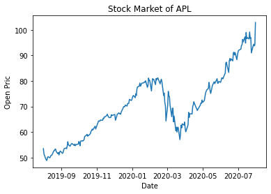
1 | import matplotlib |
3.2.2
0.11.2
시각화 그려보기
1 | import matplotlib.pyplot as plt |
주섹 데이터 다운로드 받기
1 | !pip install yfinance --upgrade --no-cache-dir |
Collecting yfinance
Downloading yfinance-0.1.70-py2.py3-none-any.whl (26 kB)
Requirement already satisfied: pandas>=0.24.0 in /usr/local/lib/python3.7/dist-packages (from yfinance) (1.3.5)
Requirement already satisfied: numpy>=1.15 in /usr/local/lib/python3.7/dist-packages (from yfinance) (1.21.5)
Requirement already satisfied: multitasking>=0.0.7 in /usr/local/lib/python3.7/dist-packages (from yfinance) (0.0.10)
Collecting lxml>=4.5.1
Downloading lxml-4.8.0-cp37-cp37m-manylinux_2_17_x86_64.manylinux2014_x86_64.manylinux_2_24_x86_64.whl (6.4 MB)
[K |████████████████████████████████| 6.4 MB 9.7 MB/s
[?25hCollecting requests>=2.26
Downloading requests-2.27.1-py2.py3-none-any.whl (63 kB)
[K |████████████████████████████████| 63 kB 41.2 MB/s
[?25hRequirement already satisfied: python-dateutil>=2.7.3 in /usr/local/lib/python3.7/dist-packages (from pandas>=0.24.0->yfinance) (2.8.2)
Requirement already satisfied: pytz>=2017.3 in /usr/local/lib/python3.7/dist-packages (from pandas>=0.24.0->yfinance) (2018.9)
Requirement already satisfied: six>=1.5 in /usr/local/lib/python3.7/dist-packages (from python-dateutil>=2.7.3->pandas>=0.24.0->yfinance) (1.15.0)
Requirement already satisfied: idna<4,>=2.5 in /usr/local/lib/python3.7/dist-packages (from requests>=2.26->yfinance) (2.10)
Requirement already satisfied: certifi>=2017.4.17 in /usr/local/lib/python3.7/dist-packages (from requests>=2.26->yfinance) (2021.10.8)
Requirement already satisfied: urllib3<1.27,>=1.21.1 in /usr/local/lib/python3.7/dist-packages (from requests>=2.26->yfinance) (1.24.3)
Requirement already satisfied: charset-normalizer~=2.0.0 in /usr/local/lib/python3.7/dist-packages (from requests>=2.26->yfinance) (2.0.12)
Installing collected packages: requests, lxml, yfinance
Attempting uninstall: requests
Found existing installation: requests 2.23.0
Uninstalling requests-2.23.0:
Successfully uninstalled requests-2.23.0
Attempting uninstall: lxml
Found existing installation: lxml 4.2.6
Uninstalling lxml-4.2.6:
Successfully uninstalled lxml-4.2.6
[31mERROR: pip's dependency resolver does not currently take into account all the packages that are installed. This behaviour is the source of the following dependency conflicts.
google-colab 1.0.0 requires requests~=2.23.0, but you have requests 2.27.1 which is incompatible.
datascience 0.10.6 requires folium==0.2.1, but you have folium 0.8.3 which is incompatible.[0m
Successfully installed lxml-4.8.0 requests-2.27.1 yfinance-0.1.70
1 | import yfinance as yf |
[*********************100%***********************] 1 of 1 completed
Date
2019-08-01 53.474998
2019-08-02 51.382500
2019-08-05 49.497501
2019-08-06 49.077499
2019-08-07 48.852501
Name: Open, dtype: float64
<class 'pandas.core.series.Series'>
pyplot 형태
1 | import matplotlib.pyplot as plt |
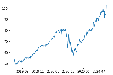
객체지향으로 그리기
- fix 는 테두리
- 나머지는 ax가 표현
1 | import matplotlib.pyplot as plt |
막대 그래프
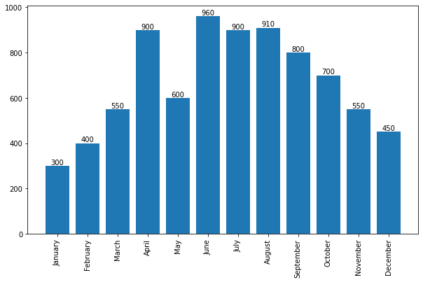
1 | import matplotlib.pyplot as plt |
barplots : <BarContainer object of 12 artists>
Rectangle(xy=(0.6, 0), width=0.8, height=300, angle=0)
Rectangle(xy=(1.6, 0), width=0.8, height=400, angle=0)
Rectangle(xy=(2.6, 0), width=0.8, height=550, angle=0)
Rectangle(xy=(3.6, 0), width=0.8, height=900, angle=0)
Rectangle(xy=(4.6, 0), width=0.8, height=600, angle=0)
Rectangle(xy=(5.6, 0), width=0.8, height=960, angle=0)
Rectangle(xy=(6.6, 0), width=0.8, height=900, angle=0)
Rectangle(xy=(7.6, 0), width=0.8, height=910, angle=0)
Rectangle(xy=(8.6, 0), width=0.8, height=800, angle=0)
Rectangle(xy=(9.6, 0), width=0.8, height=700, angle=0)
Rectangle(xy=(10.6, 0), width=0.8, height=550, angle=0)
Rectangle(xy=(11.6, 0), width=0.8, height=450, angle=0)
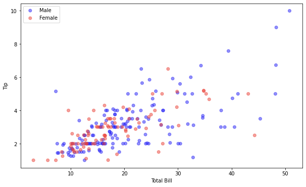
1 | ### 산점도 |
1 | import seaborn as sns |
<function matplotlib.pyplot.show>
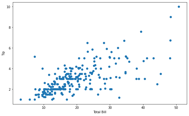
1 | label, data = tips.groupby('sex') |
Seaborn
- 다음 코드는 위와 같은 결과가 나온다. 하지만 더 간단하다.
1 | import matplotlib.pyplot as plt |
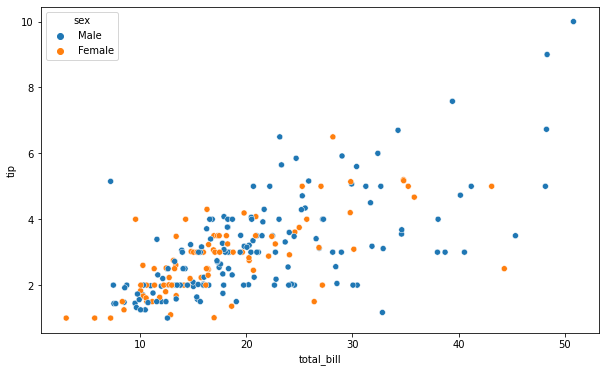
1 | # 두 개의 그래프를 동시에 표현 |
막대 그래프 그리기 seaborn 방식
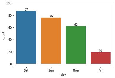
1 | sns.countplot(x="day", data=tips) |
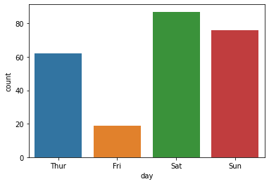
1 | print(tips['day'].value_counts().index) |
CategoricalIndex(['Sat', 'Sun', 'Thur', 'Fri'], categories=['Thur', 'Fri', 'Sat', 'Sun'], ordered=False, dtype='category')
[87 76 62 19]
Fri 19
Thur 62
Sun 76
Sat 87
Name: day, dtype: int64
1 | flg, ax = plt.subplots() |
Rectangle(xy=(-0.4, 0), width=0.8, height=87, angle=0)
Rectangle(xy=(0.6, 0), width=0.8, height=76, angle=0)
Rectangle(xy=(1.6, 0), width=0.8, height=62, angle=0)
Rectangle(xy=(2.6, 0), width=0.8, height=19, angle=0)
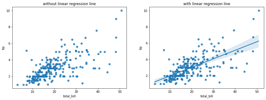
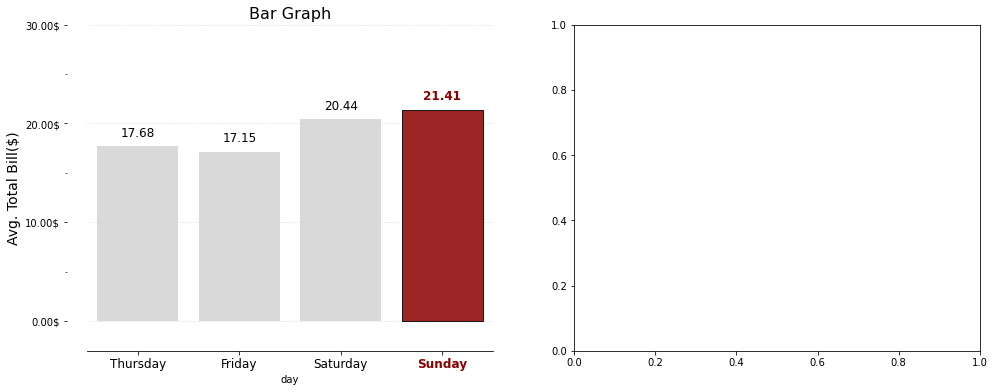
어려운 시각화 그래프
1 | import matplotlib.pyplot as plt |
21.41
Text(0, 0, 'Thur')
Text(0, 0, 'Fri')
Text(0, 0, 'Sat')
Text(0, 0, 'Sun')
pandas_tutorial_02
- 라이브러리 불러오기
1 | import pandas as pd |
1.3.5
구글 드라이브 연동
- 구글 드라이브 → colab notebook → 새 폴더 생성 : data → 슬랙에서 다운 받은 lemonade.csv 파일을 올린다 -> 다음 코드를 실행
1 | from google.colab import drive |
Mounted at /content/drive
Mounted at ..drive 가 출력되었으므로 성공
현재 좌측에 폴더 그림 -> drive -> mydrive -> Colab Notebooks -> data -> supermarket_sales.csv를 찾아서 우클릭 -> 경로 복사 -> 다음 코드에 붙여넣어 사용
1 | DATA_PATH = '/content/drive/MyDrive/Colab Notebooks/data/supermarket_sales.csv' |
| Invoice ID | Branch | City | Customer type | Gender | Product line | Unit price | Quantity | Date | Time | Payment | |
|---|---|---|---|---|---|---|---|---|---|---|---|
| 0 | 750-67-8428 | A | Yangon | Member | Female | Health and beauty | 74.69 | 7 | 1/5/2019 | 13:08 | Ewallet |
| 1 | 226-31-3081 | C | Naypyitaw | Normal | Female | Electronic accessories | 15.28 | 5 | 3/8/2019 | 10:29 | Cash |
| 2 | 631-41-3108 | A | Yangon | Normal | Male | Home and lifestyle | 46.33 | 7 | 3/3/2019 | 13:23 | Credit card |
| 3 | 123-19-1176 | A | Yangon | Member | Male | Health and beauty | 58.22 | 8 | 1/27/2019 | 20:33 | Ewallet |
| 4 | 373-73-7910 | A | Yangon | Normal | Male | Sports and travel | 86.31 | 7 | 2/8/2019 | 10:37 | Ewallet |
| ... | ... | ... | ... | ... | ... | ... | ... | ... | ... | ... | ... |
| 995 | 233-67-5758 | C | Naypyitaw | Normal | Male | Health and beauty | 40.35 | 1 | 1/29/2019 | 13:46 | Ewallet |
| 996 | 303-96-2227 | B | Mandalay | Normal | Female | Home and lifestyle | 97.38 | 10 | 3/2/2019 | 17:16 | Ewallet |
| 997 | 727-02-1313 | A | Yangon | Member | Male | Food and beverages | 31.84 | 1 | 2/9/2019 | 13:22 | Cash |
| 998 | 347-56-2442 | A | Yangon | Normal | Male | Home and lifestyle | 65.82 | 1 | 2/22/2019 | 15:33 | Cash |
| 999 | 849-09-3807 | A | Yangon | Member | Female | Fashion accessories | 88.34 | 7 | 2/18/2019 | 13:28 | Cash |
1000 rows × 11 columns
<script>
const buttonEl =
document.querySelector('#df-8a1e46d8-83ea-49d2-a98d-cf274f10b34d button.colab-df-convert');
buttonEl.style.display =
google.colab.kernel.accessAllowed ? 'block' : 'none';
async function convertToInteractive(key) {
const element = document.querySelector('#df-8a1e46d8-83ea-49d2-a98d-cf274f10b34d');
const dataTable =
await google.colab.kernel.invokeFunction('convertToInteractive',
[key], {});
if (!dataTable) return;
const docLinkHtml = 'Like what you see? Visit the ' +
'<a target="_blank" href=https://colab.research.google.com/notebooks/data_table.ipynb>data table notebook</a>'
+ ' to learn more about interactive tables.';
element.innerHTML = '';
dataTable['output_type'] = 'display_data';
await google.colab.output.renderOutput(dataTable, element);
const docLink = document.createElement('div');
docLink.innerHTML = docLinkHtml;
element.appendChild(docLink);
}
</script>
</div>
1 | sales.info() |
<class 'pandas.core.frame.DataFrame'>
RangeIndex: 1000 entries, 0 to 999
Data columns (total 11 columns):
# Column Non-Null Count Dtype
--- ------ -------------- -----
0 Invoice ID 1000 non-null object
1 Branch 1000 non-null object
2 City 1000 non-null object
3 Customer type 1000 non-null object
4 Gender 1000 non-null object
5 Product line 1000 non-null object
6 Unit price 1000 non-null float64
7 Quantity 1000 non-null int64
8 Date 1000 non-null object
9 Time 1000 non-null object
10 Payment 1000 non-null object
dtypes: float64(1), int64(1), object(9)
memory usage: 86.1+ KB
Group by
- (동의어) 집계함수를 배운다.
1 | # 여러가지 시도해보면서 정보를 파악해보자 |
750-67-8428 1
642-61-4706 1
816-72-8853 1
491-38-3499 1
322-02-2271 1
..
633-09-3463 1
374-17-3652 1
378-07-7001 1
433-75-6987 1
849-09-3807 1
Name: Invoice ID, Length: 1000, dtype: int64
1 | # 여러가지 시도해보면서 정보를 파악해보자 |
Customer type
Member 2785
Normal 2725
Name: Quantity, dtype: int64
1 | sales.groupby(['Customer type', 'Branch', 'Payment'])['Quantity'].sum() |
Customer type Branch Payment
Member A Cash 308
Credit card 282
Ewallet 374
B Cash 284
Credit card 371
Ewallet 269
C Cash 293
Credit card 349
Ewallet 255
Normal A Cash 264
Credit card 298
Ewallet 333
B Cash 344
Credit card 228
Ewallet 324
C Cash 403
Credit card 194
Ewallet 337
Name: Quantity, dtype: int64
- data type은 Series 이다.
1 | print(type(sales.groupby(['Customer type', 'Branch', 'Payment'])['Quantity'].sum())) |
<class 'pandas.core.series.Series'>
- 검색 키워드를 잘 선택하는게 중요하다.
1 | sales.groupby(['Customer type', 'Branch', 'Payment'])['Quantity'].agg(['sum', 'mean']) |
| sum | mean | |||
|---|---|---|---|---|
| Customer type | Branch | Payment | ||
| Member | A | Cash | 308 | 5.500000 |
| Credit card | 282 | 5.755102 | ||
| Ewallet | 374 | 6.032258 | ||
| B | Cash | 284 | 5.358491 | |
| Credit card | 371 | 5.888889 | ||
| Ewallet | 269 | 5.489796 | ||
| C | Cash | 293 | 4.966102 | |
| Credit card | 349 | 5.816667 | ||
| Ewallet | 255 | 5.100000 | ||
| Normal | A | Cash | 264 | 4.888889 |
| Credit card | 298 | 5.418182 | ||
| Ewallet | 333 | 5.203125 | ||
| B | Cash | 344 | 6.035088 | |
| Credit card | 228 | 4.956522 | ||
| Ewallet | 324 | 5.062500 | ||
| C | Cash | 403 | 6.200000 | |
| Credit card | 194 | 5.105263 | ||
| Ewallet | 337 | 6.017857 |
<script>
const buttonEl =
document.querySelector('#df-9f19e00c-ea81-404c-b289-c9ddb325aeaa button.colab-df-convert');
buttonEl.style.display =
google.colab.kernel.accessAllowed ? 'block' : 'none';
async function convertToInteractive(key) {
const element = document.querySelector('#df-9f19e00c-ea81-404c-b289-c9ddb325aeaa');
const dataTable =
await google.colab.kernel.invokeFunction('convertToInteractive',
[key], {});
if (!dataTable) return;
const docLinkHtml = 'Like what you see? Visit the ' +
'<a target="_blank" href=https://colab.research.google.com/notebooks/data_table.ipynb>data table notebook</a>'
+ ' to learn more about interactive tables.';
element.innerHTML = '';
dataTable['output_type'] = 'display_data';
await google.colab.output.renderOutput(dataTable, element);
const docLink = document.createElement('div');
docLink.innerHTML = docLinkHtml;
element.appendChild(docLink);
}
</script>
</div>
1 | print(type(sales.groupby(['Customer type', 'Branch', 'Payment'])['Quantity'].agg(['sum', 'mean']))) |
<class 'pandas.core.frame.DataFrame'>
1 | sales.groupby(['Customer type', 'Branch', 'Payment'], as_index=False)['Quantity'].agg(['sum', 'mean']) |
| sum | mean | |||
|---|---|---|---|---|
| Customer type | Branch | Payment | ||
| Member | A | Cash | 308 | 5.500000 |
| Credit card | 282 | 5.755102 | ||
| Ewallet | 374 | 6.032258 | ||
| B | Cash | 284 | 5.358491 | |
| Credit card | 371 | 5.888889 | ||
| Ewallet | 269 | 5.489796 | ||
| C | Cash | 293 | 4.966102 | |
| Credit card | 349 | 5.816667 | ||
| Ewallet | 255 | 5.100000 | ||
| Normal | A | Cash | 264 | 4.888889 |
| Credit card | 298 | 5.418182 | ||
| Ewallet | 333 | 5.203125 | ||
| B | Cash | 344 | 6.035088 | |
| Credit card | 228 | 4.956522 | ||
| Ewallet | 324 | 5.062500 | ||
| C | Cash | 403 | 6.200000 | |
| Credit card | 194 | 5.105263 | ||
| Ewallet | 337 | 6.017857 |
<script>
const buttonEl =
document.querySelector('#df-f56f9b0d-43e2-4ba0-8abf-56fa96c5d20f button.colab-df-convert');
buttonEl.style.display =
google.colab.kernel.accessAllowed ? 'block' : 'none';
async function convertToInteractive(key) {
const element = document.querySelector('#df-f56f9b0d-43e2-4ba0-8abf-56fa96c5d20f');
const dataTable =
await google.colab.kernel.invokeFunction('convertToInteractive',
[key], {});
if (!dataTable) return;
const docLinkHtml = 'Like what you see? Visit the ' +
'<a target="_blank" href=https://colab.research.google.com/notebooks/data_table.ipynb>data table notebook</a>'
+ ' to learn more about interactive tables.';
element.innerHTML = '';
dataTable['output_type'] = 'display_data';
await google.colab.output.renderOutput(dataTable, element);
const docLink = document.createElement('div');
docLink.innerHTML = docLinkHtml;
element.appendChild(docLink);
}
</script>
</div>
결측치 다루기
- 결측치 데이터 생성
- 임의로 여러가지 생성해보자 (숙달 과정)
1 | import pandas as pd |
| Score_A | Score_B | Score_C | |
|---|---|---|---|
| 0 | 80.0 | 30.0 | NaN |
| 1 | 90.0 | 45.0 | 50.0 |
| 2 | NaN | NaN | 80.0 |
| 3 | 80.0 | NaN | 90.0 |
<script>
const buttonEl =
document.querySelector('#df-6c9ddc3e-23cb-46c2-bcca-8e0adaab788b button.colab-df-convert');
buttonEl.style.display =
google.colab.kernel.accessAllowed ? 'block' : 'none';
async function convertToInteractive(key) {
const element = document.querySelector('#df-6c9ddc3e-23cb-46c2-bcca-8e0adaab788b');
const dataTable =
await google.colab.kernel.invokeFunction('convertToInteractive',
[key], {});
if (!dataTable) return;
const docLinkHtml = 'Like what you see? Visit the ' +
'<a target="_blank" href=https://colab.research.google.com/notebooks/data_table.ipynb>data table notebook</a>'
+ ' to learn more about interactive tables.';
element.innerHTML = '';
dataTable['output_type'] = 'display_data';
await google.colab.output.renderOutput(dataTable, element);
const docLink = document.createElement('div');
docLink.innerHTML = docLinkHtml;
element.appendChild(docLink);
}
</script>
</div>
True = 숫자 1로 인식
False = 숫자 0으로 인식
결측치 (Nan) 개수 세기
1 | df.isnull().sum() |
Score_A 1
Score_B 2
Score_C 1
dtype: int64
- 결측치를 다른 것으로 채우기
1 | df.fillna("0") |
| Score_A | Score_B | Score_C | |
|---|---|---|---|
| 0 | 80.0 | 30.0 | 0 |
| 1 | 90.0 | 45.0 | 50.0 |
| 2 | 0 | 0 | 80.0 |
| 3 | 80.0 | 0 | 90.0 |
<script>
const buttonEl =
document.querySelector('#df-ce166771-c2da-430d-aa22-8b7cac811d94 button.colab-df-convert');
buttonEl.style.display =
google.colab.kernel.accessAllowed ? 'block' : 'none';
async function convertToInteractive(key) {
const element = document.querySelector('#df-ce166771-c2da-430d-aa22-8b7cac811d94');
const dataTable =
await google.colab.kernel.invokeFunction('convertToInteractive',
[key], {});
if (!dataTable) return;
const docLinkHtml = 'Like what you see? Visit the ' +
'<a target="_blank" href=https://colab.research.google.com/notebooks/data_table.ipynb>data table notebook</a>'
+ ' to learn more about interactive tables.';
element.innerHTML = '';
dataTable['output_type'] = 'display_data';
await google.colab.output.renderOutput(dataTable, element);
const docLink = document.createElement('div');
docLink.innerHTML = docLinkHtml;
element.appendChild(docLink);
}
</script>
</div>
1 | # 바로 윗칸의 데이터로 채우기 |
| Score_A | Score_B | Score_C | |
|---|---|---|---|
| 0 | 80.0 | 30.0 | NaN |
| 1 | 90.0 | 45.0 | 50.0 |
| 2 | 90.0 | 45.0 | 80.0 |
| 3 | 80.0 | 45.0 | 90.0 |
<script>
const buttonEl =
document.querySelector('#df-14c34a17-7745-4466-a779-62f00b5030de button.colab-df-convert');
buttonEl.style.display =
google.colab.kernel.accessAllowed ? 'block' : 'none';
async function convertToInteractive(key) {
const element = document.querySelector('#df-14c34a17-7745-4466-a779-62f00b5030de');
const dataTable =
await google.colab.kernel.invokeFunction('convertToInteractive',
[key], {});
if (!dataTable) return;
const docLinkHtml = 'Like what you see? Visit the ' +
'<a target="_blank" href=https://colab.research.google.com/notebooks/data_table.ipynb>data table notebook</a>'
+ ' to learn more about interactive tables.';
element.innerHTML = '';
dataTable['output_type'] = 'display_data';
await google.colab.output.renderOutput(dataTable, element);
const docLink = document.createElement('div');
docLink.innerHTML = docLinkHtml;
element.appendChild(docLink);
}
</script>
</div>
1 | dict_01 = { |
| 성별 | Salary | |
|---|---|---|
| 0 | 남자 | 30 |
| 1 | 여자 | 45 |
| 2 | NaN | 90 |
| 3 | 남자 | 70 |
<script>
const buttonEl =
document.querySelector('#df-54d9e838-5824-4cb9-9f0f-8291411d9270 button.colab-df-convert');
buttonEl.style.display =
google.colab.kernel.accessAllowed ? 'block' : 'none';
async function convertToInteractive(key) {
const element = document.querySelector('#df-54d9e838-5824-4cb9-9f0f-8291411d9270');
const dataTable =
await google.colab.kernel.invokeFunction('convertToInteractive',
[key], {});
if (!dataTable) return;
const docLinkHtml = 'Like what you see? Visit the ' +
'<a target="_blank" href=https://colab.research.google.com/notebooks/data_table.ipynb>data table notebook</a>'
+ ' to learn more about interactive tables.';
element.innerHTML = '';
dataTable['output_type'] = 'display_data';
await google.colab.output.renderOutput(dataTable, element);
const docLink = document.createElement('div');
docLink.innerHTML = docLinkHtml;
element.appendChild(docLink);
}
</script>
</div>
1 | df['성별'].fillna("성별 없음") |
0 남자
1 여자
2 성별 없음
3 남자
Name: 성별, dtype: object
- 결측치
–> 문자열 타입이랑 / 숫자 타입이랑 접근 방법이 다름
–> 문자열(빈도 –> 가장 많이 나타나는 문자열 넣어주기!, 최빈값)
–> 숫자열(평균, 최대, 최소, 중간, 기타 등등..)
1 | import pandas as pd |
| Score_A | Score_B | Score_C | Score_D | |
|---|---|---|---|---|
| 0 | 80.0 | 30.0 | NaN | 50 |
| 1 | 90.0 | 45.0 | 50.0 | 30 |
| 2 | NaN | NaN | 80.0 | 80 |
| 3 | 80.0 | NaN | 90.0 | 60 |
<script>
const buttonEl =
document.querySelector('#df-a1c2a0ad-c902-4c13-8d35-ae4931ac7c3d button.colab-df-convert');
buttonEl.style.display =
google.colab.kernel.accessAllowed ? 'block' : 'none';
async function convertToInteractive(key) {
const element = document.querySelector('#df-a1c2a0ad-c902-4c13-8d35-ae4931ac7c3d');
const dataTable =
await google.colab.kernel.invokeFunction('convertToInteractive',
[key], {});
if (!dataTable) return;
const docLinkHtml = 'Like what you see? Visit the ' +
'<a target="_blank" href=https://colab.research.google.com/notebooks/data_table.ipynb>data table notebook</a>'
+ ' to learn more about interactive tables.';
element.innerHTML = '';
dataTable['output_type'] = 'display_data';
await google.colab.output.renderOutput(dataTable, element);
const docLink = document.createElement('div');
docLink.innerHTML = docLinkHtml;
element.appendChild(docLink);
}
</script>
</div>
- 결측치가 있을 때 열을 지운다.
- axis = 1 -> columns
1 | df.dropna(axis = 1) |
| Score_D | |
|---|---|
| 0 | 50 |
| 1 | 30 |
| 2 | 80 |
| 3 | 60 |
<script>
const buttonEl =
document.querySelector('#df-a9658aae-24a1-43bd-a6fe-73b30c752e90 button.colab-df-convert');
buttonEl.style.display =
google.colab.kernel.accessAllowed ? 'block' : 'none';
async function convertToInteractive(key) {
const element = document.querySelector('#df-a9658aae-24a1-43bd-a6fe-73b30c752e90');
const dataTable =
await google.colab.kernel.invokeFunction('convertToInteractive',
[key], {});
if (!dataTable) return;
const docLinkHtml = 'Like what you see? Visit the ' +
'<a target="_blank" href=https://colab.research.google.com/notebooks/data_table.ipynb>data table notebook</a>'
+ ' to learn more about interactive tables.';
element.innerHTML = '';
dataTable['output_type'] = 'display_data';
await google.colab.output.renderOutput(dataTable, element);
const docLink = document.createElement('div');
docLink.innerHTML = docLinkHtml;
element.appendChild(docLink);
}
</script>
</div>
- 결측치가 있을 때 행을 지운다.
- axis = 0 -> index
1 | df.dropna(axis = 0) |
| Score_A | Score_B | Score_C | Score_D | |
|---|---|---|---|---|
| 1 | 90.0 | 45.0 | 50.0 | 30 |
<script>
const buttonEl =
document.querySelector('#df-1359a925-a759-4d30-9b57-10abcaf3af1a button.colab-df-convert');
buttonEl.style.display =
google.colab.kernel.accessAllowed ? 'block' : 'none';
async function convertToInteractive(key) {
const element = document.querySelector('#df-1359a925-a759-4d30-9b57-10abcaf3af1a');
const dataTable =
await google.colab.kernel.invokeFunction('convertToInteractive',
[key], {});
if (!dataTable) return;
const docLinkHtml = 'Like what you see? Visit the ' +
'<a target="_blank" href=https://colab.research.google.com/notebooks/data_table.ipynb>data table notebook</a>'
+ ' to learn more about interactive tables.';
element.innerHTML = '';
dataTable['output_type'] = 'display_data';
await google.colab.output.renderOutput(dataTable, element);
const docLink = document.createElement('div');
docLink.innerHTML = docLinkHtml;
element.appendChild(docLink);
}
</script>
</div>
이상치
1 | sales |
| Invoice ID | Branch | City | Customer type | Gender | Product line | Unit price | Quantity | Date | Time | Payment | |
|---|---|---|---|---|---|---|---|---|---|---|---|
| 0 | 750-67-8428 | A | Yangon | Member | Female | Health and beauty | 74.69 | 7 | 1/5/2019 | 13:08 | Ewallet |
| 1 | 226-31-3081 | C | Naypyitaw | Normal | Female | Electronic accessories | 15.28 | 5 | 3/8/2019 | 10:29 | Cash |
| 2 | 631-41-3108 | A | Yangon | Normal | Male | Home and lifestyle | 46.33 | 7 | 3/3/2019 | 13:23 | Credit card |
| 3 | 123-19-1176 | A | Yangon | Member | Male | Health and beauty | 58.22 | 8 | 1/27/2019 | 20:33 | Ewallet |
| 4 | 373-73-7910 | A | Yangon | Normal | Male | Sports and travel | 86.31 | 7 | 2/8/2019 | 10:37 | Ewallet |
| ... | ... | ... | ... | ... | ... | ... | ... | ... | ... | ... | ... |
| 995 | 233-67-5758 | C | Naypyitaw | Normal | Male | Health and beauty | 40.35 | 1 | 1/29/2019 | 13:46 | Ewallet |
| 996 | 303-96-2227 | B | Mandalay | Normal | Female | Home and lifestyle | 97.38 | 10 | 3/2/2019 | 17:16 | Ewallet |
| 997 | 727-02-1313 | A | Yangon | Member | Male | Food and beverages | 31.84 | 1 | 2/9/2019 | 13:22 | Cash |
| 998 | 347-56-2442 | A | Yangon | Normal | Male | Home and lifestyle | 65.82 | 1 | 2/22/2019 | 15:33 | Cash |
| 999 | 849-09-3807 | A | Yangon | Member | Female | Fashion accessories | 88.34 | 7 | 2/18/2019 | 13:28 | Cash |
1000 rows × 11 columns
<script>
const buttonEl =
document.querySelector('#df-04da7866-a736-4456-8d77-a7760df771c5 button.colab-df-convert');
buttonEl.style.display =
google.colab.kernel.accessAllowed ? 'block' : 'none';
async function convertToInteractive(key) {
const element = document.querySelector('#df-04da7866-a736-4456-8d77-a7760df771c5');
const dataTable =
await google.colab.kernel.invokeFunction('convertToInteractive',
[key], {});
if (!dataTable) return;
const docLinkHtml = 'Like what you see? Visit the ' +
'<a target="_blank" href=https://colab.research.google.com/notebooks/data_table.ipynb>data table notebook</a>'
+ ' to learn more about interactive tables.';
element.innerHTML = '';
dataTable['output_type'] = 'display_data';
await google.colab.output.renderOutput(dataTable, element);
const docLink = document.createElement('div');
docLink.innerHTML = docLinkHtml;
element.appendChild(docLink);
}
</script>
</div>
일반적인 통계적 공식
IQR - 박스플롯 - 사분위수
Q0(0), Q1(25%), Q2(50%), Q3(75%), Q4(100%)
이상치의 하한 경계값 : Q1 - 1.5 * (Q3-Q1)
이상치의 상한 경계값 : Q3 + 1.5 * (Q3-Q1)
도메인 (각 비즈니스 영역, 미래 일자리) 에서 바라보는 이상치 기준 (관습)
1 | sales[['Unit price']]. describe() |
| Unit price | |
|---|---|
| count | 1000.000000 |
| mean | 55.672130 |
| std | 26.494628 |
| min | 10.080000 |
| 25% | 32.875000 |
| 50% | 55.230000 |
| 75% | 77.935000 |
| max | 99.960000 |
<script>
const buttonEl =
document.querySelector('#df-6bdae016-4a2d-4f55-9e51-5f68e6af7217 button.colab-df-convert');
buttonEl.style.display =
google.colab.kernel.accessAllowed ? 'block' : 'none';
async function convertToInteractive(key) {
const element = document.querySelector('#df-6bdae016-4a2d-4f55-9e51-5f68e6af7217');
const dataTable =
await google.colab.kernel.invokeFunction('convertToInteractive',
[key], {});
if (!dataTable) return;
const docLinkHtml = 'Like what you see? Visit the ' +
'<a target="_blank" href=https://colab.research.google.com/notebooks/data_table.ipynb>data table notebook</a>'
+ ' to learn more about interactive tables.';
element.innerHTML = '';
dataTable['output_type'] = 'display_data';
await google.colab.output.renderOutput(dataTable, element);
const docLink = document.createElement('div');
docLink.innerHTML = docLinkHtml;
element.appendChild(docLink);
}
</script>
</div>
- 이상치의 하한 경계값 : Q1 - 1.5 * (Q3-Q1)
- 이런 공식은 통계적으로 타당하지만 그 외에도 이상치인지 판단할 방법이 있다.
1 | Q1 = sales['Unit price'].quantile(0.25) |
- 이 코드는 특히 중요하다
1 | print(sales['Unit price'][~(outliers_q1 | outliers_q3)]) |
0 74.69
2 46.33
3 58.22
6 68.84
7 73.56
...
991 76.60
992 58.03
994 60.95
995 40.35
998 65.82
Name: Unit price, Length: 500, dtype: float64
pandas_10minutes
Pandas 10분 완성
https://dataitgirls2.github.io/10minutes2pandas/
1 | # 라이브러리 불러오기 |
1.Object Creation (객체 생성)
- Pandas는 값을 가지고 있는 리스트를 통해 Series를 만들고, 정수로 만들어진 인덱스를 기본값으로 불러온다.
1 | # Series를 이용한 객체 생성 |
0 1.0
1 3.0
2 5.0
3 NaN
4 6.0
5 8.0
dtype: float64
- datetime 인덱스와 레이블이 있는 열을 가지고 있는 numpy 배열을 전달하여 데이터프레임을 만든다.
1 | # date_range()를 이용해 20130101을 포함한 연속적인 6일의 데이터를 넣는다. |
DatetimeIndex(['2013-01-01', '2013-01-02', '2013-01-03', '2013-01-04',
'2013-01-05', '2013-01-06'],
dtype='datetime64[ns]', freq='D')
1 | # 데이터 프레임 생성 |
| A | B | C | D | |
|---|---|---|---|---|
| 2013-01-01 | -0.214371 | -0.489334 | 0.807876 | -2.328570 |
| 2013-01-02 | -0.018762 | -0.438046 | 0.593880 | 0.671849 |
| 2013-01-03 | -0.596207 | 0.081615 | 0.182117 | -2.063007 |
| 2013-01-04 | -2.044753 | -0.853425 | 1.582471 | -0.756233 |
| 2013-01-05 | 0.394973 | -0.526762 | 0.393856 | 1.550660 |
| 2013-01-06 | -1.665879 | 0.184903 | 1.905710 | 2.345500 |
<script>
const buttonEl =
document.querySelector('#df-98ec8384-9a3f-4ee3-9d62-d8f6d1821857 button.colab-df-convert');
buttonEl.style.display =
google.colab.kernel.accessAllowed ? 'block' : 'none';
async function convertToInteractive(key) {
const element = document.querySelector('#df-98ec8384-9a3f-4ee3-9d62-d8f6d1821857');
const dataTable =
await google.colab.kernel.invokeFunction('convertToInteractive',
[key], {});
if (!dataTable) return;
const docLinkHtml = 'Like what you see? Visit the ' +
'<a target="_blank" href=https://colab.research.google.com/notebooks/data_table.ipynb>data table notebook</a>'
+ ' to learn more about interactive tables.';
element.innerHTML = '';
dataTable['output_type'] = 'display_data';
await google.colab.output.renderOutput(dataTable, element);
const docLink = document.createElement('div');
docLink.innerHTML = docLinkHtml;
element.appendChild(docLink);
}
</script>
</div>
- Series와 같은 것으로 변환될 수 있는 객체들의 dict로 구성된 데이터프레임을 만든다.
1 | df2 = pd.DataFrame({'A' : 1., |
| A | B | C | D | E | F | |
|---|---|---|---|---|---|---|
| 0 | 1.0 | 2013-01-02 | 1.0 | 3 | test | foo |
| 1 | 1.0 | 2013-01-02 | 1.0 | 3 | train | foo |
| 2 | 1.0 | 2013-01-02 | 1.0 | 3 | test | foo |
| 3 | 1.0 | 2013-01-02 | 1.0 | 3 | train | foo |
<script>
const buttonEl =
document.querySelector('#df-32a9a2b4-301b-48af-8afa-569444b4838a button.colab-df-convert');
buttonEl.style.display =
google.colab.kernel.accessAllowed ? 'block' : 'none';
async function convertToInteractive(key) {
const element = document.querySelector('#df-32a9a2b4-301b-48af-8afa-569444b4838a');
const dataTable =
await google.colab.kernel.invokeFunction('convertToInteractive',
[key], {});
if (!dataTable) return;
const docLinkHtml = 'Like what you see? Visit the ' +
'<a target="_blank" href=https://colab.research.google.com/notebooks/data_table.ipynb>data table notebook</a>'
+ ' to learn more about interactive tables.';
element.innerHTML = '';
dataTable['output_type'] = 'display_data';
await google.colab.output.renderOutput(dataTable, element);
const docLink = document.createElement('div');
docLink.innerHTML = docLinkHtml;
element.appendChild(docLink);
}
</script>
</div>
- 데이터프레임 결과물의 열은 다양한 데이터 타입 (dtypes) 으로 구성
1 | df2.dtypes |
A float64
B datetime64[ns]
C float32
D int32
E category
F object
dtype: object
2.Viewing Data (데이터 확인하기)
- 데이터프레임의 가장 윗 줄과 마지막 줄을 확인하고 싶을 때에 사용하는 방법은 다음과 같다.
1 | df.tail(3) # 끝에서부터 3줄을 출력 |
| A | B | C | D | |
|---|---|---|---|---|
| 2013-01-02 | -0.018762 | -0.438046 | 0.593880 | 0.671849 |
| 2013-01-03 | -0.596207 | 0.081615 | 0.182117 | -2.063007 |
| 2013-01-04 | -2.044753 | -0.853425 | 1.582471 | -0.756233 |
| 2013-01-05 | 0.394973 | -0.526762 | 0.393856 | 1.550660 |
| 2013-01-06 | -1.665879 | 0.184903 | 1.905710 | 2.345500 |
<script>
const buttonEl =
document.querySelector('#df-b90adfec-6c56-41b4-a15c-699d26a51033 button.colab-df-convert');
buttonEl.style.display =
google.colab.kernel.accessAllowed ? 'block' : 'none';
async function convertToInteractive(key) {
const element = document.querySelector('#df-b90adfec-6c56-41b4-a15c-699d26a51033');
const dataTable =
await google.colab.kernel.invokeFunction('convertToInteractive',
[key], {});
if (!dataTable) return;
const docLinkHtml = 'Like what you see? Visit the ' +
'<a target="_blank" href=https://colab.research.google.com/notebooks/data_table.ipynb>data table notebook</a>'
+ ' to learn more about interactive tables.';
element.innerHTML = '';
dataTable['output_type'] = 'display_data';
await google.colab.output.renderOutput(dataTable, element);
const docLink = document.createElement('div');
docLink.innerHTML = docLinkHtml;
element.appendChild(docLink);
}
</script>
</div>
1 | df.head() # 처음 5줄을 출력. |
| A | B | C | D | |
|---|---|---|---|---|
| 2013-01-01 | -0.214371 | -0.489334 | 0.807876 | -2.328570 |
| 2013-01-02 | -0.018762 | -0.438046 | 0.593880 | 0.671849 |
| 2013-01-03 | -0.596207 | 0.081615 | 0.182117 | -2.063007 |
| 2013-01-04 | -2.044753 | -0.853425 | 1.582471 | -0.756233 |
| 2013-01-05 | 0.394973 | -0.526762 | 0.393856 | 1.550660 |
<script>
const buttonEl =
document.querySelector('#df-1d5aaccf-3123-46cc-a71a-b7f235656a2f button.colab-df-convert');
buttonEl.style.display =
google.colab.kernel.accessAllowed ? 'block' : 'none';
async function convertToInteractive(key) {
const element = document.querySelector('#df-1d5aaccf-3123-46cc-a71a-b7f235656a2f');
const dataTable =
await google.colab.kernel.invokeFunction('convertToInteractive',
[key], {});
if (!dataTable) return;
const docLinkHtml = 'Like what you see? Visit the ' +
'<a target="_blank" href=https://colab.research.google.com/notebooks/data_table.ipynb>data table notebook</a>'
+ ' to learn more about interactive tables.';
element.innerHTML = '';
dataTable['output_type'] = 'display_data';
await google.colab.output.renderOutput(dataTable, element);
const docLink = document.createElement('div');
docLink.innerHTML = docLinkHtml;
element.appendChild(docLink);
}
</script>
</div>
- 인덱스(index), 열(column) 그리고 numpy 데이터에 대한 세부 정보를 표시
1 | df.index |
DatetimeIndex(['2013-01-01', '2013-01-02', '2013-01-03', '2013-01-04',
'2013-01-05', '2013-01-06'],
dtype='datetime64[ns]', freq='D')
1 | df.columns |
Index(['A', 'B', 'C', 'D'], dtype='object')
1 | df.values |
array([[-0.21437119, -0.48933404, 0.80787593, -2.32856993],
[-0.01876194, -0.43804563, 0.59387975, 0.67184854],
[-0.59620717, 0.08161493, 0.18211706, -2.06300731],
[-2.0447528 , -0.85342539, 1.58247067, -0.75623263],
[ 0.39497306, -0.52676189, 0.39385602, 1.55066002],
[-1.66587853, 0.18490331, 1.9057098 , 2.34549952]])
- describe()는 데이터의 대략적인 통계적 정보 요약을 보여준다.
1 | df.describe() |
| A | B | C | D | |
|---|---|---|---|---|
| count | 6.000000 | 6.000000 | 6.000000 | 6.000000 |
| mean | -0.690833 | -0.340175 | 0.910985 | -0.096634 |
| std | 0.964410 | 0.395899 | 0.685599 | 1.926208 |
| min | -2.044753 | -0.853425 | 0.182117 | -2.328570 |
| 25% | -1.398461 | -0.517405 | 0.443862 | -1.736314 |
| 50% | -0.405289 | -0.463690 | 0.700878 | -0.042192 |
| 75% | -0.067664 | -0.048300 | 1.388822 | 1.330957 |
| max | 0.394973 | 0.184903 | 1.905710 | 2.345500 |
<script>
const buttonEl =
document.querySelector('#df-bc50d2c1-8824-4181-b8ce-c7aecf4a30e1 button.colab-df-convert');
buttonEl.style.display =
google.colab.kernel.accessAllowed ? 'block' : 'none';
async function convertToInteractive(key) {
const element = document.querySelector('#df-bc50d2c1-8824-4181-b8ce-c7aecf4a30e1');
const dataTable =
await google.colab.kernel.invokeFunction('convertToInteractive',
[key], {});
if (!dataTable) return;
const docLinkHtml = 'Like what you see? Visit the ' +
'<a target="_blank" href=https://colab.research.google.com/notebooks/data_table.ipynb>data table notebook</a>'
+ ' to learn more about interactive tables.';
element.innerHTML = '';
dataTable['output_type'] = 'display_data';
await google.colab.output.renderOutput(dataTable, element);
const docLink = document.createElement('div');
docLink.innerHTML = docLinkHtml;
element.appendChild(docLink);
}
</script>
</div>
- 데이터를 전치한다.
- 즉, 두 축을 서로 바꾼다
1 | df.T |
| 2013-01-01 | 2013-01-02 | 2013-01-03 | 2013-01-04 | 2013-01-05 | 2013-01-06 | |
|---|---|---|---|---|---|---|
| A | -0.214371 | -0.018762 | -0.596207 | -2.044753 | 0.394973 | -1.665879 |
| B | -0.489334 | -0.438046 | 0.081615 | -0.853425 | -0.526762 | 0.184903 |
| C | 0.807876 | 0.593880 | 0.182117 | 1.582471 | 0.393856 | 1.905710 |
| D | -2.328570 | 0.671849 | -2.063007 | -0.756233 | 1.550660 | 2.345500 |
<script>
const buttonEl =
document.querySelector('#df-cfc48a53-c108-4b41-bf62-f85fc6923d20 button.colab-df-convert');
buttonEl.style.display =
google.colab.kernel.accessAllowed ? 'block' : 'none';
async function convertToInteractive(key) {
const element = document.querySelector('#df-cfc48a53-c108-4b41-bf62-f85fc6923d20');
const dataTable =
await google.colab.kernel.invokeFunction('convertToInteractive',
[key], {});
if (!dataTable) return;
const docLinkHtml = 'Like what you see? Visit the ' +
'<a target="_blank" href=https://colab.research.google.com/notebooks/data_table.ipynb>data table notebook</a>'
+ ' to learn more about interactive tables.';
element.innerHTML = '';
dataTable['output_type'] = 'display_data';
await google.colab.output.renderOutput(dataTable, element);
const docLink = document.createElement('div');
docLink.innerHTML = docLinkHtml;
element.appendChild(docLink);
}
</script>
</div>
- 축 별로 정렬한다.
1 | df.sort_index(axis=1, ascending=False) |
| D | C | B | A | |
|---|---|---|---|---|
| 2013-01-01 | -2.328570 | 0.807876 | -0.489334 | -0.214371 |
| 2013-01-02 | 0.671849 | 0.593880 | -0.438046 | -0.018762 |
| 2013-01-03 | -2.063007 | 0.182117 | 0.081615 | -0.596207 |
| 2013-01-04 | -0.756233 | 1.582471 | -0.853425 | -2.044753 |
| 2013-01-05 | 1.550660 | 0.393856 | -0.526762 | 0.394973 |
| 2013-01-06 | 2.345500 | 1.905710 | 0.184903 | -1.665879 |
<script>
const buttonEl =
document.querySelector('#df-2b34e281-4cce-48fe-b140-c57dc7828ca4 button.colab-df-convert');
buttonEl.style.display =
google.colab.kernel.accessAllowed ? 'block' : 'none';
async function convertToInteractive(key) {
const element = document.querySelector('#df-2b34e281-4cce-48fe-b140-c57dc7828ca4');
const dataTable =
await google.colab.kernel.invokeFunction('convertToInteractive',
[key], {});
if (!dataTable) return;
const docLinkHtml = 'Like what you see? Visit the ' +
'<a target="_blank" href=https://colab.research.google.com/notebooks/data_table.ipynb>data table notebook</a>'
+ ' to learn more about interactive tables.';
element.innerHTML = '';
dataTable['output_type'] = 'display_data';
await google.colab.output.renderOutput(dataTable, element);
const docLink = document.createElement('div');
docLink.innerHTML = docLinkHtml;
element.appendChild(docLink);
}
</script>
</div>
- 값 별로 정렬한다.
1 | df.sort_values(by='B') |
| A | B | C | D | |
|---|---|---|---|---|
| 2013-01-04 | -2.044753 | -0.853425 | 1.582471 | -0.756233 |
| 2013-01-05 | 0.394973 | -0.526762 | 0.393856 | 1.550660 |
| 2013-01-01 | -0.214371 | -0.489334 | 0.807876 | -2.328570 |
| 2013-01-02 | -0.018762 | -0.438046 | 0.593880 | 0.671849 |
| 2013-01-03 | -0.596207 | 0.081615 | 0.182117 | -2.063007 |
| 2013-01-06 | -1.665879 | 0.184903 | 1.905710 | 2.345500 |
<script>
const buttonEl =
document.querySelector('#df-30e7da7b-4a36-43a6-b2c3-a5a382f252de button.colab-df-convert');
buttonEl.style.display =
google.colab.kernel.accessAllowed ? 'block' : 'none';
async function convertToInteractive(key) {
const element = document.querySelector('#df-30e7da7b-4a36-43a6-b2c3-a5a382f252de');
const dataTable =
await google.colab.kernel.invokeFunction('convertToInteractive',
[key], {});
if (!dataTable) return;
const docLinkHtml = 'Like what you see? Visit the ' +
'<a target="_blank" href=https://colab.research.google.com/notebooks/data_table.ipynb>data table notebook</a>'
+ ' to learn more about interactive tables.';
element.innerHTML = '';
dataTable['output_type'] = 'display_data';
await google.colab.output.renderOutput(dataTable, element);
const docLink = document.createElement('div');
docLink.innerHTML = docLinkHtml;
element.appendChild(docLink);
}
</script>
</div>
3.Selection (선택)
주석 (Note) : 선택과 설정을 위한 Python / Numpy의 표준화된 표현들이 직관적이며, 코드 작성을 위한 양방향 작업에 유용하지만 우리는 Pandas에 최적화된 데이터 접근 방법인 .at, .iat, .loc 및 .iloc 을 추천.
Getting (데이터 얻기)
- df.A 와 동일한 Series를 생성하는 단일 열을 선택
1 | df['A'] |
2013-01-01 -0.214371
2013-01-02 -0.018762
2013-01-03 -0.596207
2013-01-04 -2.044753
2013-01-05 0.394973
2013-01-06 -1.665879
Freq: D, Name: A, dtype: float64
- 행을 분할하는 [ ]를 통해 선택한다.
1 | df[0:3] |
| A | B | C | D | |
|---|---|---|---|---|
| 2013-01-01 | 0.654753 | -0.366034 | -1.440226 | -1.043957 |
| 2013-01-02 | 1.589167 | 0.321939 | 1.393342 | 0.898153 |
| 2013-01-03 | 0.270879 | 0.107423 | -2.032053 | 1.861947 |
<script>
const buttonEl =
document.querySelector('#df-42a08968-1f35-45a3-bca9-318f73f513c6 button.colab-df-convert');
buttonEl.style.display =
google.colab.kernel.accessAllowed ? 'block' : 'none';
async function convertToInteractive(key) {
const element = document.querySelector('#df-42a08968-1f35-45a3-bca9-318f73f513c6');
const dataTable =
await google.colab.kernel.invokeFunction('convertToInteractive',
[key], {});
if (!dataTable) return;
const docLinkHtml = 'Like what you see? Visit the ' +
'<a target="_blank" href=https://colab.research.google.com/notebooks/data_table.ipynb>data table notebook</a>'
+ ' to learn more about interactive tables.';
element.innerHTML = '';
dataTable['output_type'] = 'display_data';
await google.colab.output.renderOutput(dataTable, element);
const docLink = document.createElement('div');
docLink.innerHTML = docLinkHtml;
element.appendChild(docLink);
}
</script>
</div>
1 | df['20130102':'20130104'] |
| A | B | C | D | |
|---|---|---|---|---|
| 2013-01-02 | -0.018762 | -0.438046 | 0.593880 | 0.671849 |
| 2013-01-03 | -0.596207 | 0.081615 | 0.182117 | -2.063007 |
| 2013-01-04 | -2.044753 | -0.853425 | 1.582471 | -0.756233 |
<script>
const buttonEl =
document.querySelector('#df-ebb43e9b-1f8f-4438-93a1-e004bc46108e button.colab-df-convert');
buttonEl.style.display =
google.colab.kernel.accessAllowed ? 'block' : 'none';
async function convertToInteractive(key) {
const element = document.querySelector('#df-ebb43e9b-1f8f-4438-93a1-e004bc46108e');
const dataTable =
await google.colab.kernel.invokeFunction('convertToInteractive',
[key], {});
if (!dataTable) return;
const docLinkHtml = 'Like what you see? Visit the ' +
'<a target="_blank" href=https://colab.research.google.com/notebooks/data_table.ipynb>data table notebook</a>'
+ ' to learn more about interactive tables.';
element.innerHTML = '';
dataTable['output_type'] = 'display_data';
await google.colab.output.renderOutput(dataTable, element);
const docLink = document.createElement('div');
docLink.innerHTML = docLinkHtml;
element.appendChild(docLink);
}
</script>
</div>
Selection by Label (Label을 통한 선택)
- 라벨을 사용하여 횡단면을 얻는다.
1 | df.loc[dates[0]] |
A -0.214371
B -0.489334
C 0.807876
D -2.328570
Name: 2013-01-01 00:00:00, dtype: float64
- 라벨을 사용하여 여러 축의 데이터를 획득한다.
1 | df.loc[:,['A','B']] |
| A | B | |
|---|---|---|
| 2013-01-01 | -0.214371 | -0.489334 |
| 2013-01-02 | -0.018762 | -0.438046 |
| 2013-01-03 | -0.596207 | 0.081615 |
| 2013-01-04 | -2.044753 | -0.853425 |
| 2013-01-05 | 0.394973 | -0.526762 |
| 2013-01-06 | -1.665879 | 0.184903 |
<script>
const buttonEl =
document.querySelector('#df-0d130634-6f70-4a3b-a931-3907cbf47eb6 button.colab-df-convert');
buttonEl.style.display =
google.colab.kernel.accessAllowed ? 'block' : 'none';
async function convertToInteractive(key) {
const element = document.querySelector('#df-0d130634-6f70-4a3b-a931-3907cbf47eb6');
const dataTable =
await google.colab.kernel.invokeFunction('convertToInteractive',
[key], {});
if (!dataTable) return;
const docLinkHtml = 'Like what you see? Visit the ' +
'<a target="_blank" href=https://colab.research.google.com/notebooks/data_table.ipynb>data table notebook</a>'
+ ' to learn more about interactive tables.';
element.innerHTML = '';
dataTable['output_type'] = 'display_data';
await google.colab.output.renderOutput(dataTable, element);
const docLink = document.createElement('div');
docLink.innerHTML = docLinkHtml;
element.appendChild(docLink);
}
</script>
</div>
- 양쪽 종단점을 포함한 라벨 슬라이싱을 표시.
1 | df.loc['20130102':'20130104', ['A','B']] |
| A | B | |
|---|---|---|
| 2013-01-02 | -0.018762 | -0.438046 |
| 2013-01-03 | -0.596207 | 0.081615 |
| 2013-01-04 | -2.044753 | -0.853425 |
<script>
const buttonEl =
document.querySelector('#df-80998ed9-78c8-48ef-84e6-b2e58d3420c3 button.colab-df-convert');
buttonEl.style.display =
google.colab.kernel.accessAllowed ? 'block' : 'none';
async function convertToInteractive(key) {
const element = document.querySelector('#df-80998ed9-78c8-48ef-84e6-b2e58d3420c3');
const dataTable =
await google.colab.kernel.invokeFunction('convertToInteractive',
[key], {});
if (!dataTable) return;
const docLinkHtml = 'Like what you see? Visit the ' +
'<a target="_blank" href=https://colab.research.google.com/notebooks/data_table.ipynb>data table notebook</a>'
+ ' to learn more about interactive tables.';
element.innerHTML = '';
dataTable['output_type'] = 'display_data';
await google.colab.output.renderOutput(dataTable, element);
const docLink = document.createElement('div');
docLink.innerHTML = docLinkHtml;
element.appendChild(docLink);
}
</script>
</div>
- 반환되는 객체의 차원를 줄인다.
1 | df.loc['20130102',['A','B']] |
A -0.018762
B -0.438046
Name: 2013-01-02 00:00:00, dtype: float64
- 스칼라 값을 얻는다.
1 | df.loc[dates[0], 'A'] |
-0.21437119207750993
- 스칼라 값을 더 빠르게 구하는 방법 (앞선 메소드와 동일하다)
1 | df.at[dates[0], 'A'] |
-0.21437119207750993
Selection by Position(위치로 선택하기)
- 넘겨받은 정수의 위치를 기준으로 선택.
1 | df.iloc[3] |
A -2.044753
B -0.853425
C 1.582471
D -0.756233
Name: 2013-01-04 00:00:00, dtype: float64
- 정수로 표기된 슬라이스들을 통해, numpy / python과 유사하게 작동.
1 | df.iloc[3:5, 0:2] |
| A | B | |
|---|---|---|
| 2013-01-04 | -2.044753 | -0.853425 |
| 2013-01-05 | 0.394973 | -0.526762 |
<script>
const buttonEl =
document.querySelector('#df-a6c9e7cd-47c2-42bc-8726-b9b8dbf72bb9 button.colab-df-convert');
buttonEl.style.display =
google.colab.kernel.accessAllowed ? 'block' : 'none';
async function convertToInteractive(key) {
const element = document.querySelector('#df-a6c9e7cd-47c2-42bc-8726-b9b8dbf72bb9');
const dataTable =
await google.colab.kernel.invokeFunction('convertToInteractive',
[key], {});
if (!dataTable) return;
const docLinkHtml = 'Like what you see? Visit the ' +
'<a target="_blank" href=https://colab.research.google.com/notebooks/data_table.ipynb>data table notebook</a>'
+ ' to learn more about interactive tables.';
element.innerHTML = '';
dataTable['output_type'] = 'display_data';
await google.colab.output.renderOutput(dataTable, element);
const docLink = document.createElement('div');
docLink.innerHTML = docLinkHtml;
element.appendChild(docLink);
}
</script>
</div>
- 정수로 표기된 위치값의 리스트를 통하여 numpy / python 의 스타일과 유사해진다.
1 | df.iloc[[1, 2, 4], [0, 2]] |
| A | C | |
|---|---|---|
| 2013-01-02 | -0.018762 | 0.593880 |
| 2013-01-03 | -0.596207 | 0.182117 |
| 2013-01-05 | 0.394973 | 0.393856 |
<script>
const buttonEl =
document.querySelector('#df-1d8279d9-f642-48e7-8d6a-5006bade95b3 button.colab-df-convert');
buttonEl.style.display =
google.colab.kernel.accessAllowed ? 'block' : 'none';
async function convertToInteractive(key) {
const element = document.querySelector('#df-1d8279d9-f642-48e7-8d6a-5006bade95b3');
const dataTable =
await google.colab.kernel.invokeFunction('convertToInteractive',
[key], {});
if (!dataTable) return;
const docLinkHtml = 'Like what you see? Visit the ' +
'<a target="_blank" href=https://colab.research.google.com/notebooks/data_table.ipynb>data table notebook</a>'
+ ' to learn more about interactive tables.';
element.innerHTML = '';
dataTable['output_type'] = 'display_data';
await google.colab.output.renderOutput(dataTable, element);
const docLink = document.createElement('div');
docLink.innerHTML = docLinkHtml;
element.appendChild(docLink);
}
</script>
</div>
- 다음은 명시적으로 행을 나누고자 하는 경우이다
- 즉, 한쪽을 공백으로 둘 경우
1 | df.iloc[1:3, : ] |
| A | B | C | D | |
|---|---|---|---|---|
| 2013-01-02 | -0.018762 | -0.438046 | 0.593880 | 0.671849 |
| 2013-01-03 | -0.596207 | 0.081615 | 0.182117 | -2.063007 |
<script>
const buttonEl =
document.querySelector('#df-f8cec5e2-bbc6-4151-9e24-a55e5e4cd2b8 button.colab-df-convert');
buttonEl.style.display =
google.colab.kernel.accessAllowed ? 'block' : 'none';
async function convertToInteractive(key) {
const element = document.querySelector('#df-f8cec5e2-bbc6-4151-9e24-a55e5e4cd2b8');
const dataTable =
await google.colab.kernel.invokeFunction('convertToInteractive',
[key], {});
if (!dataTable) return;
const docLinkHtml = 'Like what you see? Visit the ' +
'<a target="_blank" href=https://colab.research.google.com/notebooks/data_table.ipynb>data table notebook</a>'
+ ' to learn more about interactive tables.';
element.innerHTML = '';
dataTable['output_type'] = 'display_data';
await google.colab.output.renderOutput(dataTable, element);
const docLink = document.createElement('div');
docLink.innerHTML = docLinkHtml;
element.appendChild(docLink);
}
</script>
</div>
- 다음은 명시적으로 열을 나누고자 하는 경우이다
- 즉, 한쪽을 공백으로 둘 경우
1 | df.iloc[ : , 1:3] |
| B | C | |
|---|---|---|
| 2013-01-01 | -0.489334 | 0.807876 |
| 2013-01-02 | -0.438046 | 0.593880 |
| 2013-01-03 | 0.081615 | 0.182117 |
| 2013-01-04 | -0.853425 | 1.582471 |
| 2013-01-05 | -0.526762 | 0.393856 |
| 2013-01-06 | 0.184903 | 1.905710 |
<script>
const buttonEl =
document.querySelector('#df-e2e93a02-91f2-43f7-a503-bec4339b83b8 button.colab-df-convert');
buttonEl.style.display =
google.colab.kernel.accessAllowed ? 'block' : 'none';
async function convertToInteractive(key) {
const element = document.querySelector('#df-e2e93a02-91f2-43f7-a503-bec4339b83b8');
const dataTable =
await google.colab.kernel.invokeFunction('convertToInteractive',
[key], {});
if (!dataTable) return;
const docLinkHtml = 'Like what you see? Visit the ' +
'<a target="_blank" href=https://colab.research.google.com/notebooks/data_table.ipynb>data table notebook</a>'
+ ' to learn more about interactive tables.';
element.innerHTML = '';
dataTable['output_type'] = 'display_data';
await google.colab.output.renderOutput(dataTable, element);
const docLink = document.createElement('div');
docLink.innerHTML = docLinkHtml;
element.appendChild(docLink);
}
</script>
</div>
- 다음은 명시적으로 (특정한) 값을 얻고자 하는 경우이다.
1 | df.iloc[1, 1] |
-0.43804562902186034
- 스칼라 값을 빠르게 얻는 방법 (위의 방식과 동일하다)
1 | df.iat[1,1] |
-0.43804562902186034
Boolean Indexing
- 데이터를 선택하기 위해 단일 열의 값을 사용
1 | df[df.A > 0] |
| A | B | C | D | |
|---|---|---|---|---|
| 2013-01-05 | 0.394973 | -0.526762 | 0.393856 | 1.55066 |
<script>
const buttonEl =
document.querySelector('#df-4f4aed32-1929-4051-a6c9-8f593fb92c84 button.colab-df-convert');
buttonEl.style.display =
google.colab.kernel.accessAllowed ? 'block' : 'none';
async function convertToInteractive(key) {
const element = document.querySelector('#df-4f4aed32-1929-4051-a6c9-8f593fb92c84');
const dataTable =
await google.colab.kernel.invokeFunction('convertToInteractive',
[key], {});
if (!dataTable) return;
const docLinkHtml = 'Like what you see? Visit the ' +
'<a target="_blank" href=https://colab.research.google.com/notebooks/data_table.ipynb>data table notebook</a>'
+ ' to learn more about interactive tables.';
element.innerHTML = '';
dataTable['output_type'] = 'display_data';
await google.colab.output.renderOutput(dataTable, element);
const docLink = document.createElement('div');
docLink.innerHTML = docLinkHtml;
element.appendChild(docLink);
}
</script>
</div>
- Boolean 조건을 충족하는 데이터프레임에서 값을 선택
1 | df[df > 0] |
| A | B | C | D | |
|---|---|---|---|---|
| 2013-01-01 | NaN | NaN | 0.807876 | NaN |
| 2013-01-02 | NaN | NaN | 0.593880 | 0.671849 |
| 2013-01-03 | NaN | 0.081615 | 0.182117 | NaN |
| 2013-01-04 | NaN | NaN | 1.582471 | NaN |
| 2013-01-05 | 0.394973 | NaN | 0.393856 | 1.550660 |
| 2013-01-06 | NaN | 0.184903 | 1.905710 | 2.345500 |
<script>
const buttonEl =
document.querySelector('#df-35a1e446-5c1c-4a6c-b39d-6ff2b7801761 button.colab-df-convert');
buttonEl.style.display =
google.colab.kernel.accessAllowed ? 'block' : 'none';
async function convertToInteractive(key) {
const element = document.querySelector('#df-35a1e446-5c1c-4a6c-b39d-6ff2b7801761');
const dataTable =
await google.colab.kernel.invokeFunction('convertToInteractive',
[key], {});
if (!dataTable) return;
const docLinkHtml = 'Like what you see? Visit the ' +
'<a target="_blank" href=https://colab.research.google.com/notebooks/data_table.ipynb>data table notebook</a>'
+ ' to learn more about interactive tables.';
element.innerHTML = '';
dataTable['output_type'] = 'display_data';
await google.colab.output.renderOutput(dataTable, element);
const docLink = document.createElement('div');
docLink.innerHTML = docLinkHtml;
element.appendChild(docLink);
}
</script>
</div>
isin
- 필터링을 위한 메소드이다.
1 | df2 = df.copy() |
1 | # df2[df2['E'].isin(['two','four'])] |
Setting (설정)
- 새 열을 설정하면 데이터가 인덱스 별로 자동 정렬된다.
1 | s1 = pd.Series([1,2,3,4,5,6], index=pd.date_range('20130102', periods=6)) |
2013-01-02 1
2013-01-03 2
2013-01-04 3
2013-01-05 4
2013-01-06 5
2013-01-07 6
Freq: D, dtype: int64
1 | df['F'] = s1 |
- 라벨에 의해 값을 설정한다.
1 | df.at[dates[0], 'A'] = 0 |
- 위치에 의해 값을 설정한다.
1 | df.iat[0, 1] = 0 |
- Numpy 배열을 사용한 할당에 의해 값을 설정한다.
1 | df.loc[:, 'D'] = np.array([5] * len(df)) |
- 위 설정대로 작동한 결과다.
1 | df |
| A | B | C | D | F | |
|---|---|---|---|---|---|
| 2013-01-01 | 0.000000 | 0.000000 | 0.807876 | 5 | NaN |
| 2013-01-02 | -0.018762 | -0.438046 | 0.593880 | 5 | 1.0 |
| 2013-01-03 | -0.596207 | 0.081615 | 0.182117 | 5 | 2.0 |
| 2013-01-04 | -2.044753 | -0.853425 | 1.582471 | 5 | 3.0 |
| 2013-01-05 | 0.394973 | -0.526762 | 0.393856 | 5 | 4.0 |
| 2013-01-06 | -1.665879 | 0.184903 | 1.905710 | 5 | 5.0 |
<script>
const buttonEl =
document.querySelector('#df-12bdced2-022e-4cec-87a4-12165a361bd7 button.colab-df-convert');
buttonEl.style.display =
google.colab.kernel.accessAllowed ? 'block' : 'none';
async function convertToInteractive(key) {
const element = document.querySelector('#df-12bdced2-022e-4cec-87a4-12165a361bd7');
const dataTable =
await google.colab.kernel.invokeFunction('convertToInteractive',
[key], {});
if (!dataTable) return;
const docLinkHtml = 'Like what you see? Visit the ' +
'<a target="_blank" href=https://colab.research.google.com/notebooks/data_table.ipynb>data table notebook</a>'
+ ' to learn more about interactive tables.';
element.innerHTML = '';
dataTable['output_type'] = 'display_data';
await google.colab.output.renderOutput(dataTable, element);
const docLink = document.createElement('div');
docLink.innerHTML = docLinkHtml;
element.appendChild(docLink);
}
</script>
</div>
- where 연산을 설정합니다.
1 | df2 = df.copy() |
| A | B | C | D | F | |
|---|---|---|---|---|---|
| 2013-01-01 | 0.000000 | 0.000000 | -0.807876 | -5 | NaN |
| 2013-01-02 | -0.018762 | -0.438046 | -0.593880 | -5 | -1.0 |
| 2013-01-03 | -0.596207 | -0.081615 | -0.182117 | -5 | -2.0 |
| 2013-01-04 | -2.044753 | -0.853425 | -1.582471 | -5 | -3.0 |
| 2013-01-05 | -0.394973 | -0.526762 | -0.393856 | -5 | -4.0 |
| 2013-01-06 | -1.665879 | -0.184903 | -1.905710 | -5 | -5.0 |
<script>
const buttonEl =
document.querySelector('#df-2e3a7cd9-4958-46ba-a9ca-9fb4031816c0 button.colab-df-convert');
buttonEl.style.display =
google.colab.kernel.accessAllowed ? 'block' : 'none';
async function convertToInteractive(key) {
const element = document.querySelector('#df-2e3a7cd9-4958-46ba-a9ca-9fb4031816c0');
const dataTable =
await google.colab.kernel.invokeFunction('convertToInteractive',
[key], {});
if (!dataTable) return;
const docLinkHtml = 'Like what you see? Visit the ' +
'<a target="_blank" href=https://colab.research.google.com/notebooks/data_table.ipynb>data table notebook</a>'
+ ' to learn more about interactive tables.';
element.innerHTML = '';
dataTable['output_type'] = 'display_data';
await google.colab.output.renderOutput(dataTable, element);
const docLink = document.createElement('div');
docLink.innerHTML = docLinkHtml;
element.appendChild(docLink);
}
</script>
</div>
4.Missing Data (결측치)
- Pandas는 결측치를 표현하기 위해 주로 np.nan 값을 사용한다.
- 이 방법은 기본 설정값이지만 계산에는 포함되지 않는다.
- Reindexing으로 지정된 축 상의 인덱스를 변경 / 추가 / 삭제 가능. Reindexing은 데이터의 복사본을 반환.
1 | df1 = df.reindex(index=dates[0:4], columns=list(df.columns) + ['E']) |
| A | B | C | D | F | E | |
|---|---|---|---|---|---|---|
| 2013-01-01 | 0.000000 | 0.000000 | 0.807876 | 5 | NaN | 1.0 |
| 2013-01-02 | -0.018762 | -0.438046 | 0.593880 | 5 | 1.0 | 1.0 |
| 2013-01-03 | -0.596207 | 0.081615 | 0.182117 | 5 | 2.0 | NaN |
| 2013-01-04 | -2.044753 | -0.853425 | 1.582471 | 5 | 3.0 | NaN |
<script>
const buttonEl =
document.querySelector('#df-bd5a580c-316a-44a4-b5af-496ed1ad2f48 button.colab-df-convert');
buttonEl.style.display =
google.colab.kernel.accessAllowed ? 'block' : 'none';
async function convertToInteractive(key) {
const element = document.querySelector('#df-bd5a580c-316a-44a4-b5af-496ed1ad2f48');
const dataTable =
await google.colab.kernel.invokeFunction('convertToInteractive',
[key], {});
if (!dataTable) return;
const docLinkHtml = 'Like what you see? Visit the ' +
'<a target="_blank" href=https://colab.research.google.com/notebooks/data_table.ipynb>data table notebook</a>'
+ ' to learn more about interactive tables.';
element.innerHTML = '';
dataTable['output_type'] = 'display_data';
await google.colab.output.renderOutput(dataTable, element);
const docLink = document.createElement('div');
docLink.innerHTML = docLinkHtml;
element.appendChild(docLink);
}
</script>
</div>
- 결측치를 가지고 있는 행들을 지운다.
1 | df1.dropna(how = 'any') |
| A | B | C | D | F | E | |
|---|---|---|---|---|---|---|
| 2013-01-02 | -0.018762 | -0.438046 | 0.59388 | 5 | 1.0 | 1.0 |
<script>
const buttonEl =
document.querySelector('#df-e2491041-b1d4-4902-9dce-0ef94792d204 button.colab-df-convert');
buttonEl.style.display =
google.colab.kernel.accessAllowed ? 'block' : 'none';
async function convertToInteractive(key) {
const element = document.querySelector('#df-e2491041-b1d4-4902-9dce-0ef94792d204');
const dataTable =
await google.colab.kernel.invokeFunction('convertToInteractive',
[key], {});
if (!dataTable) return;
const docLinkHtml = 'Like what you see? Visit the ' +
'<a target="_blank" href=https://colab.research.google.com/notebooks/data_table.ipynb>data table notebook</a>'
+ ' to learn more about interactive tables.';
element.innerHTML = '';
dataTable['output_type'] = 'display_data';
await google.colab.output.renderOutput(dataTable, element);
const docLink = document.createElement('div');
docLink.innerHTML = docLinkHtml;
element.appendChild(docLink);
}
</script>
</div>
- 결측치를 채워 넣는다.
1 | df1.fillna(value=5) |
| A | B | C | D | F | E | |
|---|---|---|---|---|---|---|
| 2013-01-01 | 0.000000 | 0.000000 | 0.807876 | 5 | 5.0 | 1.0 |
| 2013-01-02 | -0.018762 | -0.438046 | 0.593880 | 5 | 1.0 | 1.0 |
| 2013-01-03 | -0.596207 | 0.081615 | 0.182117 | 5 | 2.0 | 5.0 |
| 2013-01-04 | -2.044753 | -0.853425 | 1.582471 | 5 | 3.0 | 5.0 |
<script>
const buttonEl =
document.querySelector('#df-d9ef038f-e4ba-4702-b903-2a4056ec371e button.colab-df-convert');
buttonEl.style.display =
google.colab.kernel.accessAllowed ? 'block' : 'none';
async function convertToInteractive(key) {
const element = document.querySelector('#df-d9ef038f-e4ba-4702-b903-2a4056ec371e');
const dataTable =
await google.colab.kernel.invokeFunction('convertToInteractive',
[key], {});
if (!dataTable) return;
const docLinkHtml = 'Like what you see? Visit the ' +
'<a target="_blank" href=https://colab.research.google.com/notebooks/data_table.ipynb>data table notebook</a>'
+ ' to learn more about interactive tables.';
element.innerHTML = '';
dataTable['output_type'] = 'display_data';
await google.colab.output.renderOutput(dataTable, element);
const docLink = document.createElement('div');
docLink.innerHTML = docLinkHtml;
element.appendChild(docLink);
}
</script>
</div>
- nan인 값에 boolean을 통한 표식을 얻는다.
- 데이터프레임의 모든 값이 boolean 형태로 표시되며, nan 값에만 True를 표시한다.
1 | pd.isna(df1) |
| A | B | C | D | F | E | |
|---|---|---|---|---|---|---|
| 2013-01-01 | False | False | False | False | True | False |
| 2013-01-02 | False | False | False | False | False | False |
| 2013-01-03 | False | False | False | False | False | True |
| 2013-01-04 | False | False | False | False | False | True |
<script>
const buttonEl =
document.querySelector('#df-5ac60ecc-0098-4e10-8e23-74a0aa20e121 button.colab-df-convert');
buttonEl.style.display =
google.colab.kernel.accessAllowed ? 'block' : 'none';
async function convertToInteractive(key) {
const element = document.querySelector('#df-5ac60ecc-0098-4e10-8e23-74a0aa20e121');
const dataTable =
await google.colab.kernel.invokeFunction('convertToInteractive',
[key], {});
if (!dataTable) return;
const docLinkHtml = 'Like what you see? Visit the ' +
'<a target="_blank" href=https://colab.research.google.com/notebooks/data_table.ipynb>data table notebook</a>'
+ ' to learn more about interactive tables.';
element.innerHTML = '';
dataTable['output_type'] = 'display_data';
await google.colab.output.renderOutput(dataTable, element);
const docLink = document.createElement('div');
docLink.innerHTML = docLinkHtml;
element.appendChild(docLink);
}
</script>
</div>
5.Operation (연산)
Stats (통계)
- 일반적으로 결측치를 제외한 후 연산.
- 기술통계를 수행한다.
1 | df.mean() |
A -0.655105
B -0.258619
C 0.910985
D 5.000000
F 3.000000
dtype: float64
- 다른 축에서도 동일한 연산을 수행.
1 | df.mean(1) |
2013-01-01 1.451969
2013-01-02 1.227414
2013-01-03 1.333505
2013-01-04 1.336858
2013-01-05 1.852413
2013-01-06 2.084947
Freq: D, dtype: float64
- 정렬이 필요하다. 차원이 다른 객체로 연산해보자.
- pandas는 지정된 차원을 따라 자동으로 브로드 캐스팅된다.
- broadcast란 n차원이나 스칼라 값으로 연산을 수행할 때 도출되는 결과의 규칙을 설명하는 것을 의미
1 | s = pd.Series([1, 3, 4, np.nan, 6, 8], index=dates) |
2013-01-01 1.0
2013-01-02 3.0
2013-01-03 4.0
2013-01-04 NaN
2013-01-05 6.0
2013-01-06 8.0
Freq: D, dtype: float64
- 위 코드를 shift로 2칸 옮긴 것
1 | s = pd.Series([1, 3, 4, np.nan, 6, 8], index=dates).shift(2) |
2013-01-01 NaN
2013-01-02 NaN
2013-01-03 1.0
2013-01-04 3.0
2013-01-05 4.0
2013-01-06 NaN
Freq: D, dtype: float64
- index를 축(axis)으로 실행
1 | df.sub(s, axis='index') |
| A | B | C | D | F | |
|---|---|---|---|---|---|
| 2013-01-01 | NaN | NaN | NaN | NaN | NaN |
| 2013-01-02 | NaN | NaN | NaN | NaN | NaN |
| 2013-01-03 | -1.596207 | -0.918385 | -0.817883 | 4.0 | 1.0 |
| 2013-01-04 | -5.044753 | -3.853425 | -1.417529 | 2.0 | 0.0 |
| 2013-01-05 | -3.605027 | -4.526762 | -3.606144 | 1.0 | 0.0 |
| 2013-01-06 | NaN | NaN | NaN | NaN | NaN |
<script>
const buttonEl =
document.querySelector('#df-99b442a2-cd95-4ff7-886d-18b60cfb80eb button.colab-df-convert');
buttonEl.style.display =
google.colab.kernel.accessAllowed ? 'block' : 'none';
async function convertToInteractive(key) {
const element = document.querySelector('#df-99b442a2-cd95-4ff7-886d-18b60cfb80eb');
const dataTable =
await google.colab.kernel.invokeFunction('convertToInteractive',
[key], {});
if (!dataTable) return;
const docLinkHtml = 'Like what you see? Visit the ' +
'<a target="_blank" href=https://colab.research.google.com/notebooks/data_table.ipynb>data table notebook</a>'
+ ' to learn more about interactive tables.';
element.innerHTML = '';
dataTable['output_type'] = 'display_data';
await google.colab.output.renderOutput(dataTable, element);
const docLink = document.createElement('div');
docLink.innerHTML = docLinkHtml;
element.appendChild(docLink);
}
</script>
</div>
Apply (적용)
- 데이터에 함수를 적용한다.
1 | df.apply(np.cumsum) |
| A | B | C | D | F | |
|---|---|---|---|---|---|
| 2013-01-01 | 0.000000 | 0.000000 | 0.807876 | 5 | NaN |
| 2013-01-02 | -0.018762 | -0.438046 | 1.401756 | 10 | 1.0 |
| 2013-01-03 | -0.614969 | -0.356431 | 1.583873 | 15 | 3.0 |
| 2013-01-04 | -2.659722 | -1.209856 | 3.166343 | 20 | 6.0 |
| 2013-01-05 | -2.264749 | -1.736618 | 3.560199 | 25 | 10.0 |
| 2013-01-06 | -3.930627 | -1.551715 | 5.465909 | 30 | 15.0 |
<script>
const buttonEl =
document.querySelector('#df-5f71bb31-515e-4d3e-b14d-f49a6239f43b button.colab-df-convert');
buttonEl.style.display =
google.colab.kernel.accessAllowed ? 'block' : 'none';
async function convertToInteractive(key) {
const element = document.querySelector('#df-5f71bb31-515e-4d3e-b14d-f49a6239f43b');
const dataTable =
await google.colab.kernel.invokeFunction('convertToInteractive',
[key], {});
if (!dataTable) return;
const docLinkHtml = 'Like what you see? Visit the ' +
'<a target="_blank" href=https://colab.research.google.com/notebooks/data_table.ipynb>data table notebook</a>'
+ ' to learn more about interactive tables.';
element.innerHTML = '';
dataTable['output_type'] = 'display_data';
await google.colab.output.renderOutput(dataTable, element);
const docLink = document.createElement('div');
docLink.innerHTML = docLinkHtml;
element.appendChild(docLink);
}
</script>
</div>
1 | df.apply(lambda x: x.max() - x.min()) |
A 2.439726
B 1.038329
C 1.723593
D 0.000000
F 4.000000
dtype: float64
Histogramming (히스토그래밍)
1 | s = pd.Series(np.random.randint(0, 7, size=10)) # 랜덤 생성 |
0 1
1 5
2 0
3 1
4 6
5 6
6 5
7 5
8 5
9 1
dtype: int64
1 | s.value_counts() |
5 4
1 3
6 2
0 1
dtype: int64
String Methods (문자열 메소드)
- Series는 다음의 코드와 같이 문자열 처리 메소드 모음 (set)을 가지고 있다.
- 이 모음은 배열의 각 요소를 쉽게 조작할 수 있도록 만들어주는 문자열의 속성에 포함되어 있다.
- 문자열의 패턴 일치 확인은 기본적으로 정규 표현식을 사용.
1 | s = pd.Series(['A', 'B', 'C', 'Aaba', 'Baca', np.nan, 'CABA', 'dog', 'cat']) |
0 a
1 b
2 c
3 aaba
4 baca
5 NaN
6 caba
7 dog
8 cat
dtype: object
6.Merge (병합)
concat (연결)
결합 (join) / 병합 (merge) 형태의 연산에 대한 인덱스, 관계 대수 기능을 위한 다양한 형태의 논리를 포함한 Series, 데이터프레임, Panel 객체를 손쉽게 결합할 수 있도록 하는 다양한 기능을 pandas 에서 제공한다.
concat()으로 pandas 객체를 연결한다.
1 | df = pd.DataFrame(np.random.randn(10, 4)) |
| 0 | 1 | 2 | 3 | |
|---|---|---|---|---|
| 0 | -0.639128 | -0.371715 | -2.320589 | 0.932025 |
| 1 | -1.041656 | 0.646479 | 1.551379 | -0.353387 |
| 2 | -0.782444 | 0.677232 | -0.050054 | -0.054370 |
| 3 | -0.418260 | 0.673768 | -1.694420 | 0.193668 |
| 4 | 0.788359 | -0.308937 | -0.314680 | -0.058661 |
| 5 | 0.457466 | -2.021977 | 0.611340 | -0.538168 |
| 6 | 1.355963 | 1.295236 | -0.399497 | -0.052334 |
| 7 | -0.324138 | -0.165932 | 0.290442 | 0.531520 |
| 8 | -0.386876 | 0.217569 | 0.926404 | -0.813724 |
| 9 | -0.452338 | -0.259533 | -0.810046 | 1.186298 |
<script>
const buttonEl =
document.querySelector('#df-64ce2183-4d4b-4538-857b-4b2f38748c8b button.colab-df-convert');
buttonEl.style.display =
google.colab.kernel.accessAllowed ? 'block' : 'none';
async function convertToInteractive(key) {
const element = document.querySelector('#df-64ce2183-4d4b-4538-857b-4b2f38748c8b');
const dataTable =
await google.colab.kernel.invokeFunction('convertToInteractive',
[key], {});
if (!dataTable) return;
const docLinkHtml = 'Like what you see? Visit the ' +
'<a target="_blank" href=https://colab.research.google.com/notebooks/data_table.ipynb>data table notebook</a>'
+ ' to learn more about interactive tables.';
element.innerHTML = '';
dataTable['output_type'] = 'display_data';
await google.colab.output.renderOutput(dataTable, element);
const docLink = document.createElement('div');
docLink.innerHTML = docLinkHtml;
element.appendChild(docLink);
}
</script>
</div>
1 | # break it into pieces |
| 0 | 1 | 2 | 3 | |
|---|---|---|---|---|
| 0 | -0.639128 | -0.371715 | -2.320589 | 0.932025 |
| 1 | -1.041656 | 0.646479 | 1.551379 | -0.353387 |
| 2 | -0.782444 | 0.677232 | -0.050054 | -0.054370 |
| 3 | -0.418260 | 0.673768 | -1.694420 | 0.193668 |
| 4 | 0.788359 | -0.308937 | -0.314680 | -0.058661 |
| 5 | 0.457466 | -2.021977 | 0.611340 | -0.538168 |
| 6 | 1.355963 | 1.295236 | -0.399497 | -0.052334 |
| 7 | -0.324138 | -0.165932 | 0.290442 | 0.531520 |
| 8 | -0.386876 | 0.217569 | 0.926404 | -0.813724 |
| 9 | -0.452338 | -0.259533 | -0.810046 | 1.186298 |
<script>
const buttonEl =
document.querySelector('#df-b9f8c250-4e6a-49c3-8b57-729bd58c514f button.colab-df-convert');
buttonEl.style.display =
google.colab.kernel.accessAllowed ? 'block' : 'none';
async function convertToInteractive(key) {
const element = document.querySelector('#df-b9f8c250-4e6a-49c3-8b57-729bd58c514f');
const dataTable =
await google.colab.kernel.invokeFunction('convertToInteractive',
[key], {});
if (!dataTable) return;
const docLinkHtml = 'Like what you see? Visit the ' +
'<a target="_blank" href=https://colab.research.google.com/notebooks/data_table.ipynb>data table notebook</a>'
+ ' to learn more about interactive tables.';
element.innerHTML = '';
dataTable['output_type'] = 'display_data';
await google.colab.output.renderOutput(dataTable, element);
const docLink = document.createElement('div');
docLink.innerHTML = docLinkHtml;
element.appendChild(docLink);
}
</script>
</div>
Join (결합)
SQL 방식으로 병합한다.
1 | left = pd.DataFrame({'key' : ['foo', 'foo'], 'lval' : [1, 2]}) |
| key | lval | |
|---|---|---|
| 0 | foo | 1 |
| 1 | foo | 2 |
<script>
const buttonEl =
document.querySelector('#df-5ee0033f-5dc0-4ee1-a4ae-aab4984c9f56 button.colab-df-convert');
buttonEl.style.display =
google.colab.kernel.accessAllowed ? 'block' : 'none';
async function convertToInteractive(key) {
const element = document.querySelector('#df-5ee0033f-5dc0-4ee1-a4ae-aab4984c9f56');
const dataTable =
await google.colab.kernel.invokeFunction('convertToInteractive',
[key], {});
if (!dataTable) return;
const docLinkHtml = 'Like what you see? Visit the ' +
'<a target="_blank" href=https://colab.research.google.com/notebooks/data_table.ipynb>data table notebook</a>'
+ ' to learn more about interactive tables.';
element.innerHTML = '';
dataTable['output_type'] = 'display_data';
await google.colab.output.renderOutput(dataTable, element);
const docLink = document.createElement('div');
docLink.innerHTML = docLinkHtml;
element.appendChild(docLink);
}
</script>
</div>
1 | right |
| key | rval | |
|---|---|---|
| 0 | foo | 4 |
| 1 | foo | 5 |
<script>
const buttonEl =
document.querySelector('#df-7b2e03cd-9c2d-471a-aba2-b4a36968ffa5 button.colab-df-convert');
buttonEl.style.display =
google.colab.kernel.accessAllowed ? 'block' : 'none';
async function convertToInteractive(key) {
const element = document.querySelector('#df-7b2e03cd-9c2d-471a-aba2-b4a36968ffa5');
const dataTable =
await google.colab.kernel.invokeFunction('convertToInteractive',
[key], {});
if (!dataTable) return;
const docLinkHtml = 'Like what you see? Visit the ' +
'<a target="_blank" href=https://colab.research.google.com/notebooks/data_table.ipynb>data table notebook</a>'
+ ' to learn more about interactive tables.';
element.innerHTML = '';
dataTable['output_type'] = 'display_data';
await google.colab.output.renderOutput(dataTable, element);
const docLink = document.createElement('div');
docLink.innerHTML = docLinkHtml;
element.appendChild(docLink);
}
</script>
</div>
- 위 두 가지를 병합하기
1 | pd.merge(left, right, on = 'key') |
| key | lval | rval | |
|---|---|---|---|
| 0 | foo | 1 | 4 |
| 1 | foo | 1 | 5 |
| 2 | foo | 2 | 4 |
| 3 | foo | 2 | 5 |
<script>
const buttonEl =
document.querySelector('#df-62da57e4-df6e-4fe9-b5a0-3094a8ba0ed2 button.colab-df-convert');
buttonEl.style.display =
google.colab.kernel.accessAllowed ? 'block' : 'none';
async function convertToInteractive(key) {
const element = document.querySelector('#df-62da57e4-df6e-4fe9-b5a0-3094a8ba0ed2');
const dataTable =
await google.colab.kernel.invokeFunction('convertToInteractive',
[key], {});
if (!dataTable) return;
const docLinkHtml = 'Like what you see? Visit the ' +
'<a target="_blank" href=https://colab.research.google.com/notebooks/data_table.ipynb>data table notebook</a>'
+ ' to learn more about interactive tables.';
element.innerHTML = '';
dataTable['output_type'] = 'display_data';
await google.colab.output.renderOutput(dataTable, element);
const docLink = document.createElement('div');
docLink.innerHTML = docLinkHtml;
element.appendChild(docLink);
}
</script>
</div>
Append (추가)
- 데이터프레임에 행을 추가한다.
1 | df = pd.DataFrame(np.random.randn(8, 4), columns=['A', 'B', 'C', 'D']) |
| A | B | C | D | |
|---|---|---|---|---|
| 0 | -0.909696 | 0.146335 | -0.568276 | -0.434510 |
| 1 | -0.802681 | 0.235747 | -0.751299 | -0.053560 |
| 2 | 2.005541 | -1.265754 | -1.152046 | -0.081151 |
| 3 | -0.422940 | -0.095189 | -1.634583 | 0.180732 |
| 4 | -1.535375 | -0.594391 | -1.102247 | 0.047852 |
| 5 | 0.369960 | -0.902356 | -1.196501 | -0.109521 |
| 6 | -1.369044 | -2.044557 | -0.487275 | 0.267463 |
| 7 | 0.439153 | 0.003023 | -1.716505 | -2.119485 |
<script>
const buttonEl =
document.querySelector('#df-fb76804e-7023-4762-a17b-9f4e79e4d070 button.colab-df-convert');
buttonEl.style.display =
google.colab.kernel.accessAllowed ? 'block' : 'none';
async function convertToInteractive(key) {
const element = document.querySelector('#df-fb76804e-7023-4762-a17b-9f4e79e4d070');
const dataTable =
await google.colab.kernel.invokeFunction('convertToInteractive',
[key], {});
if (!dataTable) return;
const docLinkHtml = 'Like what you see? Visit the ' +
'<a target="_blank" href=https://colab.research.google.com/notebooks/data_table.ipynb>data table notebook</a>'
+ ' to learn more about interactive tables.';
element.innerHTML = '';
dataTable['output_type'] = 'display_data';
await google.colab.output.renderOutput(dataTable, element);
const docLink = document.createElement('div');
docLink.innerHTML = docLinkHtml;
element.appendChild(docLink);
}
</script>
</div>
- 3행의 내용을 복사하여 8행을 추가한다.
1 | s = df.iloc[3] |
| A | B | C | D | |
|---|---|---|---|---|
| 0 | -0.909696 | 0.146335 | -0.568276 | -0.434510 |
| 1 | -0.802681 | 0.235747 | -0.751299 | -0.053560 |
| 2 | 2.005541 | -1.265754 | -1.152046 | -0.081151 |
| 3 | -0.422940 | -0.095189 | -1.634583 | 0.180732 |
| 4 | -1.535375 | -0.594391 | -1.102247 | 0.047852 |
| 5 | 0.369960 | -0.902356 | -1.196501 | -0.109521 |
| 6 | -1.369044 | -2.044557 | -0.487275 | 0.267463 |
| 7 | 0.439153 | 0.003023 | -1.716505 | -2.119485 |
| 8 | -0.422940 | -0.095189 | -1.634583 | 0.180732 |
<script>
const buttonEl =
document.querySelector('#df-9c5c9e98-661f-4d00-b16c-b0e389424ef0 button.colab-df-convert');
buttonEl.style.display =
google.colab.kernel.accessAllowed ? 'block' : 'none';
async function convertToInteractive(key) {
const element = document.querySelector('#df-9c5c9e98-661f-4d00-b16c-b0e389424ef0');
const dataTable =
await google.colab.kernel.invokeFunction('convertToInteractive',
[key], {});
if (!dataTable) return;
const docLinkHtml = 'Like what you see? Visit the ' +
'<a target="_blank" href=https://colab.research.google.com/notebooks/data_table.ipynb>data table notebook</a>'
+ ' to learn more about interactive tables.';
element.innerHTML = '';
dataTable['output_type'] = 'display_data';
await google.colab.output.renderOutput(dataTable, element);
const docLink = document.createElement('div');
docLink.innerHTML = docLinkHtml;
element.appendChild(docLink);
}
</script>
</div>
7.Grouping (그룹화)
- 룹화는 다음 단계 중 하나 이상을 포함하는 과정을 가리킨다.
- 몇몇 기준에 따라 여러 그룹으로 데이터를 분할 (splitting)
- 각 그룹에 독립적으로 함수를 적용 (applying)
- 결과물들을 하나의 데이터 구조로 결합 (combining)
1 | df = pd.DataFrame( |
| A | B | C | D | |
|---|---|---|---|---|
| 0 | foo | one | 0.144726 | 0.653074 |
| 1 | bar | one | -0.590503 | 0.128616 |
| 2 | foo | two | 1.816665 | -1.533646 |
| 3 | bar | three | -1.574489 | -0.140956 |
| 4 | foo | two | 0.103910 | 1.448011 |
| 5 | bar | two | -0.610817 | 0.742873 |
| 6 | foo | one | -1.576850 | 0.444138 |
| 7 | foo | three | 0.857080 | 0.157513 |
<script>
const buttonEl =
document.querySelector('#df-eb85beec-778a-44c7-aac7-eb71caf64586 button.colab-df-convert');
buttonEl.style.display =
google.colab.kernel.accessAllowed ? 'block' : 'none';
async function convertToInteractive(key) {
const element = document.querySelector('#df-eb85beec-778a-44c7-aac7-eb71caf64586');
const dataTable =
await google.colab.kernel.invokeFunction('convertToInteractive',
[key], {});
if (!dataTable) return;
const docLinkHtml = 'Like what you see? Visit the ' +
'<a target="_blank" href=https://colab.research.google.com/notebooks/data_table.ipynb>data table notebook</a>'
+ ' to learn more about interactive tables.';
element.innerHTML = '';
dataTable['output_type'] = 'display_data';
await google.colab.output.renderOutput(dataTable, element);
const docLink = document.createElement('div');
docLink.innerHTML = docLinkHtml;
element.appendChild(docLink);
}
</script>
</div>
- 생성된 데이터프레임을 그룹화한 후 각 그룹에 sum() 함수를 적용.
1 | df.groupby('A').sum() |
| C | D | |
|---|---|---|
| A | ||
| bar | -2.775808 | 0.730534 |
| foo | 1.345531 | 1.169089 |
<script>
const buttonEl =
document.querySelector('#df-1aa22f34-79db-46e3-ae05-1187c99d6af5 button.colab-df-convert');
buttonEl.style.display =
google.colab.kernel.accessAllowed ? 'block' : 'none';
async function convertToInteractive(key) {
const element = document.querySelector('#df-1aa22f34-79db-46e3-ae05-1187c99d6af5');
const dataTable =
await google.colab.kernel.invokeFunction('convertToInteractive',
[key], {});
if (!dataTable) return;
const docLinkHtml = 'Like what you see? Visit the ' +
'<a target="_blank" href=https://colab.research.google.com/notebooks/data_table.ipynb>data table notebook</a>'
+ ' to learn more about interactive tables.';
element.innerHTML = '';
dataTable['output_type'] = 'display_data';
await google.colab.output.renderOutput(dataTable, element);
const docLink = document.createElement('div');
docLink.innerHTML = docLinkHtml;
element.appendChild(docLink);
}
</script>
</div>
- 여러 열을 기준으로 그룹화하면 계층적 인덱스가 형성된다. 여기에도 sum 함수를 적용 가능.
1 | df.groupby(['A', 'B']).sum() |
| C | D | ||
|---|---|---|---|
| A | B | ||
| bar | one | -0.590503 | 0.128616 |
| three | -1.574489 | -0.140956 | |
| two | -0.610817 | 0.742873 | |
| foo | one | -1.432124 | 1.097212 |
| three | 0.857080 | 0.157513 | |
| two | 1.920575 | -0.085635 |
<script>
const buttonEl =
document.querySelector('#df-4d41ac7d-2fef-4b0e-a140-e235f321dab0 button.colab-df-convert');
buttonEl.style.display =
google.colab.kernel.accessAllowed ? 'block' : 'none';
async function convertToInteractive(key) {
const element = document.querySelector('#df-4d41ac7d-2fef-4b0e-a140-e235f321dab0');
const dataTable =
await google.colab.kernel.invokeFunction('convertToInteractive',
[key], {});
if (!dataTable) return;
const docLinkHtml = 'Like what you see? Visit the ' +
'<a target="_blank" href=https://colab.research.google.com/notebooks/data_table.ipynb>data table notebook</a>'
+ ' to learn more about interactive tables.';
element.innerHTML = '';
dataTable['output_type'] = 'display_data';
await google.colab.output.renderOutput(dataTable, element);
const docLink = document.createElement('div');
docLink.innerHTML = docLinkHtml;
element.appendChild(docLink);
}
</script>
</div>
8.Reshaping (변형)
Stack (스택)
1 | tuples = list(zip(*[['bar', 'bar', 'baz', 'baz', |
| A | B | ||
|---|---|---|---|
| first | second | ||
| bar | one | -0.827364 | -1.346867 |
| two | -1.197194 | -0.118960 | |
| baz | one | -1.071918 | 0.825303 |
| two | 0.507340 | -1.517231 |
<script>
const buttonEl =
document.querySelector('#df-5a082081-c6ac-484f-9748-3682bcfb55a3 button.colab-df-convert');
buttonEl.style.display =
google.colab.kernel.accessAllowed ? 'block' : 'none';
async function convertToInteractive(key) {
const element = document.querySelector('#df-5a082081-c6ac-484f-9748-3682bcfb55a3');
const dataTable =
await google.colab.kernel.invokeFunction('convertToInteractive',
[key], {});
if (!dataTable) return;
const docLinkHtml = 'Like what you see? Visit the ' +
'<a target="_blank" href=https://colab.research.google.com/notebooks/data_table.ipynb>data table notebook</a>'
+ ' to learn more about interactive tables.';
element.innerHTML = '';
dataTable['output_type'] = 'display_data';
await google.colab.output.renderOutput(dataTable, element);
const docLink = document.createElement('div');
docLink.innerHTML = docLinkHtml;
element.appendChild(docLink);
}
</script>
</div>
- stack() 메소드는 데이터프레임 열들의 계층을 “압축” 한다.
1 | stacked = df2.stack() |
first second
bar one A -0.827364
B -1.346867
two A -1.197194
B -0.118960
baz one A -1.071918
B 0.825303
two A 0.507340
B -1.517231
dtype: float64
- “Stack된” 데이터프레임 또는 (MultiIndex를 인덱스로 사용하는) Series인 경우, stack()의 역 연산은 unstack()이며, 기본적으로 마지막 계층을 unstack 한다.
1 | stacked.unstack() |
| A | B | ||
|---|---|---|---|
| first | second | ||
| bar | one | -0.827364 | -1.346867 |
| two | -1.197194 | -0.118960 | |
| baz | one | -1.071918 | 0.825303 |
| two | 0.507340 | -1.517231 |
<script>
const buttonEl =
document.querySelector('#df-55a6a6ce-eb1f-401f-8bcb-8246e05bc0dd button.colab-df-convert');
buttonEl.style.display =
google.colab.kernel.accessAllowed ? 'block' : 'none';
async function convertToInteractive(key) {
const element = document.querySelector('#df-55a6a6ce-eb1f-401f-8bcb-8246e05bc0dd');
const dataTable =
await google.colab.kernel.invokeFunction('convertToInteractive',
[key], {});
if (!dataTable) return;
const docLinkHtml = 'Like what you see? Visit the ' +
'<a target="_blank" href=https://colab.research.google.com/notebooks/data_table.ipynb>data table notebook</a>'
+ ' to learn more about interactive tables.';
element.innerHTML = '';
dataTable['output_type'] = 'display_data';
await google.colab.output.renderOutput(dataTable, element);
const docLink = document.createElement('div');
docLink.innerHTML = docLinkHtml;
element.appendChild(docLink);
}
</script>
</div>
1 | stacked.unstack(1) |
| second | one | two | |
|---|---|---|---|
| first | |||
| bar | A | -0.827364 | -1.197194 |
| B | -1.346867 | -0.118960 | |
| baz | A | -1.071918 | 0.507340 |
| B | 0.825303 | -1.517231 |
<script>
const buttonEl =
document.querySelector('#df-d48353b8-1fdf-416f-b815-fc90f9b22135 button.colab-df-convert');
buttonEl.style.display =
google.colab.kernel.accessAllowed ? 'block' : 'none';
async function convertToInteractive(key) {
const element = document.querySelector('#df-d48353b8-1fdf-416f-b815-fc90f9b22135');
const dataTable =
await google.colab.kernel.invokeFunction('convertToInteractive',
[key], {});
if (!dataTable) return;
const docLinkHtml = 'Like what you see? Visit the ' +
'<a target="_blank" href=https://colab.research.google.com/notebooks/data_table.ipynb>data table notebook</a>'
+ ' to learn more about interactive tables.';
element.innerHTML = '';
dataTable['output_type'] = 'display_data';
await google.colab.output.renderOutput(dataTable, element);
const docLink = document.createElement('div');
docLink.innerHTML = docLinkHtml;
element.appendChild(docLink);
}
</script>
</div>
1 | stacked.unstack(0) |
| first | bar | baz | |
|---|---|---|---|
| second | |||
| one | A | -0.827364 | -1.071918 |
| B | -1.346867 | 0.825303 | |
| two | A | -1.197194 | 0.507340 |
| B | -0.118960 | -1.517231 |
<script>
const buttonEl =
document.querySelector('#df-2305db67-99b3-4d0f-94cd-f423b56a95f6 button.colab-df-convert');
buttonEl.style.display =
google.colab.kernel.accessAllowed ? 'block' : 'none';
async function convertToInteractive(key) {
const element = document.querySelector('#df-2305db67-99b3-4d0f-94cd-f423b56a95f6');
const dataTable =
await google.colab.kernel.invokeFunction('convertToInteractive',
[key], {});
if (!dataTable) return;
const docLinkHtml = 'Like what you see? Visit the ' +
'<a target="_blank" href=https://colab.research.google.com/notebooks/data_table.ipynb>data table notebook</a>'
+ ' to learn more about interactive tables.';
element.innerHTML = '';
dataTable['output_type'] = 'display_data';
await google.colab.output.renderOutput(dataTable, element);
const docLink = document.createElement('div');
docLink.innerHTML = docLinkHtml;
element.appendChild(docLink);
}
</script>
</div>
Pivot Tables (피봇 테이블)
1 | df = pd.DataFrame({'A' : ['one', 'one', 'two', 'three'] * 3, |
| A | B | C | D | E | |
|---|---|---|---|---|---|
| 0 | one | A | foo | -0.548983 | 0.943447 |
| 1 | one | B | foo | -0.400173 | 1.836891 |
| 2 | two | C | foo | 0.995067 | 0.029331 |
| 3 | three | A | bar | -0.693458 | 0.457755 |
| 4 | one | B | bar | 0.786452 | -0.665671 |
| 5 | one | C | bar | -0.686570 | -1.718177 |
| 6 | two | A | foo | 0.338070 | 0.163933 |
| 7 | three | B | foo | 1.793455 | -0.410172 |
| 8 | one | C | foo | -0.271664 | -0.857467 |
| 9 | one | A | bar | 0.979950 | -1.324755 |
| 10 | two | B | bar | -0.689860 | 0.907164 |
| 11 | three | C | bar | -1.210862 | -0.276602 |
<script>
const buttonEl =
document.querySelector('#df-b66bc639-fd5d-4d5c-8180-1ed50d78e959 button.colab-df-convert');
buttonEl.style.display =
google.colab.kernel.accessAllowed ? 'block' : 'none';
async function convertToInteractive(key) {
const element = document.querySelector('#df-b66bc639-fd5d-4d5c-8180-1ed50d78e959');
const dataTable =
await google.colab.kernel.invokeFunction('convertToInteractive',
[key], {});
if (!dataTable) return;
const docLinkHtml = 'Like what you see? Visit the ' +
'<a target="_blank" href=https://colab.research.google.com/notebooks/data_table.ipynb>data table notebook</a>'
+ ' to learn more about interactive tables.';
element.innerHTML = '';
dataTable['output_type'] = 'display_data';
await google.colab.output.renderOutput(dataTable, element);
const docLink = document.createElement('div');
docLink.innerHTML = docLinkHtml;
element.appendChild(docLink);
}
</script>
</div>
- 이 데이터로부터 피봇 테이블을 매우 쉽게 생성 가능하다.
1 | pd.pivot_table(df, values='D', index=['A', 'B'], columns=['C']) |
| C | bar | foo | |
|---|---|---|---|
| A | B | ||
| one | A | 0.979950 | -0.548983 |
| B | 0.786452 | -0.400173 | |
| C | -0.686570 | -0.271664 | |
| three | A | -0.693458 | NaN |
| B | NaN | 1.793455 | |
| C | -1.210862 | NaN | |
| two | A | NaN | 0.338070 |
| B | -0.689860 | NaN | |
| C | NaN | 0.995067 |
<script>
const buttonEl =
document.querySelector('#df-3e058eed-2670-412b-9bdb-87227d4add5d button.colab-df-convert');
buttonEl.style.display =
google.colab.kernel.accessAllowed ? 'block' : 'none';
async function convertToInteractive(key) {
const element = document.querySelector('#df-3e058eed-2670-412b-9bdb-87227d4add5d');
const dataTable =
await google.colab.kernel.invokeFunction('convertToInteractive',
[key], {});
if (!dataTable) return;
const docLinkHtml = 'Like what you see? Visit the ' +
'<a target="_blank" href=https://colab.research.google.com/notebooks/data_table.ipynb>data table notebook</a>'
+ ' to learn more about interactive tables.';
element.innerHTML = '';
dataTable['output_type'] = 'display_data';
await google.colab.output.renderOutput(dataTable, element);
const docLink = document.createElement('div');
docLink.innerHTML = docLinkHtml;
element.appendChild(docLink);
}
</script>
</div>
9.Time Series (시계열)
- Pandas는 자주 일어나는 변환 (예시 : 5분마다 일어나는 데이터에 대한 2차 데이터 변환) 사이에 수행하는 리샘플링 연산을 위한 간단하고, 강력하며, 효율적인 함수를 제공.
- 이는 재무 (금융) 응용에서 매우 일반적이지만 이에 국한되지는 않는다.
1 | rng = pd.date_range('1/1/2012', periods=100, freq='S') |
2012-01-01 23654
Freq: 5T, dtype: int64
- 시간대를 표현
1 | rng = pd.date_range('3/6/2012 00:00', periods=5, freq='D') |
2012-03-06 -0.480140
2012-03-07 -0.904772
2012-03-08 0.386809
2012-03-09 0.873791
2012-03-10 0.478778
Freq: D, dtype: float64
1 | ts_utc = ts.tz_localize('UTC') |
2012-03-06 00:00:00+00:00 -0.480140
2012-03-07 00:00:00+00:00 -0.904772
2012-03-08 00:00:00+00:00 0.386809
2012-03-09 00:00:00+00:00 0.873791
2012-03-10 00:00:00+00:00 0.478778
Freq: D, dtype: float64
- 다른 시간대로 변환한다.
1 | ts_utc.tz_convert('US/Eastern') |
2012-03-05 19:00:00-05:00 -0.480140
2012-03-06 19:00:00-05:00 -0.904772
2012-03-07 19:00:00-05:00 0.386809
2012-03-08 19:00:00-05:00 0.873791
2012-03-09 19:00:00-05:00 0.478778
Freq: D, dtype: float64
- 시간 표현 <–> 기간 표현으로 변환한다.
1 | rng = pd.date_range('1/1/2012', periods=5, freq='M') |
2012-01-31 -0.914418
2012-02-29 -0.077113
2012-03-31 -0.006825
2012-04-30 0.007167
2012-05-31 -0.733946
Freq: M, dtype: float64
1 | ps = ts.to_period() |
2012-01 -0.914418
2012-02 -0.077113
2012-03 -0.006825
2012-04 0.007167
2012-05 -0.733946
Freq: M, dtype: float64
1 | ps.to_timestamp() |
2012-01-01 -0.914418
2012-02-01 -0.077113
2012-03-01 -0.006825
2012-04-01 0.007167
2012-05-01 -0.733946
Freq: MS, dtype: float64
- 기간 <–> 시간 변환은 편리한 산술 기능들을 사용할 수 있도록 만들어준다.
- 다음 예제에서, 11월에 끝나는 연말 결산의 분기별 빈도를 분기말 익월의 월말일 오전 9시로 변환한다.
1 | prng = pd.period_range('1990Q1', '2000Q4', freq='Q-NOV') |
1990-03-01 09:00 -0.685539
1990-06-01 09:00 -1.076153
1990-09-01 09:00 0.737103
1990-12-01 09:00 -1.115201
1991-03-01 09:00 0.680304
Freq: H, dtype: float64
10.Categoricals (범주화)
- Pandas는 데이터프레임 내에 범주형 데이터를 포함할 수 있다.
1 | df = pd.DataFrame({"id":[1,2,3,4,5,6], "raw_grade":['a', 'b', 'b', 'a', 'a', 'e']}) |
- 가공하지 않은 성적을 범주형 데이터로 변환
1 | df["grade"] = df["raw_grade"].astype("category") |
0 a
1 b
2 b
3 a
4 a
5 e
Name: grade, dtype: category
Categories (3, object): ['a', 'b', 'e']
범주에 더 의미 있는 이름을 붙여야 한다. (Series.cat.categories로 할당하는 것이 적합)
1 | df["grade"].cat.set_categories(["very bad", "bad", "medium", "good", "very good"]) |
0 a
1 b
2 b
3 a
4 a
5 e
Name: grade, dtype: category
Categories (3, object): ['a', 'b', 'e']
- 정렬은 사전 순서가 아닌, 해당 범주에서 지정된 순서대로 배열된다.
- 131번에서 very bad, bad, medium, good, very good 의 순서로 기재되어 있기 때문에 정렬 결과도 해당 순서대로 배열.
1 | df.sort_values(by="grade") |
| id | raw_grade | grade | |
|---|---|---|---|
| 0 | 1 | a | a |
| 3 | 4 | a | a |
| 4 | 5 | a | a |
| 1 | 2 | b | b |
| 2 | 3 | b | b |
| 5 | 6 | e | e |
<script>
const buttonEl =
document.querySelector('#df-b7146b32-62f2-46d3-9fd0-73a739ee4d33 button.colab-df-convert');
buttonEl.style.display =
google.colab.kernel.accessAllowed ? 'block' : 'none';
async function convertToInteractive(key) {
const element = document.querySelector('#df-b7146b32-62f2-46d3-9fd0-73a739ee4d33');
const dataTable =
await google.colab.kernel.invokeFunction('convertToInteractive',
[key], {});
if (!dataTable) return;
const docLinkHtml = 'Like what you see? Visit the ' +
'<a target="_blank" href=https://colab.research.google.com/notebooks/data_table.ipynb>data table notebook</a>'
+ ' to learn more about interactive tables.';
element.innerHTML = '';
dataTable['output_type'] = 'display_data';
await google.colab.output.renderOutput(dataTable, element);
const docLink = document.createElement('div');
docLink.innerHTML = docLinkHtml;
element.appendChild(docLink);
}
</script>
</div>
- 범주의 열을 기준으로 그룹화하면 빈 범주도 표시된다.
1 | df.groupby("grade").size() |
grade
a 3
b 2
e 1
dtype: int64
11.Plotting (그래프)
1 | ts = pd.Series(np.random.randn(1000), index=pd.date_range('1/1/2000', periods=1000)) |
<matplotlib.axes._subplots.AxesSubplot at 0x7f177f1ef3d0>
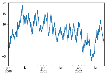
- 데이터프레임에서 plot() 메소드는 라벨이 존재하는 모든 열을 그릴 때 편리하다.
1 | df = pd.DataFrame(np.random.randn(1000, 4), index=ts.index, |
<matplotlib.legend.Legend at 0x7f177ebf3a50>
<Figure size 432x288 with 0 Axes>
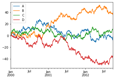
12.Getting Data In / Out (데이터 입/출력)
CSV
- csv 파일에 쓴다.
1 | df.to_csv('foo.csv') |
- csv 파일을 읽어낸다.
1 | pd.read_csv('foo.csv') |
| Unnamed: 0 | A | B | C | D | |
|---|---|---|---|---|---|
| 0 | 2000-01-01 | 0.005390 | -0.616651 | 2.261198 | -0.868199 |
| 1 | 2000-01-02 | -0.084304 | -0.247153 | 0.097660 | -0.381440 |
| 2 | 2000-01-03 | 1.540081 | 0.806761 | 0.628394 | -0.810376 |
| 3 | 2000-01-04 | 2.339388 | 0.573873 | 2.907442 | 0.339424 |
| 4 | 2000-01-05 | 0.938390 | 2.164131 | 3.848056 | 0.158632 |
| ... | ... | ... | ... | ... | ... |
| 995 | 2002-09-22 | -4.732994 | 38.365117 | 10.155791 | -34.795312 |
| 996 | 2002-09-23 | -7.505606 | 38.661194 | 10.837375 | -35.956062 |
| 997 | 2002-09-24 | -4.967844 | 37.522602 | 10.977005 | -35.639584 |
| 998 | 2002-09-25 | -3.707181 | 35.950703 | 11.191352 | -36.306747 |
| 999 | 2002-09-26 | -1.984682 | 36.604786 | 10.741370 | -35.995049 |
1000 rows × 5 columns
<script>
const buttonEl =
document.querySelector('#df-f2acd47f-3ad2-400d-b1c5-ff10dfa1d025 button.colab-df-convert');
buttonEl.style.display =
google.colab.kernel.accessAllowed ? 'block' : 'none';
async function convertToInteractive(key) {
const element = document.querySelector('#df-f2acd47f-3ad2-400d-b1c5-ff10dfa1d025');
const dataTable =
await google.colab.kernel.invokeFunction('convertToInteractive',
[key], {});
if (!dataTable) return;
const docLinkHtml = 'Like what you see? Visit the ' +
'<a target="_blank" href=https://colab.research.google.com/notebooks/data_table.ipynb>data table notebook</a>'
+ ' to learn more about interactive tables.';
element.innerHTML = '';
dataTable['output_type'] = 'display_data';
await google.colab.output.renderOutput(dataTable, element);
const docLink = document.createElement('div');
docLink.innerHTML = docLinkHtml;
element.appendChild(docLink);
}
</script>
</div>
HDF5
- HDFStores에 읽고 쓴다.
1 | df.to_hdf('foo.h5','df') |
- HDF5 Store에서 읽어온다.
1 | pd.read_hdf('foo.h5', 'df') |
| A | B | C | D | |
|---|---|---|---|---|
| 2000-01-01 | 0.005390 | -0.616651 | 2.261198 | -0.868199 |
| 2000-01-02 | -0.084304 | -0.247153 | 0.097660 | -0.381440 |
| 2000-01-03 | 1.540081 | 0.806761 | 0.628394 | -0.810376 |
| 2000-01-04 | 2.339388 | 0.573873 | 2.907442 | 0.339424 |
| 2000-01-05 | 0.938390 | 2.164131 | 3.848056 | 0.158632 |
| ... | ... | ... | ... | ... |
| 2002-09-22 | -4.732994 | 38.365117 | 10.155791 | -34.795312 |
| 2002-09-23 | -7.505606 | 38.661194 | 10.837375 | -35.956062 |
| 2002-09-24 | -4.967844 | 37.522602 | 10.977005 | -35.639584 |
| 2002-09-25 | -3.707181 | 35.950703 | 11.191352 | -36.306747 |
| 2002-09-26 | -1.984682 | 36.604786 | 10.741370 | -35.995049 |
1000 rows × 4 columns
<script>
const buttonEl =
document.querySelector('#df-d8254976-8070-4b22-bdc3-11fbbd746968 button.colab-df-convert');
buttonEl.style.display =
google.colab.kernel.accessAllowed ? 'block' : 'none';
async function convertToInteractive(key) {
const element = document.querySelector('#df-d8254976-8070-4b22-bdc3-11fbbd746968');
const dataTable =
await google.colab.kernel.invokeFunction('convertToInteractive',
[key], {});
if (!dataTable) return;
const docLinkHtml = 'Like what you see? Visit the ' +
'<a target="_blank" href=https://colab.research.google.com/notebooks/data_table.ipynb>data table notebook</a>'
+ ' to learn more about interactive tables.';
element.innerHTML = '';
dataTable['output_type'] = 'display_data';
await google.colab.output.renderOutput(dataTable, element);
const docLink = document.createElement('div');
docLink.innerHTML = docLinkHtml;
element.appendChild(docLink);
}
</script>
</div>
Excel
MS Excel에 읽고 쓴다.
엑셀 파일에 쓴다.
1 | df.to_excel('foo.xlsx', sheet_name='Sheet1') |
- 엑셀 파일을 읽어온다.
1 | pd.read_excel('foo.xlsx', 'Sheet1', index_col = None, na_values=['NA']) |
| Unnamed: 0 | A | B | C | D | |
|---|---|---|---|---|---|
| 0 | 2000-01-01 | 0.005390 | -0.616651 | 2.261198 | -0.868199 |
| 1 | 2000-01-02 | -0.084304 | -0.247153 | 0.097660 | -0.381440 |
| 2 | 2000-01-03 | 1.540081 | 0.806761 | 0.628394 | -0.810376 |
| 3 | 2000-01-04 | 2.339388 | 0.573873 | 2.907442 | 0.339424 |
| 4 | 2000-01-05 | 0.938390 | 2.164131 | 3.848056 | 0.158632 |
| ... | ... | ... | ... | ... | ... |
| 995 | 2002-09-22 | -4.732994 | 38.365117 | 10.155791 | -34.795312 |
| 996 | 2002-09-23 | -7.505606 | 38.661194 | 10.837375 | -35.956062 |
| 997 | 2002-09-24 | -4.967844 | 37.522602 | 10.977005 | -35.639584 |
| 998 | 2002-09-25 | -3.707181 | 35.950703 | 11.191352 | -36.306747 |
| 999 | 2002-09-26 | -1.984682 | 36.604786 | 10.741370 | -35.995049 |
1000 rows × 5 columns
<script>
const buttonEl =
document.querySelector('#df-0adace20-cbb2-4908-846b-7f1dd49ea7cb button.colab-df-convert');
buttonEl.style.display =
google.colab.kernel.accessAllowed ? 'block' : 'none';
async function convertToInteractive(key) {
const element = document.querySelector('#df-0adace20-cbb2-4908-846b-7f1dd49ea7cb');
const dataTable =
await google.colab.kernel.invokeFunction('convertToInteractive',
[key], {});
if (!dataTable) return;
const docLinkHtml = 'Like what you see? Visit the ' +
'<a target="_blank" href=https://colab.research.google.com/notebooks/data_table.ipynb>data table notebook</a>'
+ ' to learn more about interactive tables.';
element.innerHTML = '';
dataTable['output_type'] = 'display_data';
await google.colab.output.renderOutput(dataTable, element);
const docLink = document.createElement('div');
docLink.innerHTML = docLinkHtml;
element.appendChild(docLink);
}
</script>
</div>
13.Gotchas (잡았다!)
- 연산 수행 시 다음과 같은 예외 상황(Error)을 볼 수도 있다.
1 | if pd.Series([False, True, False]): |
---------------------------------------------------------------------------
ValueError Traceback (most recent call last)
<ipython-input-129-5c782b38cd2f> in <module>()
----> 1 if pd.Series([False, True, False]):
2 print("I was true")
/usr/local/lib/python3.7/dist-packages/pandas/core/generic.py in __nonzero__(self)
1536 def __nonzero__(self):
1537 raise ValueError(
-> 1538 f"The truth value of a {type(self).__name__} is ambiguous. "
1539 "Use a.empty, a.bool(), a.item(), a.any() or a.all()."
1540 )
ValueError: The truth value of a Series is ambiguous. Use a.empty, a.bool(), a.item(), a.any() or a.all().
- 이런 경우에는 any(), all(), empty 등을 사용해서 무엇을 원하는지를 선택 (반영)해주어야 한다.
1 | if pd.Series([False, True, False])is not None: |
I was not None
End of document
pandas_tutorial_01
데이터 전처리
- 데이터 전처리의 기본
- garbage Data —[ Great Model ]—> Garbage Results
데이터 전처리의 주요 과정
- 데이터 전처리 수행 프로세스***(중요)***
- 1.중복값 제거 및 결측치 처리 -> 2.이상치 처리 -> 3.Feature Engineering
- 주요 목적 : 더 나은 분석 결과 도출 및 모형 성능 개선 실현
pandas 기본자료형
- 숫자, 문자 모두 들어간다.
- 중복이 불가능하다.
판다스
라이브러리 불러오기
1 | import pandas as pd |
1.3.5
테스트
1 | temp_dic = {"col1": [1,2,3], |
| col1 | col2 | |
|---|---|---|
| 0 | 1 | 3 |
| 1 | 2 | 4 |
| 2 | 3 | 5 |
<script>
const buttonEl =
document.querySelector('#df-5f12a67d-363f-495e-a8d6-e15402e0c5d6 button.colab-df-convert');
buttonEl.style.display =
google.colab.kernel.accessAllowed ? 'block' : 'none';
async function convertToInteractive(key) {
const element = document.querySelector('#df-5f12a67d-363f-495e-a8d6-e15402e0c5d6');
const dataTable =
await google.colab.kernel.invokeFunction('convertToInteractive',
[key], {});
if (!dataTable) return;
const docLinkHtml = 'Like what you see? Visit the ' +
'<a target="_blank" href=https://colab.research.google.com/notebooks/data_table.ipynb>data table notebook</a>'
+ ' to learn more about interactive tables.';
element.innerHTML = '';
dataTable['output_type'] = 'display_data';
await google.colab.output.renderOutput(dataTable, element);
const docLink = document.createElement('div');
docLink.innerHTML = docLinkHtml;
element.appendChild(docLink);
}
</script>
</div>
1 | print(type(df)) |
<class 'pandas.core.frame.DataFrame'>
1 | temp_dic = {'a':1, 'b':2, 'c':3} |
a 1
b 2
c 3
dtype: int64
<class 'pandas.core.series.Series'>
구글 드라이브 연동
- 구글 드라이브 → colab notebook → 새 폴더 생성 : data → 슬랙에서 다운 받은 lemonade.csv 파일을 올린다 -> 다음 코드를 실행
1 | from google.colab import drive |
Mounted at /content/drive
Mounted at ..drive 가 출력되었으므로 성공
현재 좌측에 폴더 그림 -> drive -> mydrive -> Colab Notebooks -> data -> Lemonade2016.csv를 찾아서 우클릭 -> 경로 복사 -> 다음 코드에 붙여넣어 사용
1 | DATA_PATH = '/content/drive/MyDrive/Colab Notebooks/data/Lemonade2016.csv' |
| Date | Location | Lemon | Orange | Temperature | Leaflets | Price | |
|---|---|---|---|---|---|---|---|
| 0 | 7/1/2016 | Park | 97 | 67 | 70 | 90.0 | 0.25 |
| 1 | 7/2/2016 | Park | 98 | 67 | 72 | 90.0 | 0.25 |
| 2 | 7/3/2016 | Park | 110 | 77 | 71 | 104.0 | 0.25 |
| 3 | 7/4/2016 | Beach | 134 | 99 | 76 | 98.0 | 0.25 |
| 4 | 7/5/2016 | Beach | 159 | 118 | 78 | 135.0 | 0.25 |
| 5 | 7/6/2016 | Beach | 103 | 69 | 82 | 90.0 | 0.25 |
| 6 | 7/6/2016 | Beach | 103 | 69 | 82 | 90.0 | 0.25 |
| 7 | 7/7/2016 | Beach | 143 | 101 | 81 | 135.0 | 0.25 |
| 8 | NaN | Beach | 123 | 86 | 82 | 113.0 | 0.25 |
| 9 | 7/9/2016 | Beach | 134 | 95 | 80 | 126.0 | 0.25 |
| 10 | 7/10/2016 | Beach | 140 | 98 | 82 | 131.0 | 0.25 |
| 11 | 7/11/2016 | Beach | 162 | 120 | 83 | 135.0 | 0.25 |
| 12 | 7/12/2016 | Beach | 130 | 95 | 84 | 99.0 | 0.25 |
| 13 | 7/13/2016 | Beach | 109 | 75 | 77 | 99.0 | 0.25 |
| 14 | 7/14/2016 | Beach | 122 | 85 | 78 | 113.0 | 0.25 |
| 15 | 7/15/2016 | Beach | 98 | 62 | 75 | 108.0 | 0.50 |
| 16 | 7/16/2016 | Beach | 81 | 50 | 74 | 90.0 | 0.50 |
| 17 | 7/17/2016 | Beach | 115 | 76 | 77 | 126.0 | 0.50 |
| 18 | 7/18/2016 | Park | 131 | 92 | 81 | 122.0 | 0.50 |
| 19 | 7/19/2016 | Park | 122 | 85 | 78 | 113.0 | 0.50 |
| 20 | 7/20/2016 | Park | 71 | 42 | 70 | NaN | 0.50 |
| 21 | 7/21/2016 | Park | 83 | 50 | 77 | 90.0 | 0.50 |
| 22 | 7/22/2016 | Park | 112 | 75 | 80 | 108.0 | 0.50 |
| 23 | 7/23/2016 | Park | 120 | 82 | 81 | 117.0 | 0.50 |
| 24 | 7/24/2016 | Park | 121 | 82 | 82 | 117.0 | 0.50 |
| 25 | 7/25/2016 | Park | 156 | 113 | 84 | 135.0 | 0.50 |
| 26 | 7/26/2016 | Park | 176 | 129 | 83 | 158.0 | 0.35 |
| 27 | 7/27/2016 | Park | 104 | 68 | 80 | 99.0 | 0.35 |
| 28 | 7/28/2016 | Park | 96 | 63 | 82 | 90.0 | 0.35 |
| 29 | 7/29/2016 | Park | 100 | 66 | 81 | 95.0 | 0.35 |
| 30 | 7/30/2016 | Beach | 88 | 57 | 82 | 81.0 | 0.35 |
| 31 | 7/31/2016 | Beach | 76 | 47 | 82 | 68.0 | 0.35 |
<script>
const buttonEl =
document.querySelector('#df-e4ed5b94-20e7-42ba-9f65-459f54e1728a button.colab-df-convert');
buttonEl.style.display =
google.colab.kernel.accessAllowed ? 'block' : 'none';
async function convertToInteractive(key) {
const element = document.querySelector('#df-e4ed5b94-20e7-42ba-9f65-459f54e1728a');
const dataTable =
await google.colab.kernel.invokeFunction('convertToInteractive',
[key], {});
if (!dataTable) return;
const docLinkHtml = 'Like what you see? Visit the ' +
'<a target="_blank" href=https://colab.research.google.com/notebooks/data_table.ipynb>data table notebook</a>'
+ ' to learn more about interactive tables.';
element.innerHTML = '';
dataTable['output_type'] = 'display_data';
await google.colab.output.renderOutput(dataTable, element);
const docLink = document.createElement('div');
docLink.innerHTML = docLinkHtml;
element.appendChild(docLink);
}
</script>
</div>
- 데이터를 불러왔다.
- 첫번째 파악해야 하는 것!
- 데이터 구조를 파악해보자
1 | juice.info() # 데이터 구조 파악 |
<class 'pandas.core.frame.DataFrame'>
RangeIndex: 32 entries, 0 to 31
Data columns (total 7 columns):
# Column Non-Null Count Dtype
--- ------ -------------- -----
0 Date 31 non-null object
1 Location 32 non-null object
2 Lemon 32 non-null int64
3 Orange 32 non-null int64
4 Temperature 32 non-null int64
5 Leaflets 31 non-null float64
6 Price 32 non-null float64
dtypes: float64(2), int64(3), object(2)
memory usage: 1.9+ KB
1 | juice.head() # 상위의 데이터를 여러개 불러온다. 디폴트 값이 5개. |
| Date | Location | Lemon | Orange | Temperature | Leaflets | Price | |
|---|---|---|---|---|---|---|---|
| 0 | 7/1/2016 | Park | 97 | 67 | 70 | 90.0 | 0.25 |
| 1 | 7/2/2016 | Park | 98 | 67 | 72 | 90.0 | 0.25 |
| 2 | 7/3/2016 | Park | 110 | 77 | 71 | 104.0 | 0.25 |
| 3 | 7/4/2016 | Beach | 134 | 99 | 76 | 98.0 | 0.25 |
| 4 | 7/5/2016 | Beach | 159 | 118 | 78 | 135.0 | 0.25 |
<script>
const buttonEl =
document.querySelector('#df-c3238942-1033-4010-80b8-10e94c66dc23 button.colab-df-convert');
buttonEl.style.display =
google.colab.kernel.accessAllowed ? 'block' : 'none';
async function convertToInteractive(key) {
const element = document.querySelector('#df-c3238942-1033-4010-80b8-10e94c66dc23');
const dataTable =
await google.colab.kernel.invokeFunction('convertToInteractive',
[key], {});
if (!dataTable) return;
const docLinkHtml = 'Like what you see? Visit the ' +
'<a target="_blank" href=https://colab.research.google.com/notebooks/data_table.ipynb>data table notebook</a>'
+ ' to learn more about interactive tables.';
element.innerHTML = '';
dataTable['output_type'] = 'display_data';
await google.colab.output.renderOutput(dataTable, element);
const docLink = document.createElement('div');
docLink.innerHTML = docLinkHtml;
element.appendChild(docLink);
}
</script>
</div>
1 | juice.tail() # 하위의 데이터를 여러개 불러온다. 디폴트 값이 5개 |
| Date | Location | Lemon | Orange | Temperature | Leaflets | Price | |
|---|---|---|---|---|---|---|---|
| 27 | 7/27/2016 | Park | 104 | 68 | 80 | 99.0 | 0.35 |
| 28 | 7/28/2016 | Park | 96 | 63 | 82 | 90.0 | 0.35 |
| 29 | 7/29/2016 | Park | 100 | 66 | 81 | 95.0 | 0.35 |
| 30 | 7/30/2016 | Beach | 88 | 57 | 82 | 81.0 | 0.35 |
| 31 | 7/31/2016 | Beach | 76 | 47 | 82 | 68.0 | 0.35 |
<script>
const buttonEl =
document.querySelector('#df-cc60af2a-dd96-48c1-9398-546b4a947c77 button.colab-df-convert');
buttonEl.style.display =
google.colab.kernel.accessAllowed ? 'block' : 'none';
async function convertToInteractive(key) {
const element = document.querySelector('#df-cc60af2a-dd96-48c1-9398-546b4a947c77');
const dataTable =
await google.colab.kernel.invokeFunction('convertToInteractive',
[key], {});
if (!dataTable) return;
const docLinkHtml = 'Like what you see? Visit the ' +
'<a target="_blank" href=https://colab.research.google.com/notebooks/data_table.ipynb>data table notebook</a>'
+ ' to learn more about interactive tables.';
element.innerHTML = '';
dataTable['output_type'] = 'display_data';
await google.colab.output.renderOutput(dataTable, element);
const docLink = document.createElement('div');
docLink.innerHTML = docLinkHtml;
element.appendChild(docLink);
}
</script>
</div>
- Describe() 함수
- 기술통계량 확인해주는 함수
1 | juice.describe() |
| Lemon | Orange | Temperature | Leaflets | Price | |
|---|---|---|---|---|---|
| count | 32.000000 | 32.000000 | 32.000000 | 31.000000 | 32.000000 |
| mean | 116.156250 | 80.000000 | 78.968750 | 108.548387 | 0.354687 |
| std | 25.823357 | 21.863211 | 4.067847 | 20.117718 | 0.113137 |
| min | 71.000000 | 42.000000 | 70.000000 | 68.000000 | 0.250000 |
| 25% | 98.000000 | 66.750000 | 77.000000 | 90.000000 | 0.250000 |
| 50% | 113.500000 | 76.500000 | 80.500000 | 108.000000 | 0.350000 |
| 75% | 131.750000 | 95.000000 | 82.000000 | 124.000000 | 0.500000 |
| max | 176.000000 | 129.000000 | 84.000000 | 158.000000 | 0.500000 |
<script>
const buttonEl =
document.querySelector('#df-bfd69db7-f9d2-49ea-84ed-2989ca9e02a8 button.colab-df-convert');
buttonEl.style.display =
google.colab.kernel.accessAllowed ? 'block' : 'none';
async function convertToInteractive(key) {
const element = document.querySelector('#df-bfd69db7-f9d2-49ea-84ed-2989ca9e02a8');
const dataTable =
await google.colab.kernel.invokeFunction('convertToInteractive',
[key], {});
if (!dataTable) return;
const docLinkHtml = 'Like what you see? Visit the ' +
'<a target="_blank" href=https://colab.research.google.com/notebooks/data_table.ipynb>data table notebook</a>'
+ ' to learn more about interactive tables.';
element.innerHTML = '';
dataTable['output_type'] = 'display_data';
await google.colab.output.renderOutput(dataTable, element);
const docLink = document.createElement('div');
docLink.innerHTML = docLinkHtml;
element.appendChild(docLink);
}
</script>
</div>
1 | type(juice.describe()) # Describe함수 결과물의 타입은 DataFrame 이다. |
pandas.core.frame.DataFrame
- value_counts()
1 | print(juice['Location'].value_counts()) |
Beach 17
Park 15
Name: Location, dtype: int64
<class 'pandas.core.series.Series'>
데이터 다뤄보기
- 행과 열을 핸들링 해보자.
1 | juice['Sold'] = 0 # sold 열 추가. |
Date Location Lemon Orange Temperature Leaflets Price Sold
0 7/1/2016 Park 97 67 70 90.0 0.25 0
1 7/2/2016 Park 98 67 72 90.0 0.25 0
2 7/3/2016 Park 110 77 71 104.0 0.25 0
1 | juice['Sold'] = juice['Lemon'] + juice['Orange'] # Sold에 값 설정 |
Date Location Lemon Orange Temperature Leaflets Price Sold
0 7/1/2016 Park 97 67 70 90.0 0.25 164
1 7/2/2016 Park 98 67 72 90.0 0.25 165
2 7/3/2016 Park 110 77 71 104.0 0.25 187
- 매출액 = 가격 x 판매량
- Revenue 로 만들어보자
1 | juice['Revenue'] = juice['Sold'] * juice['Price'] |
Date Location Lemon Orange Temperature Leaflets Price Sold \
0 7/1/2016 Park 97 67 70 90.0 0.25 164
1 7/2/2016 Park 98 67 72 90.0 0.25 165
2 7/3/2016 Park 110 77 71 104.0 0.25 187
Revenue
0 41.00
1 41.25
2 46.75
- drop(axis = 0|1)
- axis는 ‘축’을 의미한다. 한 축을 따라서 연산이 된다.
- axis를 0으로 설정 시, 행(=index)방향으로 drop() 실행
- axis를 1로 설정 시, 열방향으로 drop 수행함.
1 | juice_column_drop = juice.drop('Sold', axis = 1) |
Date Location Lemon Orange Temperature Leaflets Price Revenue
0 7/1/2016 Park 97 67 70 90.0 0.25 41.00
1 7/2/2016 Park 98 67 72 90.0 0.25 41.25
2 7/3/2016 Park 110 77 71 104.0 0.25 46.75
1 | juice_row_drop = juice.drop(0, axis = 0) |
Date Location Lemon Orange Temperature Leaflets Price Sold \
1 7/2/2016 Park 98 67 72 90.0 0.25 165
2 7/3/2016 Park 110 77 71 104.0 0.25 187
3 7/4/2016 Beach 134 99 76 98.0 0.25 233
Revenue
1 41.25
2 46.75
3 58.25
데이터 인덱싱
1 | juice[0:5] |
| Date | Location | Lemon | Orange | Temperature | Leaflets | Price | Sold | Revenue | |
|---|---|---|---|---|---|---|---|---|---|
| 0 | 7/1/2016 | Park | 97 | 67 | 70 | 90.0 | 0.25 | 164 | 41.00 |
| 1 | 7/2/2016 | Park | 98 | 67 | 72 | 90.0 | 0.25 | 165 | 41.25 |
| 2 | 7/3/2016 | Park | 110 | 77 | 71 | 104.0 | 0.25 | 187 | 46.75 |
| 3 | 7/4/2016 | Beach | 134 | 99 | 76 | 98.0 | 0.25 | 233 | 58.25 |
| 4 | 7/5/2016 | Beach | 159 | 118 | 78 | 135.0 | 0.25 | 277 | 69.25 |
<script>
const buttonEl =
document.querySelector('#df-bfa3fabe-e933-4527-879f-12c188c0b8bd button.colab-df-convert');
buttonEl.style.display =
google.colab.kernel.accessAllowed ? 'block' : 'none';
async function convertToInteractive(key) {
const element = document.querySelector('#df-bfa3fabe-e933-4527-879f-12c188c0b8bd');
const dataTable =
await google.colab.kernel.invokeFunction('convertToInteractive',
[key], {});
if (!dataTable) return;
const docLinkHtml = 'Like what you see? Visit the ' +
'<a target="_blank" href=https://colab.research.google.com/notebooks/data_table.ipynb>data table notebook</a>'
+ ' to learn more about interactive tables.';
element.innerHTML = '';
dataTable['output_type'] = 'display_data';
await google.colab.output.renderOutput(dataTable, element);
const docLink = document.createElement('div');
docLink.innerHTML = docLinkHtml;
element.appendChild(docLink);
}
</script>
</div>
boolean 값을 활용한 데이터 추출
1 | # location이 Beach인 경우 |
| Date | Location | Lemon | Orange | Temperature | Leaflets | Price | Sold | Revenue | |
|---|---|---|---|---|---|---|---|---|---|
| 3 | 7/4/2016 | Beach | 134 | 99 | 76 | 98.0 | 0.25 | 233 | 58.25 |
| 4 | 7/5/2016 | Beach | 159 | 118 | 78 | 135.0 | 0.25 | 277 | 69.25 |
| 5 | 7/6/2016 | Beach | 103 | 69 | 82 | 90.0 | 0.25 | 172 | 43.00 |
| 6 | 7/6/2016 | Beach | 103 | 69 | 82 | 90.0 | 0.25 | 172 | 43.00 |
| 7 | 7/7/2016 | Beach | 143 | 101 | 81 | 135.0 | 0.25 | 244 | 61.00 |
| 8 | NaN | Beach | 123 | 86 | 82 | 113.0 | 0.25 | 209 | 52.25 |
| 9 | 7/9/2016 | Beach | 134 | 95 | 80 | 126.0 | 0.25 | 229 | 57.25 |
| 10 | 7/10/2016 | Beach | 140 | 98 | 82 | 131.0 | 0.25 | 238 | 59.50 |
| 11 | 7/11/2016 | Beach | 162 | 120 | 83 | 135.0 | 0.25 | 282 | 70.50 |
| 12 | 7/12/2016 | Beach | 130 | 95 | 84 | 99.0 | 0.25 | 225 | 56.25 |
| 13 | 7/13/2016 | Beach | 109 | 75 | 77 | 99.0 | 0.25 | 184 | 46.00 |
| 14 | 7/14/2016 | Beach | 122 | 85 | 78 | 113.0 | 0.25 | 207 | 51.75 |
| 15 | 7/15/2016 | Beach | 98 | 62 | 75 | 108.0 | 0.50 | 160 | 80.00 |
| 16 | 7/16/2016 | Beach | 81 | 50 | 74 | 90.0 | 0.50 | 131 | 65.50 |
| 17 | 7/17/2016 | Beach | 115 | 76 | 77 | 126.0 | 0.50 | 191 | 95.50 |
| 30 | 7/30/2016 | Beach | 88 | 57 | 82 | 81.0 | 0.35 | 145 | 50.75 |
| 31 | 7/31/2016 | Beach | 76 | 47 | 82 | 68.0 | 0.35 | 123 | 43.05 |
<script>
const buttonEl =
document.querySelector('#df-f23f5092-ba57-4126-bdd5-ecc3581c90cd button.colab-df-convert');
buttonEl.style.display =
google.colab.kernel.accessAllowed ? 'block' : 'none';
async function convertToInteractive(key) {
const element = document.querySelector('#df-f23f5092-ba57-4126-bdd5-ecc3581c90cd');
const dataTable =
await google.colab.kernel.invokeFunction('convertToInteractive',
[key], {});
if (!dataTable) return;
const docLinkHtml = 'Like what you see? Visit the ' +
'<a target="_blank" href=https://colab.research.google.com/notebooks/data_table.ipynb>data table notebook</a>'
+ ' to learn more about interactive tables.';
element.innerHTML = '';
dataTable['output_type'] = 'display_data';
await google.colab.output.renderOutput(dataTable, element);
const docLink = document.createElement('div');
docLink.innerHTML = docLinkHtml;
element.appendChild(docLink);
}
</script>
</div>
1 | # location이 Beach인 경우 |
| Date | Location | Lemon | Orange | Temperature | Leaflets | Price | Sold | Revenue | |
|---|---|---|---|---|---|---|---|---|---|
| 2 | 7/3/2016 | Park | 110 | 77 | 71 | 104.0 | 0.25 | 187 | 46.75 |
| 4 | 7/5/2016 | Beach | 159 | 118 | 78 | 135.0 | 0.25 | 277 | 69.25 |
| 7 | 7/7/2016 | Beach | 143 | 101 | 81 | 135.0 | 0.25 | 244 | 61.00 |
| 8 | NaN | Beach | 123 | 86 | 82 | 113.0 | 0.25 | 209 | 52.25 |
| 9 | 7/9/2016 | Beach | 134 | 95 | 80 | 126.0 | 0.25 | 229 | 57.25 |
| 10 | 7/10/2016 | Beach | 140 | 98 | 82 | 131.0 | 0.25 | 238 | 59.50 |
| 11 | 7/11/2016 | Beach | 162 | 120 | 83 | 135.0 | 0.25 | 282 | 70.50 |
| 14 | 7/14/2016 | Beach | 122 | 85 | 78 | 113.0 | 0.25 | 207 | 51.75 |
| 15 | 7/15/2016 | Beach | 98 | 62 | 75 | 108.0 | 0.50 | 160 | 80.00 |
| 17 | 7/17/2016 | Beach | 115 | 76 | 77 | 126.0 | 0.50 | 191 | 95.50 |
| 18 | 7/18/2016 | Park | 131 | 92 | 81 | 122.0 | 0.50 | 223 | 111.50 |
| 19 | 7/19/2016 | Park | 122 | 85 | 78 | 113.0 | 0.50 | 207 | 103.50 |
| 22 | 7/22/2016 | Park | 112 | 75 | 80 | 108.0 | 0.50 | 187 | 93.50 |
| 23 | 7/23/2016 | Park | 120 | 82 | 81 | 117.0 | 0.50 | 202 | 101.00 |
| 24 | 7/24/2016 | Park | 121 | 82 | 82 | 117.0 | 0.50 | 203 | 101.50 |
| 25 | 7/25/2016 | Park | 156 | 113 | 84 | 135.0 | 0.50 | 269 | 134.50 |
| 26 | 7/26/2016 | Park | 176 | 129 | 83 | 158.0 | 0.35 | 305 | 106.75 |
<script>
const buttonEl =
document.querySelector('#df-080b31c4-9d87-4d46-a98d-5d6eec44b68f button.colab-df-convert');
buttonEl.style.display =
google.colab.kernel.accessAllowed ? 'block' : 'none';
async function convertToInteractive(key) {
const element = document.querySelector('#df-080b31c4-9d87-4d46-a98d-5d6eec44b68f');
const dataTable =
await google.colab.kernel.invokeFunction('convertToInteractive',
[key], {});
if (!dataTable) return;
const docLinkHtml = 'Like what you see? Visit the ' +
'<a target="_blank" href=https://colab.research.google.com/notebooks/data_table.ipynb>data table notebook</a>'
+ ' to learn more about interactive tables.';
element.innerHTML = '';
dataTable['output_type'] = 'display_data';
await google.colab.output.renderOutput(dataTable, element);
const docLink = document.createElement('div');
docLink.innerHTML = docLinkHtml;
element.appendChild(docLink);
}
</script>
</div>
iloc vs loc
- 차이를 확인한다!
1 | juice.head(3) |
| Date | Location | Lemon | Orange | Temperature | Leaflets | Price | Sold | Revenue | |
|---|---|---|---|---|---|---|---|---|---|
| 0 | 7/1/2016 | Park | 97 | 67 | 70 | 90.0 | 0.25 | 164 | 41.00 |
| 1 | 7/2/2016 | Park | 98 | 67 | 72 | 90.0 | 0.25 | 165 | 41.25 |
| 2 | 7/3/2016 | Park | 110 | 77 | 71 | 104.0 | 0.25 | 187 | 46.75 |
<script>
const buttonEl =
document.querySelector('#df-dadb1a11-c681-42a1-9b8b-85510d760ea0 button.colab-df-convert');
buttonEl.style.display =
google.colab.kernel.accessAllowed ? 'block' : 'none';
async function convertToInteractive(key) {
const element = document.querySelector('#df-dadb1a11-c681-42a1-9b8b-85510d760ea0');
const dataTable =
await google.colab.kernel.invokeFunction('convertToInteractive',
[key], {});
if (!dataTable) return;
const docLinkHtml = 'Like what you see? Visit the ' +
'<a target="_blank" href=https://colab.research.google.com/notebooks/data_table.ipynb>data table notebook</a>'
+ ' to learn more about interactive tables.';
element.innerHTML = '';
dataTable['output_type'] = 'display_data';
await google.colab.output.renderOutput(dataTable, element);
const docLink = document.createElement('div');
docLink.innerHTML = docLinkHtml;
element.appendChild(docLink);
}
</script>
</div>
%%time
- 실행 시간 측정
- 코드의 효율을 살펴보자
1 | %%time |
CPU times: user 2.14 ms, sys: 0 ns, total: 2.14 ms
Wall time: 3.19 ms
| Date | Location | |
|---|---|---|
| 0 | 7/1/2016 | Park |
| 1 | 7/2/2016 | Park |
| 2 | 7/3/2016 | Park |
<script>
const buttonEl =
document.querySelector('#df-dfd7fd78-f2b8-491f-a422-bd0e37bc0297 button.colab-df-convert');
buttonEl.style.display =
google.colab.kernel.accessAllowed ? 'block' : 'none';
async function convertToInteractive(key) {
const element = document.querySelector('#df-dfd7fd78-f2b8-491f-a422-bd0e37bc0297');
const dataTable =
await google.colab.kernel.invokeFunction('convertToInteractive',
[key], {});
if (!dataTable) return;
const docLinkHtml = 'Like what you see? Visit the ' +
'<a target="_blank" href=https://colab.research.google.com/notebooks/data_table.ipynb>data table notebook</a>'
+ ' to learn more about interactive tables.';
element.innerHTML = '';
dataTable['output_type'] = 'display_data';
await google.colab.output.renderOutput(dataTable, element);
const docLink = document.createElement('div');
docLink.innerHTML = docLinkHtml;
element.appendChild(docLink);
}
</script>
</div>
- loc
- -> 라벨 기반
1 | %%time |
CPU times: user 1.64 ms, sys: 0 ns, total: 1.64 ms
Wall time: 1.62 ms
| Date | Location | |
|---|---|---|
| 0 | 7/1/2016 | Park |
| 1 | 7/2/2016 | Park |
| 2 | 7/3/2016 | Park |
<script>
const buttonEl =
document.querySelector('#df-f63e27df-425e-4e52-acd7-6c213c3c886a button.colab-df-convert');
buttonEl.style.display =
google.colab.kernel.accessAllowed ? 'block' : 'none';
async function convertToInteractive(key) {
const element = document.querySelector('#df-f63e27df-425e-4e52-acd7-6c213c3c886a');
const dataTable =
await google.colab.kernel.invokeFunction('convertToInteractive',
[key], {});
if (!dataTable) return;
const docLinkHtml = 'Like what you see? Visit the ' +
'<a target="_blank" href=https://colab.research.google.com/notebooks/data_table.ipynb>data table notebook</a>'
+ ' to learn more about interactive tables.';
element.innerHTML = '';
dataTable['output_type'] = 'display_data';
await google.colab.output.renderOutput(dataTable, element);
const docLink = document.createElement('div');
docLink.innerHTML = docLinkHtml;
element.appendChild(docLink);
}
</script>
</div>
1 | # juice[juice['Leaflets'] >= 100, 컬럼명 별도 추출] |
| Date | Location | |
|---|---|---|
| 2 | 7/3/2016 | Park |
| 4 | 7/5/2016 | Beach |
| 7 | 7/7/2016 | Beach |
| 8 | NaN | Beach |
| 9 | 7/9/2016 | Beach |
| 10 | 7/10/2016 | Beach |
| 11 | 7/11/2016 | Beach |
| 14 | 7/14/2016 | Beach |
| 15 | 7/15/2016 | Beach |
| 17 | 7/17/2016 | Beach |
| 18 | 7/18/2016 | Park |
| 19 | 7/19/2016 | Park |
| 22 | 7/22/2016 | Park |
| 23 | 7/23/2016 | Park |
| 24 | 7/24/2016 | Park |
| 25 | 7/25/2016 | Park |
| 26 | 7/26/2016 | Park |
<script>
const buttonEl =
document.querySelector('#df-80c7ea4c-f3b6-416c-90a6-935ca4d10c87 button.colab-df-convert');
buttonEl.style.display =
google.colab.kernel.accessAllowed ? 'block' : 'none';
async function convertToInteractive(key) {
const element = document.querySelector('#df-80c7ea4c-f3b6-416c-90a6-935ca4d10c87');
const dataTable =
await google.colab.kernel.invokeFunction('convertToInteractive',
[key], {});
if (!dataTable) return;
const docLinkHtml = 'Like what you see? Visit the ' +
'<a target="_blank" href=https://colab.research.google.com/notebooks/data_table.ipynb>data table notebook</a>'
+ ' to learn more about interactive tables.';
element.innerHTML = '';
dataTable['output_type'] = 'display_data';
await google.colab.output.renderOutput(dataTable, element);
const docLink = document.createElement('div');
docLink.innerHTML = docLinkHtml;
element.appendChild(docLink);
}
</script>
</div>
1 | juice.iloc[juice['Leaflets'] >= 100, 0:2] |
정렬
- sort_values()
1 | # 매출액 순서로 정렬 |
| Date | Location | Lemon | Orange | Temperature | Leaflets | Price | Sold | Revenue | |
|---|---|---|---|---|---|---|---|---|---|
| 25 | 7/25/2016 | Park | 156 | 113 | 84 | 135.0 | 0.50 | 269 | 134.50 |
| 18 | 7/18/2016 | Park | 131 | 92 | 81 | 122.0 | 0.50 | 223 | 111.50 |
| 26 | 7/26/2016 | Park | 176 | 129 | 83 | 158.0 | 0.35 | 305 | 106.75 |
<script>
const buttonEl =
document.querySelector('#df-d4ef77c6-8bab-4eae-9f75-40bfaf70f3b7 button.colab-df-convert');
buttonEl.style.display =
google.colab.kernel.accessAllowed ? 'block' : 'none';
async function convertToInteractive(key) {
const element = document.querySelector('#df-d4ef77c6-8bab-4eae-9f75-40bfaf70f3b7');
const dataTable =
await google.colab.kernel.invokeFunction('convertToInteractive',
[key], {});
if (!dataTable) return;
const docLinkHtml = 'Like what you see? Visit the ' +
'<a target="_blank" href=https://colab.research.google.com/notebooks/data_table.ipynb>data table notebook</a>'
+ ' to learn more about interactive tables.';
element.innerHTML = '';
dataTable['output_type'] = 'display_data';
await google.colab.output.renderOutput(dataTable, element);
const docLink = document.createElement('div');
docLink.innerHTML = docLinkHtml;
element.appendChild(docLink);
}
</script>
</div>
1 | # 2개 이상 기준으로 할 경우, 그룹화하여 정렬됨 |
| Date | Location | Lemon | Orange | Temperature | Leaflets | Price | Sold | Revenue | |
|---|---|---|---|---|---|---|---|---|---|
| 25 | 7/25/2016 | Park | 156 | 113 | 84 | 135.0 | 0.50 | 269 | 134.50 |
| 24 | 7/24/2016 | Park | 121 | 82 | 82 | 117.0 | 0.50 | 203 | 101.50 |
| 18 | 7/18/2016 | Park | 131 | 92 | 81 | 122.0 | 0.50 | 223 | 111.50 |
| 23 | 7/23/2016 | Park | 120 | 82 | 81 | 117.0 | 0.50 | 202 | 101.00 |
| 22 | 7/22/2016 | Park | 112 | 75 | 80 | 108.0 | 0.50 | 187 | 93.50 |
| 19 | 7/19/2016 | Park | 122 | 85 | 78 | 113.0 | 0.50 | 207 | 103.50 |
| 17 | 7/17/2016 | Beach | 115 | 76 | 77 | 126.0 | 0.50 | 191 | 95.50 |
| 21 | 7/21/2016 | Park | 83 | 50 | 77 | 90.0 | 0.50 | 133 | 66.50 |
| 15 | 7/15/2016 | Beach | 98 | 62 | 75 | 108.0 | 0.50 | 160 | 80.00 |
| 16 | 7/16/2016 | Beach | 81 | 50 | 74 | 90.0 | 0.50 | 131 | 65.50 |
| 20 | 7/20/2016 | Park | 71 | 42 | 70 | NaN | 0.50 | 113 | 56.50 |
| 26 | 7/26/2016 | Park | 176 | 129 | 83 | 158.0 | 0.35 | 305 | 106.75 |
| 28 | 7/28/2016 | Park | 96 | 63 | 82 | 90.0 | 0.35 | 159 | 55.65 |
| 30 | 7/30/2016 | Beach | 88 | 57 | 82 | 81.0 | 0.35 | 145 | 50.75 |
| 31 | 7/31/2016 | Beach | 76 | 47 | 82 | 68.0 | 0.35 | 123 | 43.05 |
| 29 | 7/29/2016 | Park | 100 | 66 | 81 | 95.0 | 0.35 | 166 | 58.10 |
| 27 | 7/27/2016 | Park | 104 | 68 | 80 | 99.0 | 0.35 | 172 | 60.20 |
| 12 | 7/12/2016 | Beach | 130 | 95 | 84 | 99.0 | 0.25 | 225 | 56.25 |
| 11 | 7/11/2016 | Beach | 162 | 120 | 83 | 135.0 | 0.25 | 282 | 70.50 |
| 5 | 7/6/2016 | Beach | 103 | 69 | 82 | 90.0 | 0.25 | 172 | 43.00 |
| 6 | 7/6/2016 | Beach | 103 | 69 | 82 | 90.0 | 0.25 | 172 | 43.00 |
| 8 | NaN | Beach | 123 | 86 | 82 | 113.0 | 0.25 | 209 | 52.25 |
| 10 | 7/10/2016 | Beach | 140 | 98 | 82 | 131.0 | 0.25 | 238 | 59.50 |
| 7 | 7/7/2016 | Beach | 143 | 101 | 81 | 135.0 | 0.25 | 244 | 61.00 |
| 9 | 7/9/2016 | Beach | 134 | 95 | 80 | 126.0 | 0.25 | 229 | 57.25 |
| 4 | 7/5/2016 | Beach | 159 | 118 | 78 | 135.0 | 0.25 | 277 | 69.25 |
| 14 | 7/14/2016 | Beach | 122 | 85 | 78 | 113.0 | 0.25 | 207 | 51.75 |
| 13 | 7/13/2016 | Beach | 109 | 75 | 77 | 99.0 | 0.25 | 184 | 46.00 |
| 3 | 7/4/2016 | Beach | 134 | 99 | 76 | 98.0 | 0.25 | 233 | 58.25 |
| 1 | 7/2/2016 | Park | 98 | 67 | 72 | 90.0 | 0.25 | 165 | 41.25 |
| 2 | 7/3/2016 | Park | 110 | 77 | 71 | 104.0 | 0.25 | 187 | 46.75 |
| 0 | 7/1/2016 | Park | 97 | 67 | 70 | 90.0 | 0.25 | 164 | 41.00 |
<script>
const buttonEl =
document.querySelector('#df-14051fd5-627b-4ebe-ab05-3415f55cc7f3 button.colab-df-convert');
buttonEl.style.display =
google.colab.kernel.accessAllowed ? 'block' : 'none';
async function convertToInteractive(key) {
const element = document.querySelector('#df-14051fd5-627b-4ebe-ab05-3415f55cc7f3');
const dataTable =
await google.colab.kernel.invokeFunction('convertToInteractive',
[key], {});
if (!dataTable) return;
const docLinkHtml = 'Like what you see? Visit the ' +
'<a target="_blank" href=https://colab.research.google.com/notebooks/data_table.ipynb>data table notebook</a>'
+ ' to learn more about interactive tables.';
element.innerHTML = '';
dataTable['output_type'] = 'display_data';
await google.colab.output.renderOutput(dataTable, element);
const docLink = document.createElement('div');
docLink.innerHTML = docLinkHtml;
element.appendChild(docLink);
}
</script>
</div>
Group by
- R dplyr groupby() %>% summarize()
- -> 데이터 요약 -> 엑셀로 피벗 테이블
1 | # Location 항목을 카운트 |
| Date | Lemon | Orange | Temperature | Leaflets | Price | Sold | Revenue | |
|---|---|---|---|---|---|---|---|---|
| Location | ||||||||
| Beach | 16 | 17 | 17 | 17 | 17 | 17 | 17 | 17 |
| Park | 15 | 15 | 15 | 15 | 14 | 15 | 15 | 15 |
<script>
const buttonEl =
document.querySelector('#df-26afeca1-6bb7-494f-ba2d-92aab015b058 button.colab-df-convert');
buttonEl.style.display =
google.colab.kernel.accessAllowed ? 'block' : 'none';
async function convertToInteractive(key) {
const element = document.querySelector('#df-26afeca1-6bb7-494f-ba2d-92aab015b058');
const dataTable =
await google.colab.kernel.invokeFunction('convertToInteractive',
[key], {});
if (!dataTable) return;
const docLinkHtml = 'Like what you see? Visit the ' +
'<a target="_blank" href=https://colab.research.google.com/notebooks/data_table.ipynb>data table notebook</a>'
+ ' to learn more about interactive tables.';
element.innerHTML = '';
dataTable['output_type'] = 'display_data';
await google.colab.output.renderOutput(dataTable, element);
const docLink = document.createElement('div');
docLink.innerHTML = docLinkHtml;
element.appendChild(docLink);
}
</script>
</div>
1 | # 집계 함수 |
| max | min | sum | mean | |
|---|---|---|---|---|
| Location | ||||
| Beach | 95.5 | 43.0 | 1002.8 | 58.988235 |
| Park | 134.5 | 41.0 | 1178.2 | 78.546667 |
<script>
const buttonEl =
document.querySelector('#df-650575f1-c764-4097-b860-3fa1b26021c5 button.colab-df-convert');
buttonEl.style.display =
google.colab.kernel.accessAllowed ? 'block' : 'none';
async function convertToInteractive(key) {
const element = document.querySelector('#df-650575f1-c764-4097-b860-3fa1b26021c5');
const dataTable =
await google.colab.kernel.invokeFunction('convertToInteractive',
[key], {});
if (!dataTable) return;
const docLinkHtml = 'Like what you see? Visit the ' +
'<a target="_blank" href=https://colab.research.google.com/notebooks/data_table.ipynb>data table notebook</a>'
+ ' to learn more about interactive tables.';
element.innerHTML = '';
dataTable['output_type'] = 'display_data';
await google.colab.output.renderOutput(dataTable, element);
const docLink = document.createElement('div');
docLink.innerHTML = docLinkHtml;
element.appendChild(docLink);
}
</script>
</div>
1 | # 집계 함수 |
/usr/local/lib/python3.7/dist-packages/ipykernel_launcher.py:4: FutureWarning: Indexing with multiple keys (implicitly converted to a tuple of keys) will be deprecated, use a list instead.
after removing the cwd from sys.path.
| Revenue | Lemon | |||||||
|---|---|---|---|---|---|---|---|---|
| max | min | sum | mean | max | min | sum | mean | |
| Location | ||||||||
| Beach | 95.5 | 43.0 | 1002.8 | 58.988235 | 162 | 76 | 2020 | 118.823529 |
| Park | 134.5 | 41.0 | 1178.2 | 78.546667 | 176 | 71 | 1697 | 113.133333 |
<script>
const buttonEl =
document.querySelector('#df-7a3b6989-de2d-4a76-8bd8-66538dc5863c button.colab-df-convert');
buttonEl.style.display =
google.colab.kernel.accessAllowed ? 'block' : 'none';
async function convertToInteractive(key) {
const element = document.querySelector('#df-7a3b6989-de2d-4a76-8bd8-66538dc5863c');
const dataTable =
await google.colab.kernel.invokeFunction('convertToInteractive',
[key], {});
if (!dataTable) return;
const docLinkHtml = 'Like what you see? Visit the ' +
'<a target="_blank" href=https://colab.research.google.com/notebooks/data_table.ipynb>data table notebook</a>'
+ ' to learn more about interactive tables.';
element.innerHTML = '';
dataTable['output_type'] = 'display_data';
await google.colab.output.renderOutput(dataTable, element);
const docLink = document.createElement('div');
docLink.innerHTML = docLinkHtml;
element.appendChild(docLink);
}
</script>
</div>